Download
1 / 18
180 likes | 188 Vues
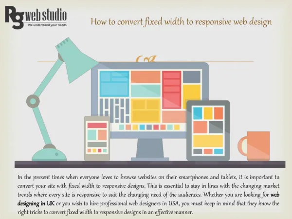
It is not too difficult for todayu2019s merchants to spread the word out and attract visitors to their online store u2013 thanks to the plenty of advertising services and tools out there. Whatu2019s challenging is to convince people to buy from you once they land on your site. http://www.webcircle.com.au<br>

E N D
It is not too difficult for today’s merchants to spread the word out and attract visitors to their online store – thanks to the plenty of advertising services and tools out there. What’s challenging is to convince people to buy from you once they land on your site.
No matter what the initial goal is, ultimately every business wants to make sales and generate revenue, which comes from conversions. Several psychological factors come into play when a customer makes a purchase online. So, understanding how customers think and behave when shopping online, can help merchants tailor their website to influence the customer’s buying decision, in a positive manner.
We are big advocates of the idea of applying psychology in eCommerce design. With strategic and effective implementation of certain psychology triggers in web design, you can silently influence customers to trust you and take a desired action. While all of this is tested and proven, it is definitely not as easy to achieve as it sounds. You need to be completely aware of the effects of psychology techniques you apply to your design or you might end up inadvertently frustrating visitors or sending them to your competition.
Listed below are some expert-approved techniques to work psychology in your web design to improve the shopping experience on your store.
CAPITALISE ON THE SERIAL POSITION EFFECT Invented by Hermann Ebbinghaus, the “Serial Effect” refers to the tendency of people to recall the first few and the last few things in a series better than those in the middle. Furthermore, the information one receives first is stored in the long-term memory – which is referred as the primacy effect. The information presented last in a series, on the other hand, is recent in your mind and hence remains fresh – this is called recency effect.
By applying these effects in your design, you can direct customer attention toward the information you want and control their behaviour. Here are some ways to put the serial effect into practice:
If the prospects’ decision is to be taken after a few seconds of exposure, put the most important information first. If the prospect’s decision is to be taken immediately after reading the content, you want to put the most important item last on the list.
For example, on a page that introduces your latest wireless headphone series, you want to place the main features or benefits of the product first on the list while the add-ons like free shipping and compatibility with iPad can go to the end of the page. This way, if a prospect leaves the page without a purchase, they are more likely to remember the main benefits of your product.
The most expensive items should be placed first on the page. • The most important links should appear at the beginning or end of your navigation menu. This will attract more clicks on the information you want to emphasise. • On a landing page, devote the first section of the page to the key benefits of your product or service and end the page with a persuasive call to action.
Evoke Emotions Through Visual Elements According to the Isolation Effect, when multiple similar objects are present, people tend to notice and remember the one that stands out. This means you can make visitors pay attention to important things on your site by strategically using colours, fonts, images and animations.
For example, you can use a contrasting colour, font style or font size in a CTA or increase the space around it to differentiate it from the rest of the content and increase the chances of clicks. You can also emphasise on the most expensive best-selling or new items by using a different colour than the rest of the colour theme.
Moreover, colours can do much more than just highlighting certain information. They can influence the mood and behaviours, so it makes sense to research well and wisely choose the hues that best resonate with your brand and customers. This is especially important if you are targeting international audiences because same colours may depict different emotions or meanings in different cultures.
The Paradox of Choice Customers love the variety and choices they are offered when shopping online. But too many options can make customers feel overwhelmed and confused, often resulting in lost sales for merchants. This is referred as the Paradox of Choice.
This state of indecision might not occur if people visit a website looking for a limited product edition but if they must choose between too many of similar products, it can hurt your conversion rates. eCommerce websites with a large range of products are at higher risk of the choice paradox.
One way to mitigate this risk and spare visitors the potential decision fatigue is limiting the number of CTAs. Another thing you can do is adding the “load more” button and allowing shoppers to adjust the number of items displayed on a page, saving them the hassle of infinite scrolling.
To sum up eCommerce UX psychology is vast and there is a lot more to know and learn. Consider using the tips outlined in this article as a starting point before you dig deeper into the key principles and strategies of eCommerce design. A professional specialised in WordPress or Magento web design services(whatever eCommerce platform you use) can give you a bigger picture of the design ethics and psychology of web design – all while helping you implement proven approaches for online success.
CONTECT US Web Circle Suite 610/12 Century Circuit, Baulkham Hills NSW 2153 1300 760 363 www.webcircle.com.au