1 / 5
50 likes | 76 Vues
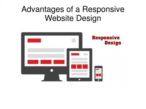
Days when designing a website for only desktop screens were practical have long gone. Owing to the ever-expanding mobile websites and technology, web designers are being pushed hard to re-think how their designs are going to be displayed across all the devices. Even the professional web designers of web design Los Angeles build creative websites that are agile and responsive. Brilliant heads at SFWPexperts truly understand that web design is just not about picking great typefaces and applying it, it is about how we use them to peak the interest of visitors. Keeping aside the scores of others, just think about yours. How much do you browse on your phone vs desktop every day? Is my standpoint clear now? We explain, what responsive design is all about? Read more on https://bit.ly/2BDzfL1

E N D
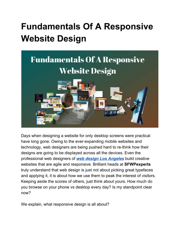
Fundamentals Of A Responsive Website Design Days when designing a website for only desktop screens were practical have long gone. Owing to the ever-expanding mobile websites and technology, web designers are being pushed hard to re-think how their designs are going to be displayed across all the devices. Even the professional web designers of web design Los Angeles build creative websites that are agile and responsive. Brilliant heads at SFWPexperts truly understand that web design is just not about picking great typefaces and applying it, it is about how we use them to peak the interest of visitors. Keeping aside the scores of others, just think about yours. How much do you browse on your phone vs desktop every day? Is my standpoint clear now? We explain, what responsive design is all about?
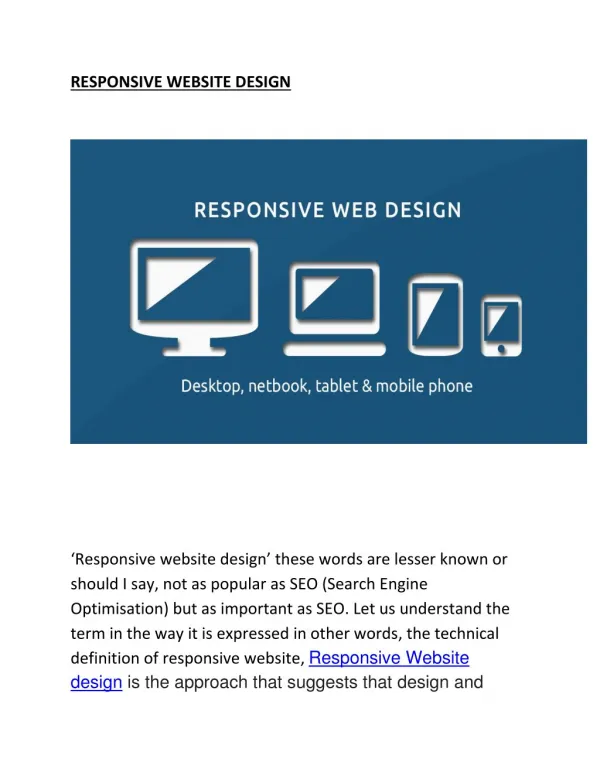
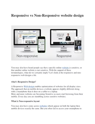
What is responsive design? A responsive web design (RWD) can be understood as an approach that allows the code and design of the website to respond according to the screen size of all the devices. And that means you are assured to get optimum viewing experience, no matter what you are looking at - a 4-inch screen, 14-inch or 40-inch display. Do you know the best responsive websites use flexible visuals, fluid grids, and CSS styling in their web design? Such utilizations are a must to change the design of the site and render it according to the available browser’s width. The goal of a talented web designer should be to tailor the UI and UX of a website design whether it is accessed from specific or different devices at a time. Staying at the forefront of web design trends and tactics, our team aims to build a website that exceeds your expectations while appointing and also works as an effective marketing tool for your business. Why having a responsive design is so important? If we try to design and develop various versions of a website that is compatible with every existing device, the process would not be practically easy and also consume more time and dollars. The designs would also be ineffective if certain technology change takes place in the future and seem impossible to maintain during its lifetime. With that logic, if you are after a cutting edge solution to future-proof the look of your website, responsive design is the undeniable answer. Based out of Los Angeles, SFWPExperts Web Design has proven instrumental in creating custom sites and success stories, resulting in the achievement of testimonials that exceeds our expectation.
The key to responsive web design is to first recognize your audience group and fetch their details about what kind of devices do they use while visiting your site. How much of your current traffic comes from mobile, tablet and laptop or desktops? At present, nearly 56 percent of total traffic is received from mobile devices alone to US websites and the users are rapidly increasing. For now, we have approximately 2.6 billion mobile users and it is expected to touch over 6 billion by 2020. Mobile optimized website design has never been so important before. Our web design company provides affordable website maintenance services to small scale businesses and corporates to make sure your website is always up and content updated. Designing your website for a variety of devices is significantly important but the process becomes quite complicated while designing across different browsers. The difficulty is that every single web browser has its own mobile version and they render all sites in a different style. What is, even more, trickier that there are many versions of browsers and your website must comply with that as well. It’s because you can’t expect every user that they would be running on the latest version. Hence you need to make sure of this too - your web design works and responds to most of the version of browsers. One proficient web designer once said that a great web designer knows well how to work with texts and not just content. Texts are just like user interface for them. Drained by what you just read? Don’t worry too much, ‘cause it’s a common battle, everyone is trying to conquer. Adapting the design for all versions of browsers and devices
should be marked as completed as soon as you can. What you can do best for it, is to test your site on as many devices as possible whether that’s newer or older. Also, don’t forget to hire an excellent web developer who can regularly test, maintain and repair your website if crashed. For successful web design, the key factor you should consider to implement is to know how to treat text as a user interface, allowing your target audience to stay on your web page for a longer period. If that’s not much or you want to ascertain the high traffic handling ability of your website, look no further to our WordPress website design company to meet the specific requirements of your site. For More Details: Contact Us: Address:The Gas Company Tower, Los Angeles, CA 90013, United States Email:la@sfwpexperts.com Contact No:213-277-9177 Google My Map:http://bit.ly/33G5rcz