Evaluating Cushion Design: Functionality, Style, and Improvements
This evaluation focuses on assessing the final cushion against the original design specifications. Key aspects include functionality, aesthetic appeal, sustainability, cost, and adherence to measurements. Analyze whether the cushion meets the needs of the target group and retains the intended style. Reflect on skills learned during the project and identify areas for improvement. Suggestions for enhancements may involve design elements like logos, colors, and materials. Draw a revised design incorporating these enhancements for the next Design Technology task.

Evaluating Cushion Design: Functionality, Style, and Improvements
E N D
Presentation Transcript
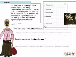
you think! You now need to assess your final cushion against the design specification you drew up . Look at each specification point and decide if you achieved it – say why or why not. Evaluation is important so that you can identify positive aspects and improve on your weaknesses. Does the cushion function as planned ? Does the cushion suit the target group ?
you think! Does the cushion look like the style as listed in your specification ? Have you considered sustainable aspects related to the cushion ? Does the cost of the cushion match the targeted price ? Does the cushion match selected/given measurements ?
you think! What skills have you learnt during the project? What could you improve about your cushion and the way you have worked ? Targets for your next Design Technology task.
Further improvements • WORD BANK • Logos • Colourful • Bondaweb • Laser • Fleece • Batik • Embroidery • Contrasting colours • Stitching • Fabric • Peer pressure • Fashionable • Cool • Free machine embroidery • Cutwork • Target group • Function Draw a possible improvement to the cushion you have designed and manufactured. In this space you’ll need todraw out an improved cushion. If you get stuck about what to improve look at your evaluation sheet. It will help you decide. Or you can use these words in the word bank opposite to assist you in coming up with some suggestions for improvements.
Further improvements Draw a possible improvement to the cushion you have designed and manufactured. • WORD BANK • Logos • Colourful • Bondaweb • Laser • Fleece • Batik • Embroidery • Contrasting colours • Stitching • Fabric • Peer pressure • Fashionable • Cool • Free machine embroidery • Cutwork • Target group • Function - cushion looks too colourful. Too much fabric too play with + cushion looks better and a bolder statement Logo smaller and subtle as colours are less harsh - orange on black is too much like the tango adverts + frills make the design look larger cushion I made cushion with improvements

