
Uploaded by
willow-weiss
1 SLIDES
154 VUES
10LIKES
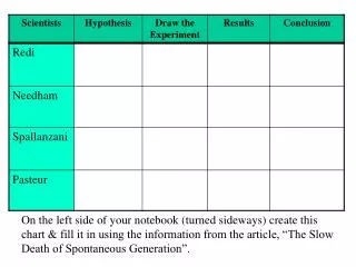
Charting Spontaneous Generation's Decline: Key Insights and Evidence
DESCRIPTION
In your notebook, oriented sideways, create a chart to visualize the key points from the article "The Slow Death of Spontaneous Generation." Use the information provided to fill in the chart with relevant data, examples, and conclusions that illustrate the decline of the concept of spontaneous generation in science. This exercise will help reinforce the critical developments and arguments presented in the article regarding how scientific understanding evolved over time.
Download
1 / 1
Télécharger la présentation 
Charting Spontaneous Generation's Decline: Key Insights and Evidence
An Image/Link below is provided (as is) to download presentation
Download Policy: Content on the Website is provided to you AS IS for your information and personal use and may not be sold / licensed / shared on other websites without getting consent from its author.
Content is provided to you AS IS for your information and personal use only.
Download presentation by click this link.
While downloading, if for some reason you are not able to download a presentation, the publisher may have deleted the file from their server.
During download, if you can't get a presentation, the file might be deleted by the publisher.
E N D
Presentation Transcript
On the left side of your notebook (turned sideways) create this chart & fill it in using the information from the article, “The Slow Death of Spontaneous Generation”.


More Related