9 Trending Web Design Background Ideas
30 likes | 58 Vues
Let us explore nine of the best background design styles that are currently trending in the world of web design In Houston.<br>

9 Trending Web Design Background Ideas
E N D
Presentation Transcript
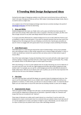
9 Trending Web Design Background Ideas During the early stages of designing a website, one of the most crucial choices that you will have to make is the type of background that you will use. With today’s interesting web design trends, there is no need to stick to a single color. Let us explore nine of the best background design styles that are currently trending in the world of web design In Houston and internet advertising. 1. Website backgrounds that make use of light colors such as grey and white have been popular for quite some time already. What makes these colors so popular is that they are simple, yet offer more than enough contrast for any other web design element that you want to include. Grey and White To use grey and white effectively for a website background, be sure to add a little bit of texture such as a gradient or type of universal pattern. If you want to separate elements that you have used in the foreground from the background, the use of shadows can do the trick. Overall, grey and white are easy for visitors to engage with and a great option if you are trying to create something minimalistic. 2. Color block layers is a craze that goes beyond the scope of website design, and you have probably seen color blocking in action in other similar industries such as interior design and fashion. In short, it is when you divide your content into a grid and then use various colors to create almost a type of mosaic effect. Color Block Layers One of the major advantages of using color blocking is that it can work well with a wide range of color schemes making it a design trend that works for a wide range of businesses and brands. Plus, it helps your website visitors to tell different types of content apart more easily. With color blocking, it is easy to create websites that are visually interesting, but not too elaborate. If you want to go this route, you will use a light background and then add another background using another color. For example, you can opt for a white background and then add different elements in bright yellow boxes. With the use of vibrant color such as yellow, you can let the most important info stand out from the rest of the website’s background. 3. The colors that have been used with flat design are a popular choice for background colors too. One way to use this web design trend is to use a bolder color or shade for the background without any gradients or variations. In other words, you will use it in only one shade or color. To create the idea of depth, you can create layers on top of this solid color by including a border or some sort of edging. Flat Color 4. There are a great number of designs that will make a visually pleasing background, yet these designs cannot easily be categorized as being purely an illustration, a geometric shape, etc. Elements and shapes like these are considered to be “abstract”. Impressionistic shapes These types of elements are solely used to spark interest on a visual level. It can be used in the background to create a central point close to an element that your website visitors must take note of or it can be applied just to create a perception of depth or space. Alternatively, you can simply use it as a layer on which you can position some of your other web design elements.
An abstract background might not enforce a lot of rules, but it is still best to include a level of organization and structure. Otherwise, your website visitors might just feel that your web page design is a bit too disorderly and confusing for their liking. 5. One of the major web design trends is a background that is completely illustrated. It does not matter if you get a graphic artist to create a custom illustration just for your website or simply opt for a generic illustration, using illustrations in your website’s background make for an interesting design. Illustrations What makes opting for illustrations in your website’s background such a great idea is that they can capture the attention helping to make sure that your website will not be forgotten soon. That being said, it is not that easy to pull it off successfully as it will require some careful consideration with regards to where you will place everything else and which style you can use for the rest of your web design elements. Get it wrong, and you will only end up with a website that is overdone and too cluttered. You can, for instance, have an area that is free of the illustration where you can place your text. This way, you will make sure that everything is still legible and easy to read. At the end of the day, you want to use an illustration that links to the rest of your website content. 6. If you do not like the idea of using a flat color for your website background, using geometric shapes instead can be a more interesting alternative. Elements like polygons and circles can make for very impressive logo designs and backgrounds for websites. If you want to go for a modern style, your website developer can implement a monotone color scheme. Just be sure to add contrasting elements so that you use your website’s background to the best advantage. Geometric shapes Another option is to use a hero image for your background and then layer it with interesting geometric shapes. By using rectangles, polygons, and other geometric shapes in this manner, you can lend a more tactile feel to your web design. That being said, you cannot just add these shapes haphazardly and think that it will be effective. Instead, it should be positioned in such a way that it will help to draw users’ attention in the right direction or specific calls to action. 7. If you are searching for something similar to geometric shapes, blobs and bubbles and other roundish shapes without defined forms can be a good alternative. Though, unlike geometric shapes, bubbles and blobs are more rudimentary. Blobs and bubbles If you want to go this route, you can either use it as your part of your actual background to include some color to your website for some visual interest or as a type of foreground element. When opting for the latter approach, the blobs or bubbles will many times be used as moving shapes to help you create the impression of layers and depth, in other words, a purely decorative function to make it easier for you to capture the attention of your website visitors. If there is not a clear flow between the images and content on your web page design, blobs and bubbles can help to create some visual connection between different elements. Overall, it is a fun type of background that will, for sure, draw users in. 8. Although many website designers in Houston connect a watercolor background with femininity and quirkiness, it does not have to be the case. With the help of a more neutral watercolor, you can add balance and depth to your website’s background. You either use swirls and lines of color or create an impression of elements being painted. As watercolors are generally light, it is a creative choice if you want to make use of a unique, thinner, and lighter typeface. Watercolor
9. Using line patterns in website backgrounds have become increasingly popular. With the help of an effective line pattern, you can pull people to your web design and guide them to see other important elements. Whether you prefer pronounced strokes or slight curves, something small or a much bigger pattern, you can create an effective pattern that will help you to achieve the goals of your website. A repeating pattern can work well as then you do not have to pay attention to how the lines of the two patterns will meet. Line patterns 10. Gradients are one of the most flexible we design trends offering you several options. In short, a gradient is when a color gradually blends to another color. With the help of gradients, you can add a new dimension to your web design, which will help an object to stand out. This added depth adds a degree of realism to your web design. After all, the real world does not consist of flat colors, allowing gradients to help create a more accurate presentation of the world as we know it. Gradients
