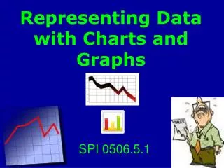
Mastering Data Visualization with Excel Charts
170 likes | 282 Vues
Learn how to organize and create various charts in Excel, from simple pie charts to complex line charts, with detailed step-by-step instructions. Enhance your data presentation skills and make impactful visualizations easily!

Mastering Data Visualization with Excel Charts
E N D
Presentation Transcript
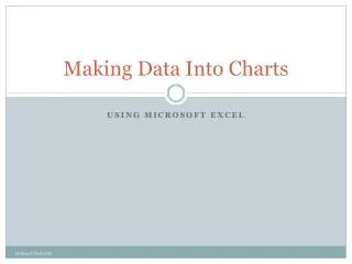
Making Data Into Charts Using Microsoft Excel by Rene F. Pack, MIS
Organizing Your Data The first step to creating a chart or graph is organizing your data. It can be organized either vertically or horizontally Horizontal Vertical by Rene F. Pack, MIS
Organizing Your Data Typically data is presented vertically Once you have your data organized you can begin the process of making a chart Vertical by Rene F. Pack, MIS
Pie Charts • We will begin with a Pie Chart • A Pie Chart shows the part of the whole • Step 1: Select the titles and the data(DO NOT select the “Total(s)”, you only want the data in a Pie Chart.) Select the data and your titles Do not select the totals by Rene F. Pack, MIS
Pie Charts • Step 2: Click the Insert tab on the Ribbon Click “Pie” in the Charts group Click “Insert” tab Click “Pie” Charts Group by Rene F. Pack, MIS
Pie Charts • Step 3: Click the first 2-D Pie in the list by Rene F. Pack, MIS
Pie Charts • Step 4: Voilà…a Pie Chart by Rene F. Pack, MIS
Pie Charts • Step 5: If you want labels on the “pieces” of the Pie, position your mouse pointer over the pie and click the right mouse button • Step 6: Click “Add Data Labels” in the pop-up menu by Rene F. Pack, MIS
Pie Charts • Step 7: Now your chart should look like the one belowIf you want to change the labels just right click on one of the labels in the chart and click “Format Data Labels” by Rene F. Pack, MIS
Pie Charts • Step 8: In the Format Data Labels Dialog Box, in the Label Options group you can choose a variety of label contents including • Series Name • Category Name • Value • Percentage In this case we will use Percentageand make sure that there is a check markin “Show Leader Lines” • Step 9: In the Label Position group choose “Outside End” • Step 10: Click “Close” by Rene F. Pack, MIS
Pie Charts • Here is your new chart by Rene F. Pack, MIS
Single Line Chart • Just like the Pie Chart • Step 1: Select the titles and the data(DO NOT select the “Total(s)”, you only want the data in your chart.) Select the data and your titles Do not select the totals by Rene F. Pack, MIS
Single Line Chart • Step 3: Click the first 2-D Line in the list by Rene F. Pack, MIS
Single Line Chart • Step 4: Voilà…a Line Chart by Rene F. Pack, MIS
Multiple Line Chart • When you have Multiple Line Charts you are comparing data. For Instance comparing sales from one year to another and in this case we will be comparing 2011 to 2012 sales • Step 1: Select the titles and the data for both years(DO NOT select the “Total(s)”, you only want the data in your chart.) Select the data and your titles by Rene F. Pack, MIS
Multiple Line Chart • Step 3: Click the first 2-D Line in the list by Rene F. Pack, MIS
Multiple Line Chart • Step 4: Voilà…a Multiple Line Chart by Rene F. Pack, MIS