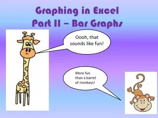
Graphing in Excel Part II – Bar Graphs
310 likes | 440 Vues
Join Barnaby the Barn Owl as we explore how to create engaging bar graphs using Excel! This tutorial provides a step-by-step approach to graphing data from last year's owl pellet project. You'll learn how to input your data correctly, highlight it, and create striking bar graphs that effectively illustrate different types of prey found in owl pellets. By the end, you'll have the skills needed to complete your owl pellet lab report like a pro. Let's make learning fun and visual with Excel!

Graphing in Excel Part II – Bar Graphs
E N D
Presentation Transcript
Oooh, that sounds like fun! Graphing in ExcelPart II – Bar Graphs More fun than a barrel of monkeys!
Well, maybe not that fun… Yeah. Nothing could be that fun!
Let’s begin. First you need some data to graph. I’m going to use the data from last year’s owl pellet project. You can use it to practice. Then, when you make the bar graphs for your owl pellet lab report, you are going to use your real data from this year. Here to present the data is my friend, Barnaby.
What’s in your pellet? Hi! I’m Barnaby the Barn Owl! Here is some data for you to graph.
The best way to illustrate data that shows the amounts of different types of something is a bar graph. Nifty. Do they also call that a histogram? Why, yes they do!
Open up the Excel Program. It will look like this:
Enter the data into the spread sheet. • Data should be entered vertically. 2. Put the types of prey in the first column. 3. Put the number of each in the second column.
Okay, let’s do it! • In the top left box, ‘1A,’ type the word vole. 2. Then keep typing the different kinds of prey down the column. pocket gopher mouse shrew rat bird mole DONE!
2. In the box directly to the right of each type of prey animal, type the number of each: Like this! 57 Good job! 6 giraffes 0 1
When you’re done, it should look like this! It is okay if pocket gopher looks like it is cut off.. Fun, right?
Now we’re going to make the graph. Move your mouse over the columns of data starting at the upper left until you have highlighted all the data. Not you again! Did someone say Mouse?!
Highlighted data: Wait! A mouse! Where? I’m hungry! UhUh-oh… Uh-oh..!
On the tabs on top, click on “Insert.” After you click, you will see a colorful collection of charts.
Tada! It makes a graph for you: But we’re not done yet!
You know that you must always give your graph a title and label both axes : This is the ‘’y” axis. This is the ‘’x” axis.
Towards the top you will see something called “Chart Tools.” Choose “layout” to add axes labels (they call them axes titles) and a title for the graph. (They call it a chart title.)
After it adds them, just click on them to change them to what you want them to say:
Your graph should now look like this: You can even change the color if you want. To do that, choose “design” in Chart Tools.
Number of Prey Animal per Pellet Great! Now let’s make the second graph. This one is about the number of prey animals in the pellets. Here’s more data from last year.
It’s just same process, but with different data. Spell out the numbers or it gets confused! I think I’m confused!
So now we highlight again? That’s right!
And once again, go to Chart Tools and choose Layout to add labels, etc.
You try it on your own, then compare it to ours, okay? Don’t worry – we don’t mind waiting!
Now it’s time to make your graphs with your REAL data! Good luck! Have fun! See you next time!
The End! It’s gonna be the end of ME if that owl finds me!