Geographical Skills
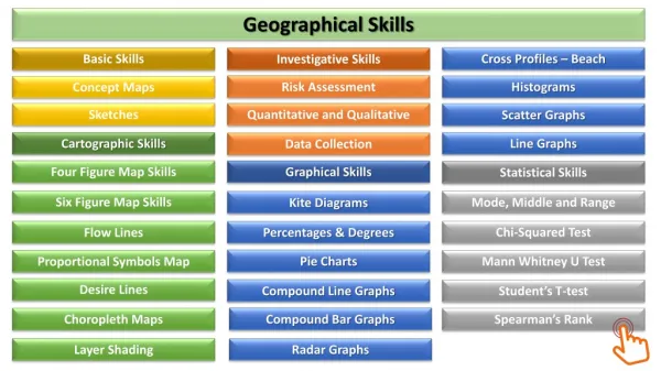
Geographical Skills. Basic Skills. Cross Profiles – Beach. Investigative Skills. Risk Assessment. Histograms. Concept Maps. Sketches. Quantitative and Qualitative. Scatter Graphs. Cartographic Skills. Line Graphs. Data Collection. Four Figure Map Skills. Graphical Skills.

Geographical Skills
E N D
Presentation Transcript
Geographical Skills Basic Skills Cross Profiles – Beach Investigative Skills Risk Assessment Histograms Concept Maps Sketches Quantitative and Qualitative Scatter Graphs Cartographic Skills Line Graphs Data Collection Four Figure Map Skills Graphical Skills Statistical Skills Six Figure Map Skills Mode, Middle and Range Kite Diagrams Chi-Squared Test Flow Lines Percentages & Degrees Pie Charts Mann Whitney U Test Proportional Symbols Map Desire Lines Compound Line Graphs Student’s T-test Choropleth Maps Compound Bar Graphs Spearman’s Rank Layer Shading Radar Graphs
Concept Mapping Concept maps are graphical tools for organizing and representing knowledge. They include concepts, usually enclosed in circles or boxes Relationships between concepts are indicated by a connecting line. Cross-referencing data collected. Presentation is clear and neat. They help visual demonstrate the connections between different pieces information. They require a lot of time to create and can be made overcomplicated. Made relevant links with arrows. Thorough annotations that describes the evidence. This students has a range of different pieces of information linking to a particular area of a coastline.
Sketches A geographical sketch is a freehand drawing of the main elements that make up a landscape. It supports the interpretation of an actual landscape or photo of a landscape based on key geographical concepts. Made focused on special/certain features. Presentation is to a high standard. They can enhance keys aspects or features of a landscapes. The are relatively easy and take little time to create. They are not as accurate as a photograph. They can miss key details that could be relevant. Thorough annotations that help to describe the evidence. This students has included a number of annotations to explain the features found within their sketch. Makes good links with other data collected.
Four Figure Grid References Four Figure Grid Reference Move ‘along the corridor’ and stop once you hit the square that the location is within. 16 Bone’s Farm Now move ‘up the stairs’ and stop once you hit the square that the location is within again. 44 16,44 11 12 13 14 15 16 17
Six Figure Grid References Six Figure Grid Reference This time you need to move within the box. Judge which ‘mini’ grid coordinate it would be. 16 1 Bone’s Farm Now do the same but this time go up within that square. 44 8 16 ,44 1 8 11 12 13 14 15 16 17
Flow Lines Flow lines represent movement along a given route. Variable width along a given route. Good to show direction and size of movement. In addition they provide a visual impression of movement. Maps lack precise interpretation unless statistical data is added. The lines are interested only in one particular source and destination area. Example: Internal migration within China.
Proportional Symbols Map Proportional symbol maps use symbols of different sizes to represent different quantities. The symbols can be different shapes and the key shows the quantity that each different sized symbol represents. These maps visually represent the data clearly. They also allow you to easily compare different locations quickly. These maps may lack the precise data for a given area, making it difficult to compare locations with similar values. Example: Traffic fatalities in the USA by state.
Desire Lines Desire lines shows individual movement with lines of proportional thickness. They are very similar to flow lines except they generalise movement, showing movement only directly from A to B whilst flow lines follow the exact path of movement. They are effective at visually showing movement of people, goods and transports. They are also good at showing the volume and direction of movement. In order to achieve a clear image, the real distance and direction may be distorted. Example: Truck flow to St Louis, USA.
Choropleth Maps These are maps, where areas are shaded according to a prearranged key, each shading or colour type representing a range of values. They can give a false impression of abrupt change at the boundaries of shaded units. Helpful for identifying relationships and comparing between different geographic location. Example: Ethnic population of Blank Caribbean in London
Layer shading Example: Land Use of Sleaford Land use maps are visuals that provide information about how a piece of land is used, like a zoning map. Areas of land are often divided by a colour that represents a type of land use. Can visually compare and identify different areas easily. Can generalise areas into categories and may not represent complete area.
Data collection Random sampling: this is the most accurate method as there is no bias involved as every person or place has an equal chance of being sampled. Systematic sampling: this is a quick and easy method to use where a regular sample is taken, eg river depth readings may be taken every 50cm across the channel. This type of sampling does not always work well with questionnaires as it may not be possible to ask every 10th person, for example, who enters a shopping area. Stratified sampling: this is where people or places are deliberately chosen according to the topic being investigated; for example, a questionnaire about a regeneration project might be asked to an equal number of males and females within pre-determined age groups; eg five males and five females aged 20-39, five of each gender aged 40-59 and so on. This can also be used alongside random or systematic sampling. http://www.rgs.org/OurWork/Schools/Fieldwork+and+local+learning/Fieldwork+techniques/Sampling+techniques.htm
Risk Assessment • Risk assessment is the fundamental tool to ensure safety is effectively managed. The purpose of the Risk Assessment process is to identify hazards; assess who may be harmed and how; and manage the hazards through safe systems of work. • In line with Health and Safety Executive guidelines, centres should follow five steps to risk assessment: • Identify the hazards • Decide who might be harmed and how • Evaluate the risks and decide on precautions • Record your findings and implement them • Review your assessment and update if necessary • The likelihood and severity of the hazard occurring can be scored numerically (one equals low, five equals high), with resultant risk being assessed as: • More than 10 - Take immediate action to either remove or control the risk, for example a less risky option, prevent access to the hazard • Eight to 10 - Inform people of the risk and look at ways of reducing it • Less than eight - Monitor the situation more closely and aim to reduce risk over longer term.
Quantitative and Qualitative Quantitative Research Quantitative research gathers data in numerical form which can be put into categories, or in rank order, or measured in units of measurement. This type of data can be used to construct graphs and tables of raw data. Qualitative Research Qualitative research gathers information that is not in numerical form. For example, diary accounts, open-ended questionnaires, unstructured interviews and unstructured observations. This methods mostly avoids personal basis and greater accuracy of results. It is useful for studies at the individual level and can find out what people think. This type of data is typically descriptive data and as such is harder to analyse. Data is much more narrower and may not always reflect feelings or situations.
Cross-Section: Beach Profiles This is a cross-section show what the landscape looks like if it’s shopped down the middle and viewed from the side. Check the degrees of your beach profile. Measurement 5m = 5 degrees 10m = 7 degrees 15m = 5 degrees 20m = 8 degrees 25m = 5 degrees 30m = 7 degrees The beach profile shouldn’t be massively steep! 45 15 30 40 20 35 25 10 5 50
Working out the Percentages and Degrees for Pie Charts Eleven students were asked about for their opinion about geography. Geography is the best subject in the world. • For a pie chart however you will need to turn the percentage into a degree. This can be done by multiplying by the magic 3.6. • For each value you will need to divide it by the total amount of people. You can check whether your result is accurate by seeing if it adds up to 100 for percentages and 360 for degrees! 22 90 136 112 x 3.6 x 3.6 x 3.6 x 3.6 x100 x100 x100 x100 6% 25% 38% 31% 1 / 16 4 / 16 6 / 16 5 / 16 = 0.06 = 0.25 = 0.38 = 0.31 • Now you need to turn the number into a percentage by multiplying by 100
Pie Charts Pie charts are used to compare categories within a data set. A pie chart displays segments of data according to the share of the total values of the data. Remember you need to include a Key! They are visually effective as it is easy to see the relative proportions for each segment. They can sometimes overemphasize large values and therefore smaller values are not clear. How do you convert percentages into degrees for a pie chart? Example: 35% x 3.6 = 126° 40% x 3.6 = 144° 25% x 3.6 = 90°
A kite diagram is a chart that shows the number of or percentage of something against distance along a transect. Kite diagrams are useful in showing changes over distance. Kite Diagrams Can be difficult to construct and analyse. Transect 1 Transect 2 0 100 200 300 400 500 600 700 800 900 1000 Distance
Histograms 400 Histograms are very similar to bar charts, but they have a continuous scale of numbers on the bottom and there can’t be any gaps between the bars. You can use histograms when your data can be divided into intervals. 300 You can graph huge data sets easily with histograms. Number of cars 200 It shows the number of values within an interval and not the actual values. 100 0 1200 1100 1000 0700 0800 0900 Time
Compound line graph Compound graphs show layers of data and are calculated by reading off the distance in values between adjacent line. 80 70 Can visually see the proportion which makes the total. It is used for continuous data. 60 50 It takes time to read accurate numbers for each section of the total. 40 30 20 10 12m 22m 14m 16m 26m 20m 28m 24m 32m 30m 18m
Compound Bar Chart A compound bar chart is useful for when you want to express two or more quantities on one chart. The clear presentation of the bar chart allows for comparison between different values. Number of Vehicles 100 This graph makes it very easy to compare the percentage of each segment. 80 60 They might not be necessarily easy to identify patterns and relations between different data sets. 40 20 Area 1 Area 3 Area 2
Radar Graphs A radar chart is a graphical method of displaying several different sets of data that are on the same scale using one focal point. Building Quality 5 4 3 They are a useful way of identifying patterns within a particular theme. Green Space Shops & Services 2 1 Can only be used for data which scale is the same. Noise Pollution Litter
Scatter Graphs Scatter graphs let you see two sets of information at the same time. The relationship between the two sets of data is called the correlation. Spearman's Rank Correlation Coefficient is a further technique for analysing this data set. • A line of best fit can either be… • No correction • Positive Correction • Negative Correction 2.2 Can compare multiple sets of data and be read easily. x 2.0 x Can only be used for continuous sets of data. 1.6 x x 1.2 x x x x x 0.8 x This line of best fit shows a Negative correction between distance and price. 0.4 600 800 200 400 900 500 700 300 1000 100 0
Line Graphs Line graphs are used to show continuous data and are useful for showing trends. This is a simple line graph. 70 60 Can compare multiple sets of data and be read easily. 50 Can only be used for continuous sets of data. 40 Population Number (millions) 30 20 10 1921 1971 1931 1941 1991 1961 2000 1981 2011 1951
Mode, Median, Mean and Range Mode, median and mean are measures of average and the range is how spread out the value is. MODE = Most Common MEDIAN = Middle value MEAN = Total of items / number of items RANGE = Difference between highest and lowest. Calculate the mean, median, mode and range for the river discharge data shown in the table above. The mode is the most common value = 64 To find the median, put all the numbers in order and find the middle value: 64, 64, 90, 95, 142, 159, 184. So the median is 95 Mean = total of items/ number of items = 114 Range = the difference between highest and lowest value. i.e. 184-64 = 120
Chi-squared test X² A group of students investigated the orientation of pebbles in an exposed bed of glacial till. The glacial till was situated near the lip of a corrie in the Lake District. The students wanted to investigate whether there was a pattern to the orientation of the long axis of the till. Their hypothesis was: There is a relation between the orientation of the glacial till and the direction of the glacier. They measure the orientation of 40 pebbles and placed their results into four categories: 0-45° = 2 Pebbles 46-90° = 10 Pebbles 91-135° = 23 pebbles 136-180° = 5 pebbles The data suggests that there is a preferential direction but as this could be due to chance a chi-squared test is carried out. The test begins with the assumption that there is no preference for any direction, with the null hypothesis. There is no significant difference between the observed orientation of pebbles and the expected random orientation.
Step Four The chi-squared result (X²) can now be calculated by totalling all of the values in column C. Nonetheless, the result by itself is meaningless. You now need to test its significance. Step One: Calculate the Expected (E) frequencies by adding up all the observed data and dividing by the number of categories. Step Two: Complete column A by subtracting the expected value from the observed value. Then complete column B by squaring 0 – E. Step Five: Work out the degrees of freedom using the formula (n – 1), where n is the number of observations – in this case the number of categories which contained observed data. Step Six: Using the Table below, compare your X² result with the degrees of freedom for the 95% significance level. If the X² result is the same or greater than the value given in the table, the null hypothesis can be rejected. Step Three: Divide the figure in column B by the expected Value (E) to complete C. 64 10 -8 6.4 10 0 0 0 10 16.9 13 169 2.5 10 25 -5 25.8
The Mann Whitney U Test Income deprivation scores in two areas of Lincoln A student investigated the economic deprivation across the city of Lincoln. She has used the National Statistics website to obtain secondary data on deprivation. From her investigation she has formulated the hypothesis. There is a greater income deprivation score for inner-city areas than outer suburbs. She has found out the income deprivation score for eight areas in each of her two study areas—one in the inner city, and the other in the outer suburbs. The table shows her results. The income deprivation score measures the percentages of the people who are income-deprived. The higher the score, the more income deprived the area is. The student decides to conduct the Mann Whitney U test to see if there is a difference between the two areas. First she sets out the null hypothesis: There is no difference in the income deprivation scores between the inner-city and the outer suburbs.
Step One: Label the data set x and y. If they are of different sizes then label the smaller one x and the larger one y. Step Four: You now have to calculate the U values for both samples, use the formulas below: Step Two: Rank the scores in terms of their position in both samples – insert these in column B and column D. Where the scores are the same take average of the rank values. 1 8 8 Step Three: Total the ranks in the column B and column D. 42 8 8 = 58 42 36 64 15.5 1 0.05 0.09 0.06 0.12 0.05 0.08 0.10 0.13 0.53 0.40 0.24 0.25 0.08 0.12 0.16 0.20 11 2 1 8 8 14 4 8 8 94 3 8.5 = 6 94 64 36 12.5 15.5 Step Five: Now select the smaller figure and compare it to the table of critical value to test the significance of the result. If the value is lower than or equal to the critical value, you reject the null hypothesis. 8.5 12.5 6 10 5 7 6 is less than 13, therefore we have to REJECT the null hypothesis. 94 42
Spearman's Rank Calculate the Spearman rank correlation coefficient for the strength of relationship between the GNI per capita and health expenditure per capita of 10 selected countries in 2014. The null hypothesis of this statistical test is written as… There is no relationship between a country’s GNI per capita and health expenditure. Step 1: Rank both sets of data values for each sets of data. 0 3 0 3 Step 2: For each pair of data values, calculate the difference, d, between the two ranks; this can be a positive or negative value. 0 0 1 1 4 0 0 4 2 2 0 0 5 5 0 0 Step 3: Now square the d values to eliminate negative signs. Make an extra column in the table to enter these d² values. 6 6.5 -0.5 0.25 8 8 0 0 7 6.5 0.5 0.25 Step 4: Add up all the d² values. 10 9.5 0.5 0.25 1 9 9.5 0.25 -0.5
Spearman's Rank Step 7: But is this result statistically significant? In other words, is it possible that it has occurred by chance? Now test the significance of the result using the Spearman Rank test. To apply the test you need the degrees of freedom of the data and the significance level you want to test at Step 5: Insert the values for and n into the formula and calculate the value. r = relationship = sum of d = differences between the ranks n = number of variables Step 8: Looking at the critical values table. The entry for 10degrees of freedom at for significance level 0.01 is 0.745. As 0.994 is well above 0.745, there is less than 1 in 100 chance of the result having occurred randomly. Step 6: If the value of r is very close to 1, there is a strong positive correlation. If the value of r is very close to -1, there is a strong negative correlation. This value suggests a strong correlation. A value you have calculated is greater than the critical value, you can reject the null hypothesis. This means that there is a significant relationshipbetween the GNI and Health expenditure.
Student’s t test As part of an ecosystem study at Hunstanton Dunes, students conducted a quadrat survey at two location, A (20m from the sea) and B (25m from the sea). At each location there were ten sample sites and at each sites the richness of species was represented by total number of individual species found in a single quadrat. Based on the data within the table, use the student’s t test to determine of there is a significant difference between the number of plant species at locations A and B. The null hypothesis of this statistical test is written as… The richness of species is the same at location A as at location B.
Step One: First calculate the values needed for the formula using the table below. Step Three: Next add up the values in the third and fourth column to find and . = 84 / 10 = 8.4 = 113 / 10 = 11.3 Step Three: Now calculate the absolute difference of and . 8.4 - 11.3 = 2.9 Step Four: Insert the various values you have found out into the t test formula to calculate the t value. Step Two: Now calculate the mean by adding the data together for each set of values (x & y). Then divide the total by the total amount of sites (i.e. 10) to find and .
Student’s t test Step Five: Now test the significance of the results using the table of critical values for Student’s t test. For Student’s t test the degrees of freedom is: 1 4 = 9 + 9 + 18 5 2 6 Step Six: As 1.6 is less the both of the critical values, we can then accept the null hypothesis. i.e. The richness of species is the same at location A as at location B. 3 7