Analyzing Correlations in Weather Data and Student Outcome Trends
This analysis explores various correlations within datasets including average winter temperatures, snowfall days in U.S. cities, student exam outcomes, and rug store sales versus design variety. By graphing scatter plots and reviewing data relationships, we aim to identify possible trends such as the expected negative correlation between winter temperatures and snowfall days, the relationship between students passing and failing exams, and predicting rug sales based on the number of designs. Insights drawn from these correlations help enhance understanding of data relationships comprehensively.

Analyzing Correlations in Weather Data and Student Outcome Trends
E N D
Presentation Transcript
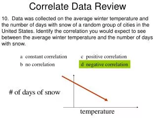
10. Data was collected on the average winter temperature and the number of days with snow of a random group of cities in the United States. Identify the correlation you would expect to see between the average winter temperature and the number of days with snow. Correlate Data Review
11. Choose the scatter plot that best represents the relationship between the number of students who passed the final exam and the number of students who failed the class. Explain your answer. Correlate Data Review
12. The scatter plot shows the relationship between the weekly total sales ($) and the number of different rug designs a rug store has. Based on this relationship, predict what the total sales will be when the store has 110 different rug designs. Correlate Data Review
13. Which situation best describes a positive correlation? Correlate Data Review
24. Graph a scatter plot using the given data. What kind of correlation does the graph show? Correlate Data Review