Download
1 / 1
20 likes | 194 Vues
This presentation offers essential guidelines for creating impactful posters in medical research. Key sections include the well-defined structure of a poster, such as title, authors, introduction, methods, results, and conclusions. It emphasizes readability with font size recommendations and layout tips, such as using dark text on light backgrounds and limiting text to concise bullet points. It addresses common mistakes to avoid, including overcrowding information and poor layout. This guide aims to enhance the clarity and effectiveness of visual communication in academic settings.

E N D
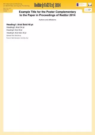
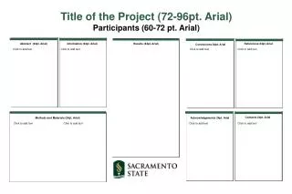
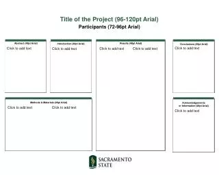
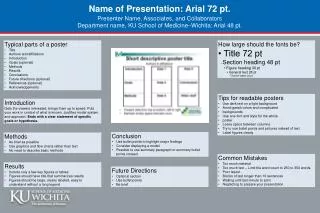
Name of Presentation: Arial 72 pt. Presenter Name, Associates, and Collaborators Department name, KU School of Medicine–Wichita: Arial 48 pt. • Typical parts of a poster • Title • Authors and affiliations • Introduction • Goals (optional) • Methods • Results • Conclusions • Future directions (optional) • References (optional) • Acknowledgements • How large should the fonts be? • • Title 72 pt • • Section heading 48 pt • • Figure heading 30 pt • • General text 28 pt • • Text for labels 20 pt • Tips for readable posters • Use dark text on a light background • Avoid garish colors and complicated • backgrounds • Use one font and style for the whole • poster • Leave space between columns • Try to use bullet points and pictures instead of text • Label figures clearly Introduction Gets the viewers interested, brings them up to speed. Puts your work in context of what is known. Justifies model system and approach. Ends with a clear statement of specific goals or hypothesis. • Conclusion • Use bullet points to highlight major findings • Consider displaying a model • Possible to use summary paragraph or summary bullet points instead • Methods • As brief as possible • Use graphics and flow charts rather than text • No need to describe basic methods • Common Mistakes • Too much material • Too much text – Limit the word count to 250 to 350 words. • Poor layout • Blocks of text longer than 10 sentences • Waiting until last minute to print • Neglecting to prepare your presentation • Results • Include only a few key figures or tables • Figures should have title that summarizes results • Figures should be large, clearly labeled, easy to understand without a long legend • Future Directions • Optional section • Use bullet points • Be brief