Creating and Modifying Comparative Graphs in Excel for Climate Data Analysis
This guide demonstrates how to create and modify comparative graphs in Excel for climate data analysis. Learn to add trendlines and alter your graphs by duplicating them for different time periods. The example covers two graphs: one representing temperature data from 1881 to 2011, and another focusing on data from 1950 to 2011. By modifying the formula bar, you can easily switch between different datasets and axes to analyze climate trends effectively. Ideal for anyone looking to visualize climate change data in Excel.

Creating and Modifying Comparative Graphs in Excel for Climate Data Analysis
E N D
Presentation Transcript
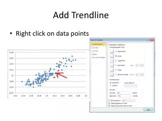
Add Trendline • Right click on data points
Modify your graph: Select your graph and copy then paste it so you have 2 identical graphs. Modify the formula bar to select different years. The top graph is 1881 to 2011 and the bottom graph is 1950 to 2011 (in this example 1950 data starts in row 228) By interchanging the Ps with Rs you can switch x and y axes. =SERIES(,Sheet1!$P$228:$P$289,Sheet1!$R$228:$R$289,1)
Modify your graph: Select your graph and copy then paste it so you have 2 identical graphs. Modify the formula bar to select different years. The top graph is 1881 to 2011 JJA temps vs DJF temps, and the bottom graph is 1881 to 2011 JJA temps vs year. =SERIES(,Sheet1!$A$159:$A$289,Sheet1!$R$159:$R$289,1)