Understanding Variable Relationships in Data Analysis
Learn how to analyze correlations between variables, interpret scatter plots, and calculate correlation coefficients for informed decision-making in data analysis.

Understanding Variable Relationships in Data Analysis
E N D
Presentation Transcript
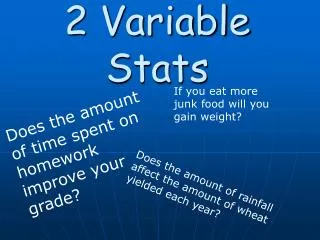
2 Variable Stats If you eat more junk food will you gain weight? Does the amount of time spent on homework improve your grade? Does the amount of rainfall affect the amount of wheat yielded each year?
By using a scatter plot we can view a visual pattern in the graph • This pattern can reveal the nature of the relationship between the two variables Weight Change after Exercise Weight (kg) Time ( months )
Variables • When Graphing this information you must determine which variable goes on which axis • One Variable is the dependent (or response) variable • The other is the independent (or explanatory) variable
Which Variable goes Where? y Dependent x Independent
Independent or Dependent Variable? For each relationship, sketch the axis and label the independent and dependent variables • The number of hours a student studies per course and his or her average mark in the course • The time of day and the number of cups of coffee sold • The amount of snowfall and the number of collisions on major highways
Correlation • Variables have a LINEAR CORRELATION if changes in one variable tend to be proportional to the changes in another variable • If your Y increases at a constant rate as X increases then you have a Perfect Positive (or direct) linear correlation
If the Y decreases at a constant rate as X increases then you have a Perfect Negative (or inverse) linear correlation
Strength of Correlation • The stronger the correlation the more closely the data points cluster around the line of best fit. • State the strength *strong, weak, moderate, moderately strong etc….* • State direction *positive or negative* • State type of correlation *Linear, Non-linear, exponential etc…*
Turn to page 160 in your textbook • Example 1 Classifying Linear Relationships
Correlation Coefficient • Karl Pearson (1857-1936) developed a formula to determine a value that would tell us the strength of a correlation. • Note he also developed the standard deviation
Correlation Covariance • First need to define what we call the covariance of two variables in a sample.
Correlation Coefficient • Denoted with an r • Is the covariance divided by the product of the standard deviations for X and Y
Gives a quantitative measure of the strength of a relationship • Basically shows how close the data points cluster around the line of best fit. • Also called the Pearson product-moment coefficient of correlation (PPMC) or Pearson’s r
Strength of Correlation • The closer the correlation coefficient (r ) is to 1 or -1 the stronger the correlation r = -1 r =+1
No relation has a correlation that is close to zero and the dots are scattered everywhere r = 0
The following diagram illustrates how the correlation coefficient corresponds to the strength of a linear correlation Negative Linear Correlation Positive Linear Correlation Perfect Perfect Strong Weak Moderate Moderate Weak Strong -1 -0.67 -0.33 0 0.33 0.67 1
SO LONG!!!!!!!! • There is a quicker way to calculate r, without having to find the standard deviations……but it looks more difficult
Example A Farmer wants to determine whether there is a relationship between the mean temperature during the growing season and the size of his wheat crop. He assembles the following data for the last six crops
a) Does the Scatter plot of this data indicate any linear correlation between the two variables Yield of Growing Season Yield (T/ha) 0 0.5 1 1.5 2 2.5 0 2 4 6 8 10 12 14 Mean Temperature (ºC)
c) What can the farmer conclude about the relationship between the mean temperatures during the growing season and the wheat yields on his farm
Homework Pg 168 #1-6