Design Tips for PowerPoint Projects
120 likes | 299 Vues
Design Tips for PowerPoint Projects. for Ms. Birtcher’s Classes. Purpose and Use for Slides. Allows you to use multiple channels for reinforcement Pictures are memory aids Enhances what you say – don’t read from slide only , use it as a prop. Backgrounds.

Design Tips for PowerPoint Projects
E N D
Presentation Transcript
Design Tips for PowerPoint Projects for Ms. Birtcher’s Classes
Purpose and Use for Slides • Allows you to use multiple channels for reinforcement • Pictures are memory aids • Enhances what you say – don’t read from slide only, use it as a prop
Backgrounds • Keep it simple – pick 1 style template to use for the whole presentation. • Graduated backgrounds are visually more interesting than solid bkgds. • Dark backgrounds with light text are easier to read in a darkened room.
Color • Blue and Green Backgrounds are easiest for the eyes to see. • White, yellow, orange lettering is good on those backgrounds. • Avoid combinations ofblueandblack-not enough contrast for the eyes. • Avoid red text– it is tiring on the eyes.
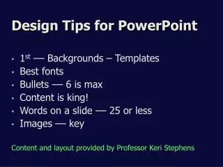
Content Text • Average 3-4 bullet points per slide • Average 6 words per bullet point • Keep slide to what viewers can absorb in 15 seconds. • Use graphics to add visual interest
Fonts • Limit presentation to 1-2 fonts • Stick with the standard fonts – no funky fonts • Sans-Serif fonts are easier to read (Comic Sans) (Here is another example) • This is an example of serif font (Times New Roman)
Option 1 Option 2 Examples for discussion
Option 1 Option 2 More Examples for Discussion
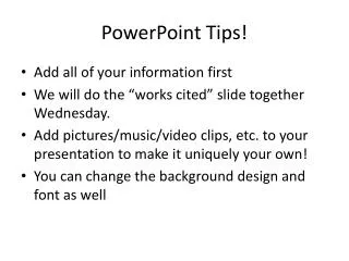
Finishing Touches • Be sure your name is on the first slide with your title • Add your bibliography as the last slide – MLA style.
Proofread • Ask someone else to read your slides with “fresh eyes”. • Use spell-check!!! (It’s under TOOLS)
Create Handoutto turn in to Ms. B • Print what: Handouts • Grayscale • Slides per page: 6
Bibliography • http://presentationzen.blogs.com/presentationzen/2005/09/whats_good_powe.html • http://www.shkaminski.com/Classes/Handouts/powerpoint.htm#C. • http://chris.pirillo.com/how-to-make-a-good-powerpoint-presentation/ • http://www.healthsci.utas.edu.au/trsu/pdf/powerpoint.pdf