Download
1 / 64
640 likes | 852 Vues
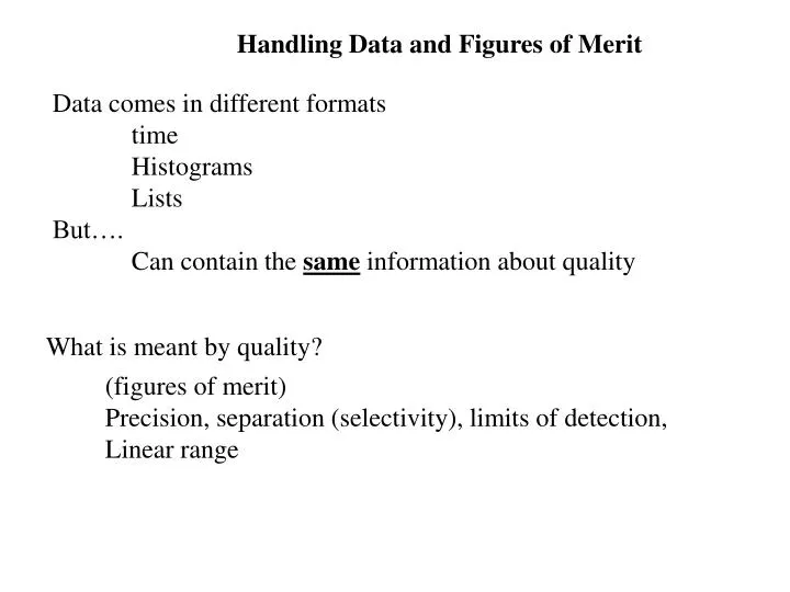
Handling Data and Figures of Merit. Data comes in different formats time Histograms Lists But…. Can contain the same information about quality. What is meant by quality?. (figures of merit) Precision, separation (selectivity), limits of detection, Linear range. My weight .

E N D
Handling Data and Figures of Merit Data comes in different formats time Histograms Lists But…. Can contain the same information about quality What is meant by quality? (figures of merit) Precision, separation (selectivity), limits of detection, Linear range
My weight Plot as a function of time data was acquired:
Comments: background is white (less ink); Font size is larger than Excel default (use 14 or 16) Do not use curved lines to connect data points – that assumes you know more about the relationship of the data than you really do
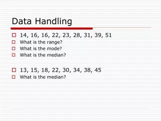
Bin refers to what groups of weight to cluster. Like A grade curve which lists number of students who got between 95 and 100 pts 95-100 would be a bin
Assume my weight is a single, random, set of similar data Make a frequency chart (histogram) of the data Create a “model” of my weight and determine average Weight and how consistent my weight is
average 143.11 Inflection pt s = 1.4 lbs s = standard deviation = measure of the consistency, or similarity, of weights
Characteristics of the Model Population (Random, Normal) Peak height, A Peak location (mean or average), m Peak width, W, at baseline Peak width at half height, W1/2 Standard deviation, s, estimates the variation in an infinite population, s Related concepts
Width is measured At inflection point = s W1/2 Triangulated peak: Base width is 2s < W < 4s
Pp = peak to peak – or – largest separation of measurements Area= 68.3% +/- 1s Area +/- 2s = 95.4% Area +/- 3s = 99.74 % Peak to peak is sometimes Easier to “see” on the data vs time plot
(Calculated s= 1.4) 144.9 Peak to peak 139.5 s~ pp/6 = (144.9-139.5)/6~0.9
There are some other important characteristics of a normal (random) population 1st derivative 2nd derivative Scale up the first derivative and second derivative to see better
Population, 0th derivative 2nd derivative Peak is at the inflection Of first derivative – should Be symmetrical for normal Population; goes to zero at Std. dev. 1st derivative, Peak is at the inflection Determines the std. dev.
Asymmetry can be determined from principle component analysis A. F. (≠Alanah Fitch) = asymmetric factor
Comparing TWO populations of measurements Is there a difference between my “baseline” weight and school weight? Can you “detect” a difference? Can you “quantitate” a difference?
Exact same information displayed differently, but now we divide The data into different measurement populations school baseline Model of the data as two normal populations
Standard deviation Of the school weight Standard deviation Of baseline weight Average school weight Average Baseline weight
We have two models to describe the population of measurements Of my weight. In one we assume that all measurements fall into a single population. In the second we assume that the measurements Have sampled two different populations. Which is the better model? How to we quantify “better”?
Compare how close The measured data Fits the model The red bars represent the difference Between the two population model and The data The purple lines represent The difference between The single population Model and the data Which model Has less summed differences? Did I gain weight?
Normally sum the square of the difference in order to account for Both positive and negative differences. This process (summing of the squares of the differences) Is essentially what occurs in an ANOVA Analysis of variance In the bad old days you had to work out all the sums of squares. In the good new days you can ask Excel program to do it for you.
Test: is F<Fcritical? If true = hypothesis true, single population if false = hypothesis false, can not be explained by a single population at the 5% certainty level
In an Analysis of Variance you test the hypothesis that the sample is • Best described as a single population. • Create the expected frequency (Gaussian from normal error curve) • Measure the deviation between the histogram point and the expected frequency • Square to remove signs • SS = sum squares • Compare to expected SS which scales with population size • If larger than expected then can not explain deviations assuming a single population
The square differences For an assumption of A single population Is larger than for The assumption of Two individual populations
There are other measurements which describe the two populations Resolution of two peaks Mean or average Baseline width
xa xb In this example Peaks are baseline resolved when R > 1
xa xb In this example Peaks are just baseline resolved when R = 1
xa xb In this example Peaks are not baseline resolved when R < 1
2008 Data What is the R for this data?
Visually better resolved Visually less resolved Anonymous 2009 student analysis of Needleman data
Visually better resolved Visually less resolved Anonymous 2009 student analysis of Needleman data
Other measures of the quality of separation of the Peaks • Limit of detection • Limit of quantification • Signal to noise (S/N)
X blank X limit of detection 99.74% Of the observations Of the blank will lie below the mean of the First detectable signal (LOD)
Other measures of the quality of separation of the Peaks • Limit of detection • Limit of quantification • Signal to noise (S/N)
Your book suggests 10 Limit of quantification requires absolute Certainty that no blank is part of the measurement
Other measures of the quality of separation of the Peaks • Limit of detection • Limit of quantification • Signal to noise (S/N) Signal = xsample - xblank Noise = N = standard deviation, s
(This assumes pp school ~ pp baseline) Estimate the S/N of this data
Can you “tell” where the switch between Red and white potatoes begins? What is the signal (length of white)? What is the background (length of red)? What is the S/N ?
Error curve Peak height grows with # of measurements. + - 1 s always has same proportion of total number of measurements However, the actual value of s decreases as population grows
Calibration Curve A calibration curve is based on a selected measurement as linear In response to the concentration of the analyte. Or… a prediction of measurement due to some change Can we predict my weight change if I had spent a longer time on Vacation?
5 days The calibration curve contains information about the sampling Of the population
This is just a trendline From “format” data Using the analysis Data pack Get an error Associated with The intercept