Download
1 / 31
370 likes | 1.65k Vues
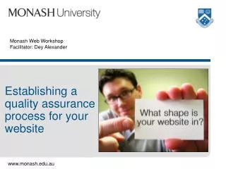
Dey Alexander Usability Specialist, Web Resources and Development (ITS) (If printing, print notes as well as slides) Introducing the Monash Web style guide and templates Overview Background: redesign of the Monash website New Monash brand Brand architecture drives web architecture

E N D
Dey AlexanderUsability Specialist, Web Resources and Development (ITS)(If printing, print notes as well as slides) Introducing the Monash Web style guide and templates
Overview Background: redesign of the Monash website New Monash brand Brand architecture drives web architecture Generic and customised templates Web style guide Obtaining templates Moving into the new design
Background • Project commenced in October 2001 • Project slowed in 2002 due to work on the Monash Identity Project (new brand) • Design went live in July 2003 • Marketing and Public Affairs was the client; Meredith Jackson was the project sponsor • Over 2000 members of the Monash community were involved in the project
Research phase User needs analysis Competitive analysis Business goals and objectives
Design (and evaluation) phase Visualdesign Content and IA review UI and navigation design
Implementation/post-implementation phase Monitor userand business feedback Manage design rollout Summative usability testing
Project documentation • http://its.monash.edu.au/web/project/user-centred/ • Conference papers • Redesign of the Monash University website: a case study in user-centred design methodshttp://ausweb.scu.edu.au/aw03/papers/alexander/ • Testing web page design concepts for usabilityhttp://ausweb.scu.edu.au/aw03/papers/alexander4/
Creation of a new Monash brand • One expression of the brand • A single logo • The “Monash blue” • Not a good representation of Monash (research from brand identity project) • Also seen as too inflexible(confirmed by research in web project)
New approach offers more flexibility Masterbrand Faculty (discipline group) brands(includes a faculty colour) Sub-brands
Creation of a brand architecture for Monash • MAPA working on rebranding project from early 2003 • The web redesign and branding projects came together very late • Significant structural design work already done for web • Visual design had also been done • Brand architecture had to be accommodated – it suggested a multi-site structure
Why was a multi-site approach warranted? • Layout of web pages creates a “visual hierarchy” • Visual hierarchy communicates, gives meaning to page content
Adobe products page Adobe logo – what does its location imply? “Products” – what do size and location imply? “Print and web” – what does the size and location of this imply? What about the items nested beneath it?
More complexity than the old approach • From one site “Monash University” • To 11 + sites • One masterbrand site “Monash University” • 10 faculty sites, e.g. “Monash University Arts” • Several sub-brand sites, e.g. “Monash College”
Planning for the rollout • Three working groups • Faculty, divisional, style guide • Worked from September to November • Discussed how to implement the brand architecture on the web • Oversaw production of the web style guide and templates
The new web templates • Three main brand styles • Differences are in the logo and colours used • Masterbrand style • Faculty style (each faculty has own style) • Sub-brand style (each sub-brand has own logo, but uses same colour scheme)
The three primary brand styles Masterbrand – same logo, colour, global navigation Faculties – 10 logos, 10 colours, 10 sets of global navigation Sub-brands – unique logos, unique global navigation, shared colour
Added flexibility has caused confusion • Still a notion of a website (just more of them) • A website must still act like a website • Use same logo • Use same colours • Use same global navigation
Example: Faculty of Medicine • All “sub-sites” (e.g. schools, topical sections) within Medicine must: • Use same logo • Use same colours • Use same global navigation
Customisation of generic templates • Webmasters need to customise templates for use on their site • Customise header (logo, navigation, banner images) • Customise footer (appropriate email address) • Design site structure and key navigation systems • Global navigation, home page navigation, section navigation, etc. • Apply relevant stylesheet
Monash websites must follow guidelines • Now have 11+ websites, but they’re all still Monash websites • Important to present a consistent approach for users • Without a consistent navigation system, users will not find information
Revisions to templates • Templates will be refined over time • We are maintaining an issues list • Email us (webmaster@monash.edu.au) with customisation issues
Web style guide • Developed on behalf of MAPA • Aims to • Help web teams/authors meet branding and other guidelines • Ensure consistent approach to the design of Monash websites • Improve quality of Monash websites • Will also be updated over time
Contents of the web style guide • Branding and visual design • Templates • Usability • Accessibility • Technical standards • Quality and legal issues • See: http://www.monash.edu.au/staff/web/
Moving into the new design • Determine your place in the brand architecture (contact MAPA if unsure) • Prepare, prepare, prepare! • Review your website structure • Review your content (resource-intensive) • Familiarise yourself with the web style guide • Obtain relevant templates • No rigid timeline set for migration
Obtaining templates • Contact your faculty or divisional web manager • ITS can customise for some organisational units