Download
1 / 10
100 likes | 217 Vues
Are we wasting. $250 million per day . due to bad PowerPoint presentations?. When Good PowerPoint Presentations Go Bad. How the Presentation Can Ruin the Point. Slide Structure.

E N D
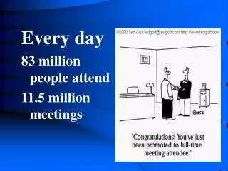
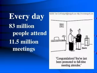
Are we wasting $250 million per day due to bad PowerPoint presentations?
When Good PowerPoint Presentations Go Bad How the Presentation Can Ruin the Point
Slide Structure • This page contains too many words for a presentation slide. It is not written in point form, making it difficult both for your audience to read and for you to present each point. In short, your audience will spend too much time trying to read this paragraph instead of listening to you.
Slide Structure • Do not use distracting animation • Do not go overboard with the animation • Be consistent with the animation that you use
Fonts • If you use a small font, your audience won’t be able to read what you have written • CAPITALIZE ONLY WHEN NECESSARY. IT IS DIFFICULT TO READ • Don’t use a complicated font
Color • Using a font color that does not contrast with the background color is hard to read • Using color for decoration is distracting and annoying. • Using a different color for each point is unnecessary • Using a different color for secondary points is also unnecessary • Trying tobe creativecan alsobe bad
Background • Avoid backgrounds that are distracting or difficult to read from • Always be consistent with the background that you use
Tables • Any idea what point I’m trying to make with this table? • Too many numbers can be distracting – especially with the use of decimals
Graphics • Be consistent – use the same style of graphics
Spelingand and Grammar • Proof your slides for: • speling mistakes • the use of of repeated words • grammatical errors you might have make