Download
1 / 27

E N D
• Within the first 10 seconds, your potential client is building up a lasting opinion about you. It sounds harsh, but it’s a fact that people often do judge a book by its cover, and you only get one shot to make a great first impression. Fortunately there are a few tricks you can pull off to diverting their attention from any shortcomings you may have by pushing a unique and beautifully designed business card under their nose. First Impressions
• Never leave home without them • Use proper business card etiquette – Whenever you give a business card, ask for a business card. When given a business card, don’t just take it and place it in your pocket. Make the person feel important by looking at their card for a few seconds • Do consistent follow up. Tips
• What are the other investors have on their business cards (or even their websites)? What do you like? What do you not like? • Keep in mind your niche. Who is your customer? Put on your card what you want people to know about what you can do for them. What problems do you solve? • Do you want to offer a $500 to $1000 referral fee? People will be more likely to keep and pass on your card if you are offering to pay them a referral fee for referrals Questions to Ask Yourself
Just knowing someone could earn you $1000!!!* Do you know ANYONE that has a home they are trying to sell?* Do you know ANYONE behind in payments?*Do you know ANYONE about to foreclose?*Do you know ANYONE that has inherited property they need to sell quickly?*Do you know ANYONE who is tired of being a landlord?*Is there an eyesore property in your neighbourhood that looks to be neglected? *Do you know ANYONE who invests in properties? *Do you know ANYONE who has CASH to invest? I PAY A $1000 FINDERS FEE FOR REFERRALS THAT: • Buys a property from me 2. Is a home I end up buying 3. Sell a property to me 4. Does a home auction with me FREE $$$ FOR YOUR REFERRALS!!!
• What is the turn-around time once the order is placed? • Can you e-mail me a proof before printing? (This is a must!) • How much do you charge to create a personalized business card design? • Is there a printing set up fee? If so how much? • Is there a shipping fee? If so how much? Questions to Ask the Printer
1. Colour and Images • Do use colour for interest and emphasis. It can be in your logo or other images, in text or in background elements. Stay with a maximum of 3-4 colours. Pull colours from your logo for other background elements and type colours. • Do match colour tones. If you have bright colours in your image or logo, use black or other bright colours that work with it. If your colours are muted, earthy or pastel, stick to that scheme with the other colours. • Do include a photo if it's a great picture of you and it's appropriate. Photos are most useful in service type businesses where an ongoing relationship is a critical factor. Do’s and Don’t Do’s
• Don't use clip art for your logo or other elements. You're brand is your identity and these days you can easily find affordable images or get help with a custom logo online. Remember you want your business card to stand out in a memorable and positive way. • Don't veer from other branded materials. Keep your business card design consistent with the general color and design scheme on your website, in your store, and other marketing materials.
2. Type • Do pay attention to alignment. Left align for easiest reading. Too much centered text can look cluttered and is hard to read. • Do limit your business card to one or two font types. • Don't use decorative or unusual fonts for your name and contact info, unless it's right for your business image. Use easy-to-read but not too generic fonts (such as Courier). • Don't mix it up with different font sizes or text that is too small to read and print clearly. • Don't use light colors that are difficult to read or have an excessively dark image in the background that obscures your text.
3. Low Quality Images and Graphics • Nothing ruins a business card design more than blurry or pixelated images. You wouldn’t put one on your website, so why make an exception for your business card. Remember that just because something looks good on your screen, doesn’t mean it will print fine. • A good guide if you are using photographs is to make sure that they are at least 300dpi. Also, if you are using a logo ensure that it is vector based. Vector files will easily scale up (or down) without any loss of quality.
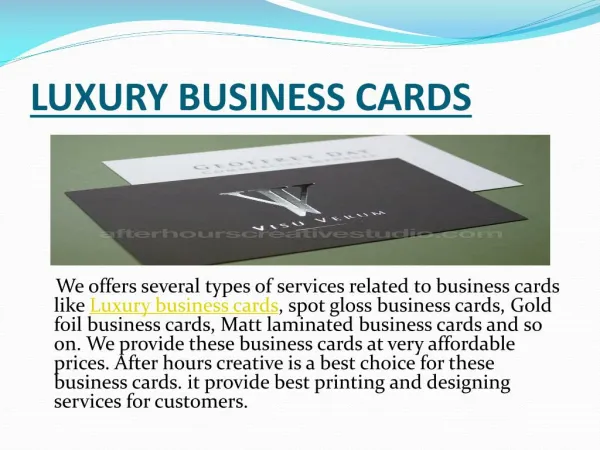
4. Cheap Quality Card • Think about what your card “says” as you hand it over. Is it strong, sturdy and solid or is it weak and flimsy like a limp handshake? Nearly all online printers offer free sample packs these days, so request one and try them out! Do’s and Don’t Do’s Cont’d
5. Don’t use plain white designs (people write on them) • Be cautious when designing a mostly white or plain business card, and don’t be too offended if it is used as a piece of scrap paper for scribbling notes or other people’s phone numbers. If you want your card to be all about you, make sure it’s a quality piece of engineering, and not another sticky note.
6. Be Careful Using Your Own Picture! • Lastly, be careful using your own picture on your business card. It can be cheesy and dated, but it can also be rather brilliant. One easy way to determine if adding a photo is a good idea is by taking a look at your card and asking yourself “what do I think about this person?” or “would I keep this?”.
1. Cram too much information into your card. • Want to cram everything anyone might ever want to know about your business onto that tiny rectangle of paper? Use a small font size so you add more text and cover as much of the surface of the card as you can. Who cares about making it easy to read? Your business card should contain everything, even if you have to provide a map to find your phone number on it. • That is why you direct them to your WEBSITE! 10 Common Mistakes
2. Hide the important information. • Make your logo so small only you know what it actually looks like. Make sure your name and the company name are too small to be read without a magnifying glass. After all, anyone you give your card to knows that already. But put your fax number and physical address in large font. After all, everyone visits or faxes: no one’s going to email you, are they?
3. Don’t bother grouping related information together. • Have your name in one corner and your job title in the other. The company name in the middle, the address in the third corner and the phone number on the fourth. Your email address? On the back of the card, with the text informing me that it’s made of recycled paper.
4. Use similar colors for the text and the background. • Contrast? What’s that? You like blue, so use a bright blue background and dark blue text, except for your name, which can be in light blue. Try reading that you pesky prospect!
5. Crowd the edge of the card. • Margins are for suckers: your business card will have text right to the edge. 6. Use as many fonts as you can. • What are all those fonts on the computer for, anyway? Show the world how creative you are! 7. Never use the back of the card. • No, don’t even consider it. That’s the sign of the devil, or something, having a Twitter handle on the back of the card. Like I said in step one, you want to cram everything to the front.
8. Don’t include all your contact information. • Yeah, you have a blog and a Facebook page, but why would you put that on your business card? It’s not like you want people to find them!
9. Ignore your company colors. • Your company logo is in green and orange? So what, if your favourite color is purple go ahead and use that for all the text. Who’s the graphic designer to tell you it’s clashing? It’s your card, isn’t it? 10. Be bland. • Your business card reflects your personality and your business, so your boring black-on-white card makes you look just as boring as you are. What’s wrong with that? Better yet, take your sister-in-law’s card design and just swap in your contact details. Why should your business card be original anyway? Your cupcakes store can totally have the same card as her accounting business.
• You are a real estate investor, not a realtor • Make sure your card doesn’t look like one Specific to Real Estate
If you would like to send in your business card to us we can give you our perspective on it. Questions@ftstudents.com Critique
www.vistaprint.com www.teleroseprintng.com www.istockphoto.com Links