Download
1 / 15
150 likes | 339 Vues
Analysis of the Rainfall of Tropical Storm Allison. Creating an Excel Model. Applying the Model to Allison.

E N D
Analysis of the Rainfall of Tropical Storm Allison Creating an Excel Model
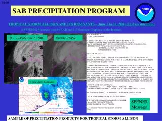
Applying the Model to Allison • Now we are ready to use our knowledge of functions and computational modeling to help us understand the flooding which took place in Harris County, June 5-9, 2001 during Tropical Storm Allison. • To use the model , we will be working with information from the website Tropical Storm Allison Recovery Project - TSARP Tropical Storm Allison Recovery Project
Allison Rainfall Assignment • Go to the website Tropical Storm Allison Recovery Project – TSARP and select Watershed from the left column. • Select 2 watersheds to study, other than the Buffalo Bayou Watershed which will be our example. • Create an Excel spreadsheet for each watershed that you select using the data obtained from the bar chart of the rainfall amounts. • Follow the format of the example which follows on the next slide.
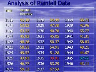
Sample Spreadsheet • Remember, a fast way to get your averages is to • Highlight the 3 rainfall amounts you want to average • Go to Insert, then Function • Average should be highlighted, so click ok. • 4. Then be certain that the correct cells to be averaged are displayed in the Function Arguments Box.. Then click ok.
Graphing the Function • Now highlight the cells that give the average of the three measuring stations in the watershed over the 3 time periods of 1, 12, and 120 hours. (On the example it would be highlighting the 6 Average Rainfall cells). Be careful to highlight the time first and then the rainfall amounts. Excel makes the first column highlighted the independent variable. Since the amount of rainfall depends on how long it rained, time must be selected first to have an accurate graph.
Graphing the Function Continued • Then go to Insert, Chart, and Chart Wizard appears. Under the tab, Standard Types, select XY (Scatter), and then click on Next. • You should see that the time (duration of rainfall) is the independent variable (x-axis) with a scale of 0-140 hours. • The dependent variable (y-axis) is the average amount of rainfall for the watershed and in the sample the scale is 0-18 inches. • Click Next and you should be at Chart Options.
Graphing the Function Continued • At Chart Options under the tab: • Titles: Title the graph and label each axis • Axis: Both value (x) axis and value (Y) axis should be checked. • Gridlines: Add major and/or minor gridlines for each axis, depending on what is needed to be able to determine the values on the graph. • Legends : Remove check mark • Data Labels: Check X Value and Y Value, this will give the coordinates of your points. • Click Next and then Finish. This will place the graph on your spreadsheet. • Note: If the scale on the x-axis has changed during this process, you can change it back by resizing the graph to make it longer.
Writing a Regression Equation • We want to determine whether the relationship between the duration time and the rainfall amount is a function. • To determine this, we are going to use our scatterplot. • Select the graph, go to Chart, then Add Trendline. • Click on the graph which best fits your scatterplot, then click on the Options tab. • Select automatic, display equation on chart, and display R-squared value on chart and click OK. • Your graph should look similar to the one on the next slide. • The R-Squared value helps determine the accuracy of the regression equation. The closer the R-squared value is to 1, the better the equation fits the data. • Add a Word Art to the graph which identifies the function.
Sample Scatterplot, Trendline, and Regression Equation A Logarithmic Function
Summary of the Results • The relationship between the duration of the rainfall and the average amount of rainfall which Buffalo Bayou Watershed experienced is a logarithmic function, • The independent variable is the duration of the rainfall and the dependent variable is the amount of rainfall. • The parent logarithmic function translated up 2.8886 and horizontally stretched by a factor of 2.6815. • The domain of the graph is all real numbers greater than or equal to 1. • The range of the graph is all real numbers greater than or equal to 2.83.
Summary of Results Continued • The regression equation is an accurate model of this data because R2 = .9998. ( The R2 is a statistical indicator. The closer the value is to 1.0000, the more accurate the equation.) • This knowledge allows us to calculate the amount of rainfall at any time during the storm, by merely substituting in the desired time for the independent variable in the regression equation.
Rainfall Assignment Continued • You should now complete the assignment (begun on slide #4) of studying the rainfall amounts of 2 different watersheds in Harris County during Allison. • Each watershed study must include all of the following list. It must then be copied and pasted into a Word document and turned in or emailed to your teacher. • 1. A spreadsheet, like slide # 5
Rainfall Assignment Continued • 2. A scatterplot graph, like slide #10 with • a. A trendline • b. A regression equation • c. An R-squared value (should be between .9 and 1 to be an accurate model of the data) • d. The function identified, if there is a functional relationship
Rainfall Assignment Continued • 3. A brief summary of the results (see slide #11 for the points to include in the summary) • a. Describe the function. • b. Identify the type of function. • c. Write it in functional notation. • d. Describe the transformations of the parent function. • e. Give the domain and range of the graph. • f. Evaluate the accuracy of the regression equation. • g. Apply the results to the situation.