Download
1 / 7
70 likes | 229 Vues
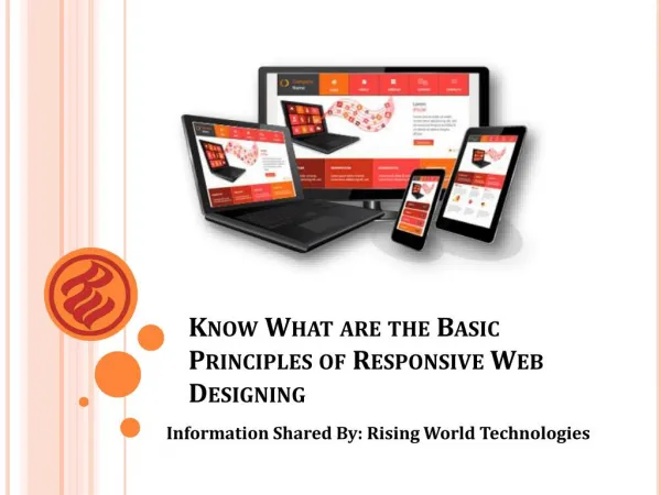
The Technique of responsive web design uses CSS3 media queries, fluid proportion-based grids and flexible images to increase user’s experience.

E N D
MEANING • WHAT IT USES • WHY IS IT GAINING POPULAR • ABOUT SLIDE-MAKER
Responsive web design enhances users’ experience by minimizing scrolling and panning with the help of CSS3 media queries and fluid proportion-based grids
Meaning • Responsive web design is the popular technique of making websites that offer optimal viewing experience. • Focus is on easy reading and navigation that requires minimum panning and scrolling.
What it Uses A responsive website uses; • CSS3 media queries • Fluid proportion-based grids • Flexible images
Way Is It Gaining Popular • It makes a website fit to be used on different platforms like tablets, desktops and mobiles. • No need to make separate websites.
About Slide Maker • FATbit Technologies is best website Design Company . • It is active in the designing and development field since 2004. FATbit focuses on intensive research and affordable packages.