Download
1 / 12
120 likes | 292 Vues
Just to help new fresher to this industry, we have curated few articles written by experts around the globe from this web design world.

E N D
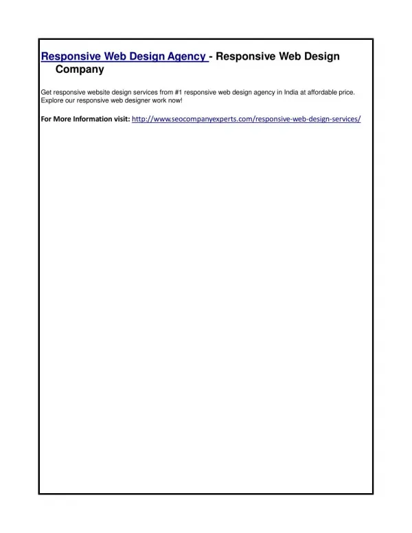
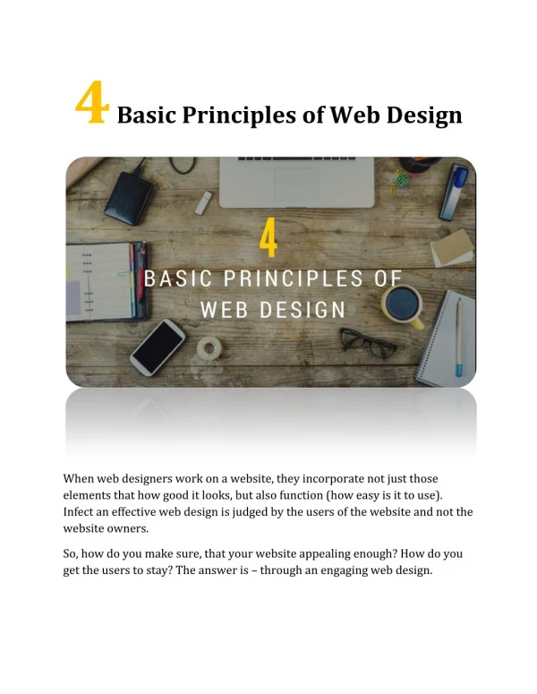
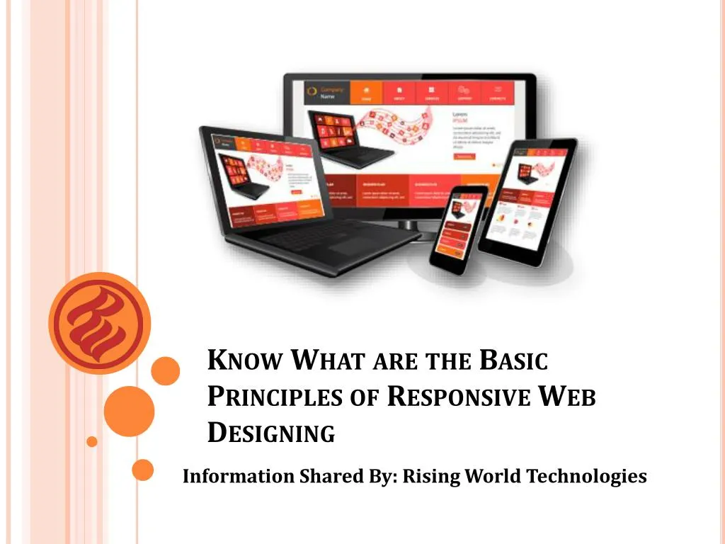
Know What are the Basic Principles of Responsive Web Designing Information Shared By: Rising World Technologies
Now it’s time to pull up your socks. It’s around a month since Google announced its new algorithmic update to give a boost to responsive or mobile friendly websites in searches. It was excellent news for the pioneers of responsive web design industry.
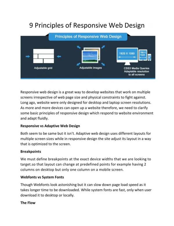
Responsive Website Design is a great remedy to our multi-screen issue, but getting into it from the creator point of view is challenging. No set webpage dimensions, no millimeters, no actual limitations to struggle against. To design a website in pixels for desktop & mobile is the past now. Therefore, let's make clear some fundamental principles of responsive web style.
Here are some basic principles about Responsive Web Designing
Adaptive vs Responsive web design It might appear the similar but it isn't really. Both techniques complement each other, so there is no perfect or inappropriate way to do it. Let the content pick.
Flow As display dimensions become smaller sized, content begins to take up more vertical area and whatever below will be pushed down, it's called flow. That might be confusing to understand if you are used to design and style with pixels, but can make complete sense when you get used to it.
Relative units The screen can be of a desktop, mobile or any other device. Pixel density can also differ, so units are required that are adaptable and work in all places. That's where relative units like percents become useful. So creating something 50% width means it will always take half of the display screen.
Vectors vs Bitmap images Does your image have lots of details and some pretty effects applied? Then it is suggested to use a bitmap image. If you are not using any effect, then think about using a vector picture. For bitmap image use format JPG, png or a GIF, for vectors the ideal selection would be an SVG or font icon.
Breakpoints Breakpoints enable the design to modify at defined points, i.e. having 3 columns on a desktop computer, but only 1 column on a mobile phone device. Most CSS attributes can be modified from one breakpoint to the other. Generally, where you place one relies upon on the content. If a phrase breaks, you might require adding a breakpoint. But use them with care. It might go messy for you.
System fonts vs Web fonts Although web fonts will appears great. Keep in mind that every font will be downloaded and the more you’ll have, the more time it will take to load. System fonts are fast, except when the user doesn’t have it locally, it will fall back to a standard font.
Find this Presentation Interesting? To Learn More Visit: www.risingworldtechnologies.com/blog Or https://www.facebook.com/RisingWorldTechnologies