Download
1 / 12
120 likes | 290 Vues
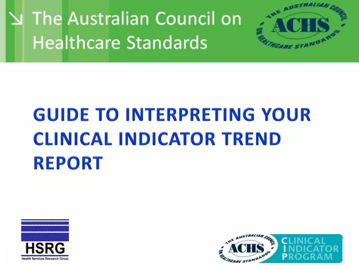
Guide to Interpreting your Clinical Indicator Trend Report. Guide to Interpreting your Clinical Indicator Trend Report . This presentation provides some guidance on how to interpret the tables and graphs provided in your Clinical Indicator Trend Report.

E N D
Guide to Interpreting your Clinical Indicator Trend Report This presentation provides some guidance on how to interpret the tables and graphs provided in your Clinical Indicator Trend Report. Most indicators have a desirable outcome that is specified as being either high (H) or low (L). The remainder are unspecified (N). Indicators are allocated a Not Specified (N) level where the impact of this measure on clinical outcomes remains unknown. For example: • 5.1 Pain intensity scores recorded for surgical patients with LOS ≥1 day(H) • 3.5 Unplanned stay in recovery room >2 hours for medical reasons(L) • 3.1 Malignancies diagnosed at colonoscopy(N)
Guide to Interpreting your Clinical Indicator Trend Report The following symbols are used to flag unusually high or low rate results and to flag trends in rates. A rate is considered unusual when the cumulative excess is more than 5 standard deviations from the expected cumulative excess, that is, from zero.
Guide to Interpreting your Clinical Indicator Trend Report - example H means the desirable rate is high and this organisation’s rate is significantly higher (better) than the average rate H means the desirable rate is low and this organisation’s rate is significantly higher (poorer) than the average rate Lmeans the desirable rate is high and this organisation’s rate is significantly lower (poorer) than the average rate Means an improving trend Means a deteriorating trend Arrows (, , , , , ) indicate a statistically significant trend The absence of a trend arrow means that the change over time (as indicated by a line of best fit) does not reach statistical significance.
Guide to Interpreting your Clinical Indicator Trend Report Symbol if the trend is statistically significant Total number of submissions from 2009 to 2012 Number of submissions that were in the best or poorest 20% of rates submitted for this indicator
Guide to Interpreting your Clinical Indicator Trend Report - example Your organisation’s rate Excess is the number of events in excess of expected. (The number that would not have occurred if the HCO had the average rate). Cumulative excess is the excess over successive periods. Adding the data reveals underlying differences that may not be apparent in a single data submission. Average rate 20th centile rate - 20% of HCOs lie below this rate 80th centile rate -- 20% of HCOs lie above this rate
Guide to Interpreting your Clinical Indicator Trend Report - example Data plotted in a graph Where there were four or more submissions the data are plotted in a graph. The fitted line is based on a logistic model, so it may be curved. It is possible that in the earlier years of reporting when our data cleaning process was not as effective as now, some aberrant data points may be apparent in the plot.
Guide to Interpreting your Clinical Indicator Trend Report – Q&As Refer to Clinical Indicator 1.4 (ED ATS Category 1.4) above Question. What do the symbols Land mean? (in combination) Answer. It means that for this indicator, this organisation’s rate is significantly poorer thanthe average but it has been improving over time. 8
Guide to Interpreting your Clinical Indicator Trend Report – Q&As The desirable rate for this indicator is Low. This organisation’s rate is significantly poorer than the average and it is improving. Q. What do the overall, 20th and 80th values imply? A. The overall is relatively constant however there is a large degree of variation among HCOs highlighted by the gap between the 20th and 80thcentiles
Guide to Interpreting your Clinical Indicator Trend Report – Q&As Text from this organisation’s report : There were 11 data submissions between 2007 and 2012. The rate was in the higher 20% of rates in 5 of the submissions. There was a deterioration in the fitted rate from 0.41 in 2007 to 4.2 in 2012, an increase of 3.8 per 100 admissions.
Guide to Interpreting your Clinical Indicator Trend Report – Q&As Q. Please comment on the trend A. This organisation’s rate was initially high and had suddenly and dramatically deteriorated since 2009. Consider what has happened in the last four years to cause a deterioration in performance. The figures and data collection processes should be reviewed to ascertain the causes.
Guide to Interpreting your Clinical Indicator Trend Report – Q&As Q. What do these figures tell you? A. This organisation has scored a perfect 100% rate for each data submission. It is unlikely that this is the case in reality and data collection processes should be reviewed.