Download
1 / 28
290 likes | 396 Vues
1. Frequency Distributions & Graphing. Nomenclature. Frequency : number of cases or subjects or occurrences represented with f i.e. f = 12 for a score of 25 12 occurrences of 25 in the sample. 1. Nomenclature. Percentage : number of cases or subjects or occurrences expressed per 100

E N D
1 Frequency Distributions & Graphing
Nomenclature • Frequency: number of cases or subjects or occurrences • represented with f • i.e. f = 12 for a score of 25 • 12 occurrences of 25 in the sample 1
Nomenclature • Percentage: number of cases or subjects or occurrences expressed per 100 • represented with P or % • So, if f = 12 for a score of 25 when n = 25, then... • % = 12/25*100 = 48% 1
Caveat (Warning) • Should report the f when presenting percentages • i.e. 80% of the elementary students came from a family with an income < $25,000 • different interpretation if n = 5 compared to n = 100 • report in literature as • f = 4 (80%) OR • 80% (f = 4) OR 80% (n = 4) 1
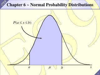
Frequency Distribution of Test Scores 2 3 4 • 40 items on exam • Most students >34 • skewed (more scores at one end of the scale) • Cumulative Percentage: how many subjects in and below a given score 1
Eyeball check of data: intro to graphing with SPSS 1 • Stem and Leaf Plot: quick viewing of data distribution • Boxplot: visual representation of many of the descriptive statistics discussed last week • Bar Chart: frequency of all cases • Histogram: malleable bar chart • Scatterplot: displays all cases based on two values of interest (X & Y) • Note: compare to our previous discussion of distributions (normal, positively skewed, etc…) 2
Stem and Leaf(SPSS: Explore command) 1 • Fast look at shape of distribution • shows f numerically & graphically • stem is value, leaf is f Frequency Stem & Leaf 2.00 Extremes (=<25.0) 2.00 28 . 00 2.00 29 . 00 1.00 30 . 0 1.00 31 . 0 3.00 32 . 000 1.00 33 . 0 6.00 34 . 000000 3.00 35 . 000 4.00 36 . 0000 8.00 37 . 00000000 Stem width: 1 Each leaf: 1 case 2 3 4
Stem and Leaf Plots • Another way of doing a stemplot • Babe Ruth’s home runs in each of 14 seasons with the NY Yankees • 54, 59, 35, 41, 46, 25, 47, 60, 54, 46, 49, 46, 41, 34, 22 1 2 2 25 3 45 4 1166679 5 449 6 0 3
Stem and Leaf Plots • Back-to-back stem plots allow you to visualize two data sets at the same time • Babe Ruth vs. Roger Maris MarisRuth 0 1 2 25 3 45 4 1166679 5 449 6 0 8 643 863 93 1 1
Boxplots 1 Maximum Q3 Median Q1 Minimum Note: we can also do side-by-side boxplots for a visual comparison of data sets
Format of Bar Chart Y axis (ordinate) 1 f X axis (abcissa) Individual scores/categories
Test score data as Bar Chart Note only scores with non-zero frequencies are included. 1
Bar chart in PASW • Using the height file on the web 2 1 3
Bar chart in SPSS • Gives… 1 2
Bar chart in PASW • Note you can use the same command for pie charts and histograms (next) 1
Format of Histogram Now the X-axis is groups of scores, rather than individual scores – gives a better idea of the distribution underlying the data. Y axis (ordinate) f 1 X axis (abcissa) Can be manipulated Groups of scores/categories
Test score data as revised Histogram 1 With an altered number of groups, you might get a better idea of the distribution
Scatterplot 1 2 3 • Quick way to visualize the data & see trends, patterns, etc… • This plot visually shows the relationship between undergrad GPA and GRE scores for applicants to our program 4
Scatterplot 1 • Here’s the relationship between undergrad GPA (admitgpa) and GPA in our program
Scatterplot 1 • Finally, here’s the relationship between GRE scores and GPA in our program
Scatterplot in PASW 1 • Use graphs_scatter/Dot
Scatterplot in PASW • Choose “simple scatter” 1
Scatterplot in PASW • Choose the variables (here I’ve used a 3rd variable too – you’ll see why in a moment) 1
Scatterplot in PASW 1 As you can see, there are rather different values for males and females
Bottom line • First step should always be to plot the data and eyeball it...following is an example of what can happen when you do. 1
One use of Frequency Distribution & Skewness 1 Expected distribution of agent-paid claims (State Farm) high low $$ amount
One use of Frequency Distribution & Skewness 3 f Observed distribution of an agent-paid claims (hmmm…) 2 1 high low $$ amount