Download
1 / 50
500 likes | 503 Vues
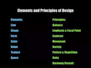
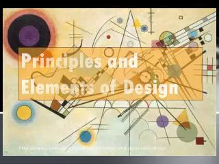
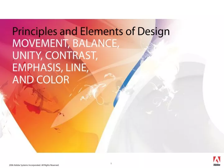
Principles and Elements of Design MOVEMENT, BALANCE, UNITY, CONTRAST, EMPHASIS, LINE, AND COLOR. Graphic design elements are the building blocks of graphics. Line Color Shape Texture. Graphic design elements. Lines. Lines can be straight or curved.

E N D
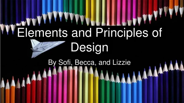
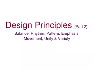
Principles and Elements of DesignMOVEMENT, BALANCE, UNITY, CONTRAST, EMPHASIS, LINE, AND COLOR
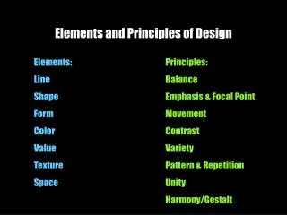
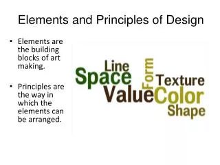
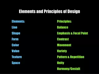
Graphic design elementsare the building blocks of graphics. Line Color Shape Texture Graphic design elements
Lines • Lines can be straight or curved. • How are lines used in the composition on this slide?
Hue is another word for color. Chroma is the intensity or purity of color. Tint is a color mixed with white. Tone is a color mixed with gray. Shade is a color mixed with black. Color definitions
Color and contrast • Using color can enhance or detract from a composition.www.lighthouse.org/color_contrast.htm • Color wheels help determine which colors are in greatest contrast. Use Kuler from Adobe Labs to try out new color schemes: http://kuler.adobe.com/
Color wheels • Analogous colors are a palette of compatible color combinations that blend well together. They are neighbors on the color wheel. They tend to live harmoniously because they are relatives to each other. • Complementary colors are opposite each other on the color wheel. They contrast, enhance and intensify each other. Therefore, complementary colors need to be used with caution.
Use color to label or show hierarchy. Use color to represent or imitate reality. Use color to unify, separate, or emphasize. Use color to decorate. Use color consistently. Color in design
Shapes • Shapes are enclosed objects that can be created by line or created by color and value changes that define their edges.
Texture • Texture is the surface look of an object created by varying dark and light areas. • Roughness • Smoothness • Depth
Credit where credit is due … • Robin Williams • Susan Hilligoss and Tharon Howard
Four concepts • Contrast • Repetition • Alignment • Proximity
“The use of opposing elements, such as colors, forms, or lines, in proximity to produce an intensified effect in a work of art“ Contrast “The difference in brightness between the light and dark areas of a picture, such as a photograph or video image”
Key idea: “Repeat some aspect of the design throughout the entire piece.” Repetition
Repetition • When you get to the end of the information, does your eye just wander off the card? Here we go with the band again. Not a bad card, right? But note the question here: Now look at the change ...
Repetition • Repeated bold type encourages reader to “bounce” between the two dominant typefaces Boldfacing that number, so it pairs with the headline, really makes it jump, and it hold your eye on the information.
Key idea: “Nothing should be placed on the page arbitrarily. Every item should have a visual connection with something else on the page.” Alignment
Alignment • No element has any connection to the others. • Elements aligned
Alignment Here’s a pretty standard layout, centered.
Alignment But look how much crisper it looks with alignment, plus some thought about proximity.
Alignment • Trapped white space pushes elements apart Does the text go with the cartoon, or are they independent chunks of information? The ragged right type seems to separate the elements.
Alignment • “Find a strong line and use it.” Flush right type makes use of image’s border. Change the alignment, and it becomes obvious that they go together. Note the strong lines Robin Williams uses in this example to get alignment. Flush right type, strong vertical line on the cartoon.
“Proximity, or closeness, implies a relationship.” Proximity Key idea: “Group related items together”
Proximity Problem: Reader’s eye must bounce all around card to obtain information
Proximity Solution: Group together related elements
Proximity Problems: • The two items in top left are in close proximity but not related • Gaps separate related items
Proximity Solution: • Regroup information • Change to caps/lowercase • Use squared edges • Let image break out of box
Proximity Problem: • Everything is close to everything else
Proximity Solution: • Contents are grouped • Contrast is added with headlines/rules
This slide shows the kind of design you see all the time from do-it-yourself Yellow Page customers. How in the world do you start accessing this information? It is daunting! Contrast • Problem: • What is the focus? • Border? Eagles? Type?
Contrast, Repetition, Alignment, and Proximity • Solution: • Contrast • Alignment • Repetition • Proximity Here is the same ad with all four principles being applied. How are they being used here?
Graphic design principlesare ways in which elements are used together. Movement Balance Emphasis Unity Graphic design principles
Movementis the use of lines, color, and repetition to create the illusion of motion. Curved forms or lines Repetition of geometric forms Fuzzy lines or outlines Movement
Lines • Lines can indicate motion or direction. • How are lines used in the composition on this slide?
Balanceis the act of comparing or estimating two things, one against the other, and the contrast between: Empty space (white space) and filled space Text and images Color and no colors and different colors Textures against flat colors Balance
There are three different types of balance when using color, shape, and position: Symmetry Asymmetry Radial symmetry Balance in composition
You can usually identify at least one of three lines of symmetry. Horizontal Vertical Diagonal Symmetrical or formal balance
Unity • Unity: The correct balance of composition or color that produces a harmonious effect. • What is the focus of the message?
Emphasis • Emphasis: To express with particular stress or force. • What message is stressed here?
How do you see it? Good Aspects: ~ Use of borders and shading ~ Headlines stand out ~ Format is balanced What could be Improved: ~ More white space around text ~ Resist the use of hyphenation ~ Allow more space between header and start of information.
How do you See It? Would this Newsletter attract your reader to the material?
How do you See It? What a difference contrast makes!
Use Color Place information in frames and boxes Hierarchy, Hierarchy, Hierarchy Use Clip Art to add to your materials Make it FUN for you and your reader! Don’t Be a Wimp (in your designs)
The basis of good graphic design is use of design elements and their thoughtful application in the form of design principles. Clearly identify what you are trying to accomplish — use design to convey your message. Brainstorm alternatives. Summary