Download
1 / 81
810 likes | 1.06k Vues
Chapter 1: Looking at Data: Distributions. Introduction 1.1 Displaying Distributions with Graphs 1.2 Describing Distributions with Numbers 1.3 Density Curves and Normal Distributions. Statistics. Statistics is the Science of Reasoning with Data .

E N D
Chapter 1: Looking at Data: Distributions Introduction 1.1 Displaying Distributions with Graphs 1.2 Describing Distributions with Numbers 1.3 Density Curves and Normal Distributions Chapter 1
Statistics • Statistics is the Science of Reasoning with Data. • It is the science of collecting, organizing, summarizing, and analyzing information to draw conclusions or answer questions. Chapter 1
Statistics involves: Design of experiment or sampling procedure 2) Collecting and analyzing data 3) Making inferences (statement) about the population based on the information on a sample.
Individuals and Variable. • Individuals are people or objects who are under a study. When the objects that we want to study are not people, we often call them cases. • A variable is any characteristics of an individual. A variable can take different values for different individuals.
Raw Data Variables Individuals Notice that height and weight are quantitative variables, and gender is a qualitative variable
Types of variables: Quantitative variable and Qualitative variable • A qualitativevariable places each individual into one of several groups, or categories. • A quantitative variable takes numerical values for which arithmetic operations such as adding and averaging make sense. • The distribution of a variable tells us the values that a variable takes and how often it takes each value.
Key Characteristics of a Data Set • Every data set is accompanied by important background information. In a statistical study, always ask the following questions: • Who? What cases do the data describe? How many cases does a data set have? • What? How many variables does the data set have? How are these variables defined? What are the units of measurement for each variable? • Why? What purpose do the data have? Do the data contain the information needed to answer the questions of interest?
Section 1.1 Displaying Distribution with Graphs and Tables • Variables • Examining distributions of variables • Graphs for categorical variables • Bar graphs • Pie charts • Graphs for quantitative variables • Histograms • Stemplots • Time plots
Variables When given a big data set, we should always explore the data set first before doing any fancy statistical analysis. Exploratory data analysis: Is a statistical tool that will help us examine data in order to describe the main focus.
Variables We construct a set of data by first deciding which individuals or units we want to study. For each case, we record information about characteristics that we call variables. object described by data Individuals: Human, animal, or object described by data • Variable: Characteristic of the individual • Categorical variable: Places individual into one of several groups or categories • Quantitative variable: Takes numerical values for which arithmetic operations make sense
Distribution of a Variable To examine a single variable, we graphically display its distribution. • The distribution of a variable tells us what values it takes and how often it takes these values. • Distributions can be displayed using a variety of graphical tools. The proper choice of graph depends on the nature of the variable.
Categorical Variables The distribution of a categorical variable lists the categories and gives the count or percent of individuals who fall into each category.
Pie charts show the distribution of a categorical variable as a “pie” whose slices are sized by the counts or percent for the categories.
Bar graphs represent categories as bars whose heights show the category counts or percent.
R codes for pie chart and barplot marital = c('Never Married','Married','Widowed','Divorce') count = c(43.9,116.3,13.4,17.6) relfreq = count/sum(count) percent = 100*relfreq # Barplot Command barplot(count,names.arg=marital,col='blue',xlab='Marital Status',ylab='Frequency',main='U.S Women Maritial Status 1995') barplot(relfreq,names.arg=marital,col='blue',xlab='Marital Status',ylab='Relative Frequency',main='U.S Women Maritial Status 1995') # Piechart Command lbls = paste(marital,',',round(percent,0),'%') pie(percent,labels=lbls)
Organize the data Organizing Categorical Data Bar Graph Pie Chart Raw Data Organize it into a distribution table
Quantitative Variables The distribution of a quantitative variable tells us what values the variable takes on and how often it takes those values. • Histograms show the distribution of a quantitative variable by using bars. The height of a bar represents the number of individuals whose values fall within the corresponding class. • Stemplotsseparate each observation into a stem and a leaf that are then plotted to display the distribution while maintaining the original values of the variable. • Time plots plot each observation against the time at which it was measured.
Stemplot • To construct a stemplot: • Determine the leaf digit unit (LDU) • Separate each observation into a stem(first part of the number) and a leaf(the remaining part of the number). • Write the stems in a vertical column; draw a vertical line to the right of the stems. • Write each leaf in the row to the right of its stem in ascending order.
Example. Exam score for introduction to statistics course of 30 students are given below. Construct a stemplot for the students’ grade. 55, 58, 65, 60, 68, 73, 75, 72, 70, 70, 75, 75, 78, 80, 85, 80, 80, 87, 85, 83, 85, 80, 92, 98, 93, 90, 92, 90, 90, 93 LDU = 1 5 | 58 6 | 058 7 | 00235558 8 | 000035557 9 | 00022338 10|
R-Code for Stem and Leaf grade=c(55, 58, 65, 60, 68, 73, 75, 72, 70, 70, 75, 75, 78, 80, 85, 80, 80, 87, 85, 83, 85, 80, 92, 98, 93, 90, 92, 90, 90, 93) # Stem and Leaf Command stem(grade)
Histograms For large datasets and/or quantitative variables that take many values: • Divide the possible values into classes,or intervals of equal widths. • Count how many observations fall into each interval. Instead of counts, one may also use percent. • Draw a picture representing the distribution―each bar height is equal to the number (percent) of observations in its interval.
R-code grade=c(55, 58, 65, 60, 68, 73, 75, 72, 70, 70, 75, 75, 78, 80, 85, 80, 80, 87, 85, 83, 85, 80, 92, 98, 93, 90, 92, 90, 90, 93) #Histogram Command hist(grade,col='green',main='Student Exam Grade',xlab='grades')
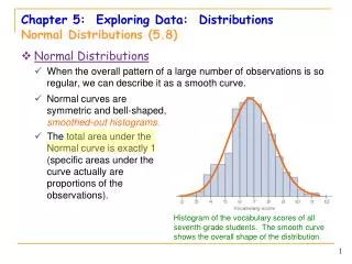
Examining Distributions In any graph of data, look for the overall patternand for striking deviationsfrom that pattern. • You can describe the overall pattern by its shape,center, and spread. • An important kind of deviation is an outlier, an individual that falls outside the overall pattern.
A distribution is symmetricif the right and left sides of the graph are approximately mirror images of each other. • A distribution is skewed to the right (right-skewed) if the right side of the graph is much longer than the left side. • It is skewed to the left (left-skewed) if the left side of the graph is much longer than the right side. Symmetric Left-skewed Right-skewed
An important kind of deviation is an outlier.Outliersare observations that lie outside the overall pattern of a distribution. Always look for outliers and try to explain them. Outliers
The overall pattern is fairly symmetrical except for two states that clearly do not belong to the main pattern. • Alaska and Florida have unusually small and large percent, respectively, of elderly residents in their populations. • A large gap in the distribution is typically a sign of an outlier. Florida Alaska
Time Plots A time plot shows behavior over time. • Time is always on the horizontal axis, and the variable being measured is on the vertical axis. • Look for an overall pattern (trend) and deviations from this trend. Connecting the data points by lines may emphasize this trend. • Look for patterns that repeat at known regular intervals (seasonal variations).
Measuring Center: The Mean The most common measure of center is the mean. To find the mean (pronounced “x-bar”) of a set of observations, add their values, and divide by the number of observations. If the n observations are x1, x2, x3, …, xn, their mean is: In more compact notation: 32
Example. Compute the mean of the data below. 13 18 13 14 13 16 14 21 13 The mean of the data is
Measuring Center: The Median Another common measure of center is the median. The median Mis the midpoint of a distribution, the number such that half of the observations are smaller and the other half are larger. To find the median of a distribution: Arrange all observations from smallest to largest. If the number of observations n is odd, the median M is the center observation in the ordered list. If the number of observations n is even, the median M is the average of the two center observations in the ordered list.
Example. Compute the median of the data: In order to calculate the median first you need to order the data and then locate the center of the data. median The median of the data is
Comparing the mean and the median The mean and the median are the same only if the distribution is symmetrical. The median is a measure of center that is resistant to skew and outliers. The mean is not. Mean and median for a symmetric distribution Mean and median are the same. Mean Median Mean and median for skewed distributions The mean is pulled toward the skew. Left skew Right skew Mean Median Mean Median
Mean and median of a distribution with outliers To find the median, first we need to sort the data in increasing order. Use the data below to calculate the mean and median of the commuting times (in minutes) of 20 randomly selected New York workers.
Mean and median of a distribution with outliers When you plot this data, you clearly see that there are outliers The mean is sensitive to outliers, therefore the value of the mean will get pulled a lot to the right. The median on the other hand is resistant to outliers and will only get slightly pulled to the right. outlier M22.5 31.25
Measuring Spread: The Quartiles • A measure of center alone can be misleading. • A useful numerical description of a distribution requires both a measure of center and a measure of spread. How to Calculate the Quartiles and the Interquartile Range • To calculate the quartiles: • Arrange the observations in increasing order and locate the median M. • The first quartile Q1is the median of the observations located to the left of the median in the ordered list. • The third quartile Q3is the median of the observations located to the right of the median in the ordered list. • The interquartile range (IQR)is defined as: IQR = Q3 – Q1.
The figure displays a number line representing the quartiles. As displayed, is the median and each quartile represents 25% of the data. is known as the 25th percentile, that is, 25% of the data values fall below . (median) is known as the 50thpercentile, that is 50% of the data values fall below . is known as the 75thpercentile, that is 75% of the data values fall below .
Suspected Outliers: 1.5 IQR Rule In addition to serving as a measure of spread, the interquartile range (IQR) is used as part of a rule of thumb for identifying outliers. The 1.5 IQR Rule for Outliers Lower Fence (LF) = Upper Fence (UF) = If data value is greater than the upper fence or less then the lower fence, then it is considered an outlier.
The Five-Number Summary The minimum and maximum values alone tell us little about the distribution as a whole. Likewise, the median and quartiles tell us little about the tails of a distribution. To get a quick summary of both center and spread, combine all five numbers. The five-number summaryof a distribution consists of the smallest observation, the first quartile, the median, the third quartile, and the largest observation, written in order from smallest to largest. Minimum Q1 M Q3 Maximum
Example. Compute the five number summary of the math exam grade data below and determine if there are any outliers. 80 73 92 85 75 98 93 55 80 90 First order the data Min = 55 Q1= 75 M= 82.5 Q3= 92 Max = 98 Any math exam grade lower than 49.5 points or higher than 117.5 is considered an outlier.
Boxplots The five number summary leads a new way to represent the distribution, the boxplot. A boxplot is plot of the five number summary. • A central box spans the quartiles • A line in the box marks the median M. • Lines extend from the from the box to the smallest and largest observation that are not outliers. • Outliers are represented as astrids (*).
outliers Maximum excluding outliers median Minimum excluding outliers
Example. Consider our New York travel times data (in minutes). Obtain the Five number summary, determine if there are any outliers, and construct a boxplot. Describe the distribution. Q1= 15 Min = 5 Max = 85 M = 22.5 Q3= 42.5 Any travel time shorter than –26.25 minutes or longer than 83.75 minutes is considered an outlier.
Boxplot of New York Travel Time M = 22.5 Q1= 15 Q3= 42.5 Max = 85 This is an outlier by 1.5 * IQR rule Min = 5 • This distribution is right skewed.
1. First calculate the variance s2. 2. Then take the square root to get the standard deviation s. Measure of spread: the standard deviation The standard deviation “s” is used to describe the variation around the mean. Like the mean, it is not resistant to skew or outliers. We denote n-1 as degrees of freedom: df You won’t be asked to calculate these by hand, but understand what’s involved in the formula and how to obtain it using RStudio!!
Calculate the mean. Calculate the deviation. Square each deviation. Find the “average” squared deviation. Calculate the sum of the squared deviations divided by (n – 1). This is called the variance. Calculate the square root of the variance. This is the standard deviation. Example. Calculate the variance and standard deviation of the math exam grade data. 80 73 92 85 64.33
s measures spread about the mean and should be used only when the mean is the measure of center. s = 0 only when all observations have the same value and there is no spread. Otherwise, s > 0. s is not resistant to outliers. s has the same units of measurement as the original observations. Properties of the Standard Deviation