Download
1 / 1
10 likes | 116 Vues
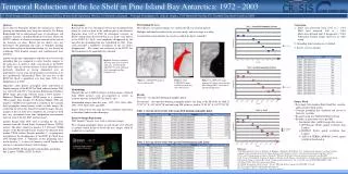
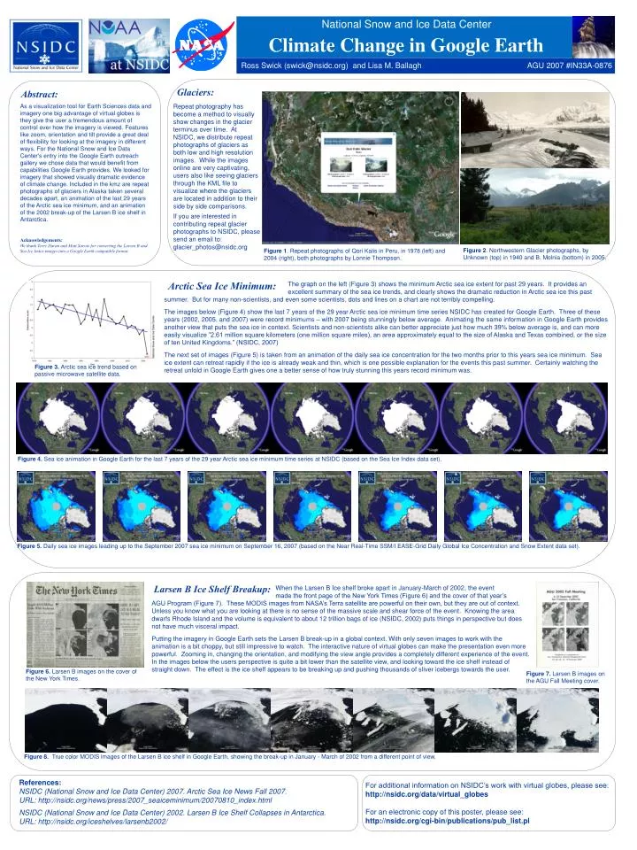
National Snow and Ice Data Center. Climate Change in Google Earth. Ross Swick (swick@nsidc.org) and Lisa M. Ballagh. AGU 2007 #IN33A-0876. Figure 3. Arctic sea ice trend based on passive microwave satellite data. Glaciers:. Abstract:.

E N D
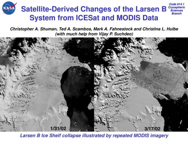
National Snow and Ice Data Center Climate Change in Google Earth Ross Swick (swick@nsidc.org) and Lisa M. Ballagh AGU 2007 #IN33A-0876 Figure 3. Arctic sea ice trend based on passive microwave satellite data. Glaciers: Abstract: As a visualization tool for Earth Sciences data and imagery one big advantage of virtual globes is they give the user a tremendous amount of control over how the imagery is viewed. Features like zoom, orientation and tilt provide a great deal of flexibility for looking at the imagery in different ways. For the National Snow and Ice Data Center's entry into the Google Earth outreach gallery we chose data that would benefit from capabilities Google Earth provides. We looked for imagery that showed visually dramatic evidence of climate change. Included in the kmz are repeat photographs of glaciers in Alaska taken several decades apart, an animation of the last 29 years of the Arctic sea ice minimum, and an animation of the 2002 break-up of the Larsen B ice shelf in Antarctica. Acknowledgements: We thank Terry Haran and Matt Savoie for converting the Larsen B and Sea Ice Index images into a Google Earth compatible format. Repeat photography has become a method to visually show changes in the glacier terminus over time. At NSIDC, we distribute repeat photographs of glaciers as both low and high resolution images. While the images online are very captivating, users also like seeing glaciers through the KML file to visualize where the glaciers are located in addition to their side by side comparisons. If you are interested in contributing repeat glacier photographs to NSIDC, please send an email to:glacier_photos@nsidc.org Figure 2. Northwestern Glacier photographs, by Unknown (top) in 1940 and B. Molnia (bottom) in 2005. Figure 1. Repeat photographs of Qori Kalis in Peru, in 1978 (left) and 2004 (right), both photographs by Lonnie Thompson. Arctic Sea Ice Minimum: The graph on the left (Figure 3) shows the minimum Arctic sea ice extent for past 29 years. It provides an excellent summary of the sea ice trends, and clearly shows the dramatic reduction in Arctic sea ice this past summer. But for many non-scientists, and even some scientists, dots and lines on a chart are not terribly compelling. The images below (Figure 4) show the last 7 years of the 29 year Arctic sea ice minimum time series NSIDC has created for Google Earth. Three of these years (2002, 2005, and 2007) were record minimums – with 2007 being stunningly below average. Animating the same information in Google Earth provides another view that puts the sea ice in context. Scientists and non-scientists alike can better appreciate just how much 39% below average is, and can more easily visualize ”2.61 million square kilometers (one million square miles), an area approximately equal to the size of Alaska and Texas combined, or the size of ten United Kingdoms.” (NSIDC, 2007) The next set of images (Figure 5) is taken from an animation of the daily sea ice concentration for the two months prior to this years sea ice minimum. Sea ice extent can retreat rapidly if the ice is already weak and thin, which is one possible explanation for the events this past summer. Certainly watching the retreat unfold in Google Earth gives one a better sense of how truly stunning this years record minimum was. Figure 4. Sea ice animation in Google Earth for the last 7 years of the 29 year Arctic sea ice minimum time series at NSIDC (based on the Sea Ice Index data set). Figure 5. Daily sea ice images leading up to the September 2007 sea ice minimum on September 16, 2007 (based on the Near Real-Time SSM/I EASE-Grid Daily Global Ice Concentration and Snow Extentdata set). Larsen B Ice Shelf Breakup: When the Larsen B Ice shelf broke apart in January-March of 2002, the event made the front page of the New York Times (Figure 6) and the cover of that year’s AGU Program (Figure 7). These MODIS images from NASA’s Terra satellite are powerful on their own, but they are out of context. Unless you know what you are looking at there is no sense of the massive scale and shear force of the event. Knowing the area dwarfs Rhode Island and the volume is equivalent to about 12 trillion bags of ice (NSIDC, 2002) puts things in perspective but does not have much visceral impact. Putting the imagery in Google Earth sets the Larsen B break-up in a global context. With only seven images to work with the animation is a bit choppy, but still impressive to watch. The interactive nature of virtual globes can make the presentation even more powerful. Zooming in, changing the orientation, and modifying the view angle provides a completely different experience of the event. In the images below the users perspective is quite a bit lower than the satellite view, and looking toward the ice shelf instead of straight down. The effect is the ice shelf appears to be breaking up and pushing thousands of sliver icebergs towards the user. Figure 6. Larsen B images on the cover of the New York Times. Figure 7. Larsen B images on the AGU Fall Meeting cover. Figure 8. True color MODIS images of the Larsen B ice shelf in Google Earth, showing the break-up in January - March of 2002 from a different point of view. References: NSIDC (National Snow and Ice Data Center) 2007. Arctic Sea Ice News Fall 2007. URL: http://nsidc.org/news/press/2007_seaiceminimum/20070810_index.html NSIDC (National Snow and Ice Data Center) 2002. Larsen B Ice Shelf Collapses in Antarctica. URL: http://nsidc.org/iceshelves/larsenb2002/ For additional information on NSIDC’s work with virtual globes, please see: http://nsidc.org/data/virtual_globes For an electronic copy of this poster, please see: http://nsidc.org/cgi-bin/publications/pub_list.pl