Download
1 / 20
200 likes | 211 Vues
Learn how to analyze and present health data using basic tools and simple techniques. Understand the importance of data-driven decision making and the concept of racial and ethnic disparities. Calculate averages, perform linear regression, create graphs, and determine if disparities exist.

E N D
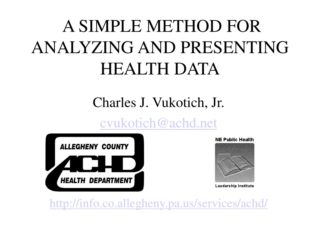
A SIMPLE METHOD FOR ANALYZING AND PRESENTING HEALTH DATA Charles J. Vukotich, Jr. cvukotich@achd.net http://info.co.allegheny.pa.us/services/achd/
This lecture is one of series produced by the Allegheny County Health Department (PA), Bethlehem Health Bureau (PA) and the City of Elizabeth Department of Health & Human Services (NJ). • The organizers of this project are scholars in the Northeast Regional Public Health Leadership Institute, Class of 2000. For information contact: dcw01@health.state.ny.us
Charles J. “Chuck” Vukotich, Jr. • Assistant Deputy Director • 25 years in public health in a variety of management Roles • Carnegie Mellon University • BS, Chemistry • MS, Public Management and Policy, H. John Heinz School of Public Management and Policy • Member of Tau Beta Pi, and Phi Kappa Phi
Chuck Vukotich has spent many years of his professional career applying management tools to public health. He developed the first program plans for the Allegheny County Health Department. He has worked in improving budgeting and fiscal forecasting. He has led the reorganization of several programs, and participated in department wide reorganization. He is presently working on planning, including the applications of MAPP, benchmarks and indicators.
LEARNING OBJECTIVES • To understand the importance of data for planning and decision making. • To understand the concept of racial and ethic disparities. • To understand basic concepts of data presentation. • To understand the basic concept of fitting a straight line to data.
PERFORMANCE OBJECTIVES • Know how to calculate an average. • Know how to do a linear regression using EXCEL. • Know how to create a graph in EXCEL. • Know how to determine if a racial disparity exists. • Know how to calculate rate of change.
Data is Important • Decision making, strategic Planning and program design should be data driven. • Data must be communicated in a way that is understandable by all, especially members of the community. • This is one way to present health data using readily available tools, basic analysis and simple presentation.
Look at 5 Years of Data • A change in one year usually doesn’t mean anything. • Collect the 5 most current years of data and look at this. • Use age adjusted data, where available. • Use rates when possible.
MethodHealth/Disease Indicators Positive rate of change indicates that these lines are all increasing
Regression Analysis –EXCEL Screen Add numbers and divide by 5, it’s just the average.
Regression Output This tells how good the data fits a straight line; think of this as a percent, 100% is perfect; 78% is good. The X Variable Coefficient.
Plot the Data • People like to see the data plotted out. • It gives them a ‘feel’ for the data. • It makes them comfortable. • It’s easy to do using Excel. • See screen print on next slide.
Determine Disparities • You can determine racial/ethnic disparities by comparing the 5 year averages between groups. • There may be many reasons for disparities, but a gap of 30% or greater indicates that the gap is real, and not just from random forces. • A DISPARITY MAY NOT EXIST.
Can We Meet the 2010 Goal? • We can project using regression analysis data Example: 7.64 = 2,721.14 + (-1.35 x 2,010)
Can We Meet the 2010 Goal? • HP 2010 Goal for Colorectal Cancer is 13.9 deaths per 100,000 • Projected Value is 7.64 deaths per 100,000 • Assumes that current trend will continue. • Projection may not be statistically valid. • BUT, it’s a good “what-if” for strategic purposes, but just don’t take it too seriously.
PUT IT ALL TOGETHER CAUSE OF DEATH “Goal” is Healthy People 2010 Goal.