Download
1 / 56
570 likes | 772 Vues
CS305, HCI in Software Development Usability Goals, Principles, Guidelines. (Introduction, Part 2) Fall 2008. Activity (Mini-Homework). Do this on your own on in pairs Go find two examples of problems in the GUIs of software apps or the UI of a interactive device (not Web pages)

E N D
CS305, HCI in Software DevelopmentUsability Goals, Principles, Guidelines (Introduction, Part 2) Fall 2008
Activity (Mini-Homework) • Do this on your own on in pairs • Go find two examples of problems in the GUIs of software apps or the UI of a interactive device (not Web pages) • Problem must illustrate a violation of one of the design principles or usability guidelines • Describe the problems in these terms • “Post” on Collab wiki page before class next Fri.
Reminder…. • users should be involved through the development of the project • specific usability and user experience goals need to be identified, clearly documented and agreed at the beginning of the project • iteration is needed through the core activities
Towards More Usable Systems • Seems like we need the following: • Goals we want to achieve • Principles on how to achieve these • Lists of do’s and don’ts • Theories that underlie principles, lists • Methods for measuring and evaluating
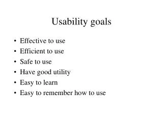
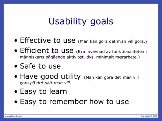
Usability Goals • Here’s one set (from the ID textbook) • Effective to use • Efficient to use • Safe to use • Have good utility • Easy to learn • Easy to remember how to use
Usability Goals • Effective to use (effectiveness) • A general goal: how well does a system do what it should do? • Efficient to use (efficiency) • Do things quickly, easily. • Especially common tasks. • Safe to use (safety) • Protect people from hazards (usually not a SW issue) • Help prevent user from making errors and recover from errors • Give users confidence
Usability Goals (2) • Have good utility • Has the right kind of functionality • Supports users in accomplishing tasks • Easy to learn (learnability) • Includes how easy it is to learn advanced features. (If hard, who bothers?) • Easy to remember how to use (memorability) • Many systems used infrequently
How to Measure Usability? • We want to achieve these goals, but how do we know? • Develop measurable criteria based on previous goals. Examples: • Time to learn • Speed of performance • Rate of errors over by users • Retention over time • Subjective satisfaction
User experience goals • Satisfying - rewarding • Fun - support creativity • Enjoyable - emotionally fulfilling • Entertaining …and more • Helpful • Motivating • Aesthetically pleasing
Usability and user experience goals • How do usability goals differ from user experience goals? • How easy is it to measure usability versus user experience goals? • Are there trade-offs between the two kinds of goals? • e.g. can a product be both fun and safe?
Reminder of where we are • Usability Goals • Some measures • User Experience Goals • Design Principles • First two were higher level (goals) • Now talking about guidance for how to achieve goals • Guidelines (guidance as lists)
Design principles • Generalizable abstractions for thinking about different aspects of design • The do’s and don’ts of interaction design • But at a high level. (Compare to guidelines later.) • What to provide and what not to provide at the interface • Derived from a mix of theory-based knowledge, experience and common-sense
Higher-level Principles • Now, we’ll talk about the following: • Visibility • Feedback • Constraints • Mapping • Consistency • Affordances • Ideas well-known (e.g. from Norman’s Design of Everyday Things)
Activity (Mini-Homework) • Do this on your own on in pairs • Go find two examples of problems in the GUIs of software apps or the UI of a interactive device (not Web pages) • Problem must illustrate a violation of one of the design principles or usability guidelines • Describe the problems in these terms • “Post” on Collab wiki page before class next Fri.
Visibility • This is a control panel for an elevator. • How does it work? • Push a button for the floor you want? • Nothing happens. Push any other button? Still nothing. What do you need to do? It is not visible as to what to do! From: www.baddesigns.com
Visibility • …you need to insert your room card in the slot by the buttons to get the elevator to work! How would you make this action more visible? • make the card reader more obvious • provide an auditory message, that says what to do (which language?) • provide a big label next to the card reader that flashes when someone enters • make relevant parts visible • make what has to be done obvious
Feedback • Sending information back to the user about what has been done • Includes sound, highlighting, animation and combinations of these • e.g. when screen button clicked on provides sound or red highlight feedback: “ccclichhk”
Constraints • Restricting the possible actions that can be performed • Helps prevent user from selecting incorrect options • Three main types (Norman, 1999) • physical • cultural • logical
Physical constraints • Refer to the way physical objects restrict the movement of things • E.g. only one way you can insert a key into a lock • How many ways can you insert a CD or DVD disk into a computer? • How physically constraining is this action? • How does it differ from the insertion of a floppy disk into a computer?
Logical constraints • Exploits people’s everyday common sense reasoning about the way the world works • An example is the logical relationship between physical layout of a device and the way it works • See next slide for an illustration
Logical or ambiguous design? • Where do you plug the mouse? • Where do you plug the keyboard? • top or bottom connector? • Do the color coded icons help? From: www.baddesigns.com
More Logically Constrained Provides direct adjacent mapping between icon and connector Provides color coding to associate the connectors with the labels From: www.baddesigns.com
Cultural constraints • Learned arbitrary conventions like red triangles for warning • Can be universal or culturally specific • For SW we’ve accepted certain conventions, e.g. we know what to do with an icon • Be concerned of cross-cultural conventions and other ambiguities! • Does an “X” mean “selected” or “not selected” • Is a check-mark better?
Mapping • Relationship between controls and their movements and the results in the world • Why is this a poor mapping of control buttons?
Mapping • Why is this a better mapping? • The control buttons are mapped better onto the sequence of actions of fast rewind, rewind, play and fast forward • Is this a logical mapping (in most people’s minds)? • Is there a mapping that makes more sense?
Mappings in the Kitchen • Which controls go with which rings (burners)? A B C D
Consistency • Design interfaces to have similar operations and use similar elements for similar tasks • For example: • always use ctrl key plus first initial of the command for an operation – ctrl+C, ctrl+S, ctrl+O • Main benefit is consistent interfaces are easier to learn and use • But… didn’t a wise man say this?Consistency is the hobgoblin of little minds. • A foolish consistency is the hobgoblin of little minds(adored by little statesmen and philosophers and divines)
When consistency breaks down • What happens if there is more than one command starting with the same letter? • e.g. save, spelling, select, style • Have to find other initials or combinations of keys, thereby breaking the consistency rule • E.g. ctrl+S, ctrl+Sp, ctrl+shift+L • Is this desirable? Does it defeat the purpose? • It may increase learning burden on user • It may make them more prone to errors • But it may still benefit frequent or experienced users
Internal and external consistency • Internal consistency refers to designing operations to behave the same within an application • Difficult to achieve with complex interfaces • External consistency refers to designing operations, interfaces, etc., to be the same across applications and devices • Very rarely the case, based on different designer’s preference • Most successful in product families (e.g MS Office) • Op. Sys. vendors may define style guidelines
Keypad numbers layout • A case of external inconsistency (a) phones, remote controls (b) calculators, computer keypads 8 9 1 2 7 3 4 5 6 4 5 6 8 9 1 2 7 3 0 0
Affordances: to give a clue • Refers to an attribute of an object that allows people to know how to use it • E.g. a mouse button invites pushing, a door handle affords pulling • Norman (1988) used the term to discuss the design of everyday objects • Since then has been popularized in interaction design to discuss how to design interface objects • E.g. scrollbars to afford moving up and down, icons to afford clicking on
What does ‘affordance’ have to offer interaction design? • Notion of affordance is often over-used!http://www.jnd.org/dn.mss/affordances-and.html • Interfaces are virtual and do not have affordances like physical objects • Norman argues it does not make sense to talk about interfaces in terms of ‘real’ affordances • Instead interfaces are better conceptualised as ‘perceived’ affordances • Learned conventions of arbitrary mappings between action and effect at the interface • Some mappings are better than others
Activity 1.3 • Physical affordances: How do the following physical objects afford? Are they obvious?
Activity 1.4 • Virtual affordances How do the following screen objects afford? What if you were a novice user? Would you know what to do with them?
Activity 1.5: Physical and Perceived Affordances • Take a cell phone, digital camera, or PDA • Have laptop? Open a fancy SW app: Outlook, Eclipse, etc? • In a small group • Identify any physical affordances the device has • Identify any perceived or visual affordances the software user interface has • Write these down, be prepared to share or turn in
A Good Example • Kodak DC-290 digital camera
Adjusting Tabs in MS Word • What’s the idea here? Problems? • What principle(s)? • Affordance • Metaphor (more on this later)
Web Links • What are the conventions that help you recognize a link? • Would you are argue this is an affordance? • A perceived affordance – convention of a mapping between action and effect • Does it “afford” clicking on it? • Examples of problems with this? • Let’s look at: http://www.cs.virginia.edu
Overview (Reminder) • Usability Goals • User Experience Goals • Design Principles • Guidelines • Still talking about guidance for how to achieve goals • These are more prescriptive (do’s & don’ts)
Guidelines • What do we mean by “guidelines”? • Tell me! • Are guidelines enough? Lead to problems? • Too specific, incomplete. Don’t generalize to all situations • But… Capture experience and best practices • Many examples of guidelines…
Nature of Guidelines • Similar to design principles, except more prescriptive • Used mainly as the basis for evaluating systems • Provide a framework for heuristic evaluation • We’ll talk about particular approach to evaluation this later
Jakob Nielsen Says… • Jakob Nielsen: a leading figure in usability • Member of the Nielsen Norman Group • Donald Norman • Bruce "Tog" Tognazzini • http://www.useit.com/ • Alertbox: regular “column” • Wikipedia: http://en.wikipedia.org/wiki/Jakob_Nielsen_(usability_consultant)
“Usability principles” (Nielsen 2001) • Visibility of system status • Match between system and the real world • User control and freedom • Consistency and standards • Help users recognize, diagnose and recover from errors • Error prevention • Recognition rather than recall • Flexibility and efficiency of use • Aesthetic and minimalist design • Help and documentation
Read More about Nielsen’s List(s) • Nielsen’s site has more on the previous listhttp://www.useit.com/papers/heuristic/heuristic_list.html • Heuristics: more general “guidelines” • We’ll see this term again • Heuristic evaluation • Activity 1.7 for you to do: • Find one list of similar usability principles (i.e heuristics, prescriptive guidelines, do’s/don’ts) for Web page design • Write it down – we’ll collect these
Shneiderman’s Eight Golden Rules • Strive for consistency • Cater to universal usability • Offer informative feedback • Design dialogs to yield closure • Prevent errors • Permit easy reversal of actions • Support internal locus of control • Reduce short-term memory load.