Download
1 / 57
580 likes | 662 Vues
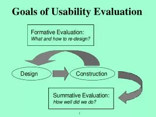
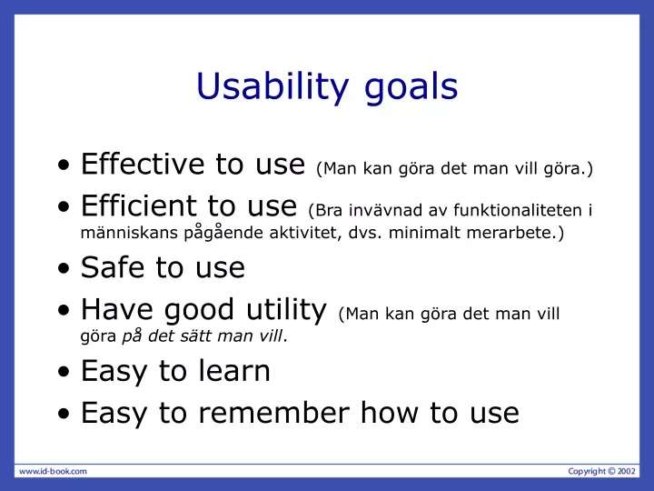
Usability goals. Effective to use (Man kan göra det man vill g öra. ) Efficient to use (Bra inv ävnad av funktionaliteten i människans pågående aktivitet, dvs. minimalt merarbete. ) Safe to use Have good utility (Man kan g öra det man vill göra på det sätt man vill . Easy to learn

E N D
Usability goals • Effective to use (Man kan göra det man vill göra.) • Efficient to use (Bra invävnad av funktionaliteten i människans pågående aktivitet, dvs. minimalt merarbete.) • Safe to use • Have good utility (Man kan göra det man vill göra på det sätt man vill. • Easy to learn • Easy to remember how to use
User experience goals • Satisfying - rewarding • Fun - support creativity • Enjoyable - emotionally fulfilling • Entertaining …and more • Helpful • Motivating • Aesthetically pleasing • Motivating
Usability and user experience goals • How do usability goals differ from user experience goals? • Are there trade-offs between the two kinds of goals? • e.g. can a product be both fun and safe? • How easy is it to measure usability versus user experience goals?
Design principles • Generalizable abstractions for thinking about different aspects of design • The do’s and don’ts of interaction design • What to provide and what not to provide at the interface • Derived from a mix of theory-based knowledge, experience and common-sense
Visibility • This is a control panel for an elevator. • How does it work? • Push a button for the floor you want? • Nothing happens. Push any other button? Still nothing. What do you need to do? It is not visible as to what to do! From: www.baddesigns.com
Visibility …you need to insert your room card in the slot by the buttons to get the elevator to work! How would you make this action more visible? • make the card reader more obvious • provide an auditory message, that says what to do (which language?) • provide a big label next to the card reader that flashes when someone enters • make relevant parts visible • make what has to be done obvious
Feedback • Sending information back to the user about what has been done • Includes sound, highlighting, animation and combinations of these • e.g. when screen button clicked on provides sound or red highlight feedback: “ccclichhk”
Constraints • Restricting the possible actions that can be performed • Helps prevent user from selecting incorrect options • Three main types (Norman, 1999) • physical • cultural • logical
Physical constraints • Refer to the way physical objects restrict the movement of things • E.g. only one way you can insert a key into a lock • How many ways can you insert a CD or DVD disk into a computer? • How physically constraining is this action? • How does it differ from the insertion of a floppy disk into a computer?
Logical constraints • Exploits people’s everyday common sense reasoning about the way the world works • An example is they logical relationship between physical layout of a device and the way it works as the next slide illustrates
Logical or ambiguous design? • Where do you plug the mouse? • Where do you plug the keyboard? • top or bottom connector? • Do the color coded icons help? From: www.baddesigns.com
How to design them more logically (i) A provides direct adjacent mapping between icon and connector (ii) B provides color coding to associate the connectors with the labels From: www.baddesigns.com
Cultural constraints • Learned arbitrary conventions like red triangles for warning • Can be universal or culturally specific
Mapping • Relationship between controls and their movements and the results in the world • Why is this a poor mapping of control buttons?
Mapping • Why is this a better mapping? • The control buttons are mapped better onto the sequence of actions of fast rewind, rewind, play and fast forward
Consistency • Design interfaces to have similar operations and use similar elements for similar tasks • For example: • always use ctrl key plus first initial of the command for an operation – ctrl+C, ctrl+S, ctrl+O • Main benefit is consistent interfaces are easier to learn and use
Affordances: to give a clue • Refers to an attribute of an object that allows people to know how to use it • e.g. a mouse button invites pushing, a door handle affords pulling • Norman (1988) used the term to discuss the design of everyday objects • Since has been much popularised in interaction design to discuss how to design interface objects • e.g. scrollbars to afford moving up and down, icons to afford clicking on
What does ‘affordance’ have to offer interaction design? • Interfaces are virtual and do not have affordances like physical objects • Norman argues it does not make sense to talk about interfaces in terms of ‘real’ affordances • Instead interfaces are better conceptualised as ‘perceived’ affordances • Learned conventions of arbitrary mappings between action and effect at the interface • Some mappings are better than others
Activity • Physical affordances: How do the following physical objects afford? Are they obvious?
Activity • Virtual affordances How do the following screen objects afford? What if you were a novice user? Would you know what to do with them?
Usability principles • Similar to design principles, except more prescriptive • Used mainly as the basis for evaluating systems • Provide a framework for heuristic evaluation
Usability principles (Nielsen 2001) • Visibility of system status • Match between system and the real world • User control and freedom • Consistency and standards • Help users recognize, diagnose and recover from errors • Error prevention • Recognition rather than recall • Flexibility and efficiency of use • Aesthetic and minimalist design • Help and documentation
Recap • HCI has moved beyond designing interfaces for desktop machines • About extending and supporting all manner of human activities in all manner of places • Facilitating user experiences through designing interactions • Make work effective, efficient and safer • Improve and enhance learning and training • Provide enjoyable and exciting entertainment • Enhance communication and understanding • Support new forms of creativity and expression
Understanding the problem space • What do you want to create? • What are your assumptions? • Will it achieve what you hope it will?
A framework for analysing the problem space • Are there problems with an existing product? • Why do you think there are problems? • Why do you think your proposed ideas might be useful? • How would you see people using it with their current way of doing things? • How will it support people in their activities? • Will it really help them?
An example • What were the assumptions made by cell phone companies when developing WAP services? • Was it a solution looking for a problem?
Assumptions: realistic or wish-list? • People want to be kept informed of up-to-date news wherever they are - reasonable • People want to interact with information on the move - reasonable • People are happy using a very small display and using an extremely restricted interface - not reasonable • People will be happy doing things on a cell phone that they normally do on their PCs (e.g. surf the web, read email, shop, bet, play video games) - reasonable only for a very select bunch of users
From problem space to design space • Having a good understanding of the problem space can help inform the design space • e.g. what kind of interface, behavior, functionality to provide • But before deciding upon these it is important to develop a conceptual model
Conceptual model • Need to first think about how the system will appear to users (i.e. how they will understand it) • A conceptual model is a high level description of: • “the proposed system in terms of a set of integrated ideas and concepts about what it should do, behave and look like, that will be understandable by the users in the manner intended”
First steps in formulating a conceptual model • What will the users be doing when carrying out their tasks? • How will the system support these? • What kind of interface metaphor, if any, will be appropriate? • What kinds of interaction modes and styles to use? Always keep in mind when making design decisions how the user will understand the underlying conceptual model
Conceptual models • Many kinds and ways of classifying them • Here we describe them in terms of core activities and objects • Also in terms of interface metaphors
Conceptual models based on activities • Giving instructions • issuing commands using keyboard and function keys and selecting options via menus • Conversing • interacting with the system as if having a conversation • Manipulating and navigating • acting on objects and interacting with virtual objects • Exploring and browsing • finding out and learning things
1. Giving instructions • Where users instruct the system and tell it what to do • e.g. tell the time, print a file, save a file • Very common conceptual model, underlying a diversity of devices and systems • e.g. CAD, word processors, VCRs, vending machines • Main benefit is that instructing supports quick and efficient interaction • good for repetitive kinds of actions performed on multiple objects
2. Conversing • Underlying model of having a conversation with another human • Range from simple voice recognition menu-driven systems to more complex ‘natural language’ dialogues • Examples include timetables, search engines, advice-giving systems, help systems • Recently, much interest in having virtual agents at the interface, who converse with you, e.g. Microsoft’s Bob and Clippy
Pros and cons of conversational model • Allows users, especially novices and technophobes, to interact with the system in a way that is familiar • makes them feel comfortable, at ease and less scared • Misunderstandings can arise when the system does not know how to parse what the user says • e.g. child types into a search engine, that uses natural language the question: “How many legs does a centipede have?” and the system responds:
3. Manipulating and navigating • Involves dragging, selecting, opening, closing and zooming actions on virtual objects • Exploit’s users’ knowledge of how they move and manipulate in the physical world • Exemplified by (i) what you see is what you get (WYSIWYG) and (ii) the direct manipulation approach (DM) • Shneiderman (1983) coined the term DM, came from his fascination with computer games at the time
Core principles of DM • Continuous representation of objects and actions of interest • Physical actions and button pressing instead of issuing commands with complex syntax • Rapid reversible actions with immediate feedback on object of interest
Why are DM interfaces so enjoyable? • Novices can learn the basic functionality quickly • Experienced users can work extremely rapidly to carry out a wide range of tasks, even defining new functions • Intermittent users can retain operational concepts over time • Error messages rarely needed • Users can immediately see if their actions are furthering their goals and if not do something else • Users experience less anxiety • Users gain confidence and mastery and feel in control
What are the disadvantages with DM? • Some people take the metaphor of direct manipulation too literally • Not all tasks can be described by objects and not all actions can be done directly • Some tasks are better achieved through delegating • e.g. spell checking • Can become screen space ‘gobblers’ • Moving a mouse around the screen can be slower than pressing function keys to do same actions
4. Exploring and browsing • Similar to how people browse information with existing media (e.g. newspapers, magazines, libraries, pamphlets) • Information is structured to allow flexibility in way user is able to search for information • e.g. multimedia, web
Conceptual models based on objects • Usually based on an analogy with something in the physical world • Examples include books, tools, vehicles • Classic: Star Interfacebased on officeobjects Johnson et al (1989)
Another classic: the spreadsheet (Bricklin) • Analogous to ledger sheet • Interactive and computational • Easy to understand • Greatly extending what accountants and others could do www.bricklin.com/history/refcards.htm
Which conceptual model is best? • Direct manipulation is good for ‘doing’ types of tasks, e.g. designing, drawing, flying, driving, sizing windows • Issuing instructions is good for repetitive tasks, e.g. spell-checking, file management • Having a conversation is good for children, computer-phobic, disabled users and specialised applications (e.g. phone services) • Hybrid conceptual models are often employed, where different ways of carrying out the same actions is supported at the interface - but can take longer to learn
Interface metaphors • Interface designed to be similar to a physical entity but also has own properties • e.g. desktop metaphor, web portals • Can be based on activity, object or a combination of both • Exploit user’s familiar knowledge, helping them to understand ‘the unfamiliar’ • Conjures up the essence of the unfamiliar activity, enabling users to leverage of this to understand more aspects of the unfamiliar functionality
Benefits of interface metaphors • Makes learning new systems easier • Helps users understand the underlying conceptual model • Can be very innovative and enable the realm of computers and their applications to be made more accessible to a greater diversity of users
Problems with interface metaphors • Break conventional and cultural rules • e.g. recycle bin placed on desktop • Can constrain designers in the way they conceptualize a problem space • Conflict with design principles • Forces users to only understand the system in terms of the metaphor • Designers can inadvertently use bad existing designs and transfer the bad parts over • Limits designers’ imagination in coming up with new conceptual models
Conceptual models: from interaction mode to style • Interaction mode: • what the user is doing when interacting with a system, e.g. instructing, talking, browsing or other • Interaction style: • the kind of interface used to support the mode, e.g. speech, menu-based, gesture