Download
1 / 5
50 likes | 123 Vues
A nalysis on T oy Story magazine page. By Sophie Aldridge.

E N D
Analysis on Toy Story magazine page By Sophie Aldridge
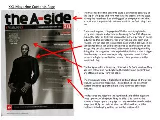
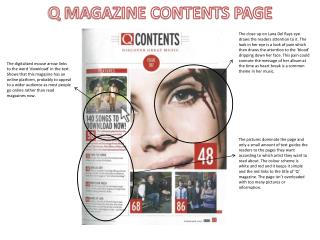
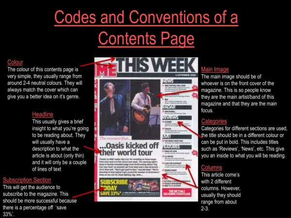
This is a page from a magazine, that as indicated by the heading at the top of the page, looks at Toy Story for the first time. I think this page may be from an adults general or gossip magazine as, just above the film review it says “movies” which suggest this is a dedicated part in a magazine to new films. I think its an adults magazine as the text it contains a lot of practical information about the film, like the running time and when its coming out. It also uses long words and the test is small, which would not be attractive to read for a child.
The layout of this page is quite simple and easy to look at. It also has a lot of white space around the test and pictures which makes the page look spacious and the text easier to read. At the top left, of the page there is a heading which immediately tells people what this is about. Underneath that is white space and two pictures. The first is placed slightly to the right, then the second one underneath but to the left more. This makes it more interesting to look at than if they were both in line. Around the top picture is two faded grey lines that frame the picture and text, and fill some white space whilst not making it crowed. The text is placed below where the second picture starts which leaves a lot of unused space, that personally Ifeel could have been used to get something else in, like a film rating. layout
There are two images used on this page, that take up a lot more space than the text. This is good as its the pictures that draws us in and gets our attention, making us want to read the text, to find out what its about. Since this is an animation about toys, both of the pictures are animated and show the toys from the film, which gives people an incite into the film The first picture is a wide shot, of a group of toys from the film. These toys are the ones you mostly see in the film, with the three main characters in the middle top row. The picture is edited so it looks as if we are on another side of glass looking in at them which is different and interesting. The second picture is very different from the first. It still shows toys from the film, but this time shows us a closer view of one of the shots during the film. It shows people that this is a funny film, as it has a hedgehog dressed up in a cardboard fish outfit, with a Barbie and ken doll walking behind it. Images
Text The amount of text on this page is relatively little compared to the other film reviews I have looked at. However despite that, it still gets the key information out there, like the release date, how long it lasts for, the story line and even quote from the director! Which may be enough to get people interested. However having read it, I personally am not attracted to watch it as I want to know more about the story and some examples of the funny parts to get me into it and wanting to know more. I think the text is a bit to formal and grown up for the film it is talking about and does not reflect how funny the film is.