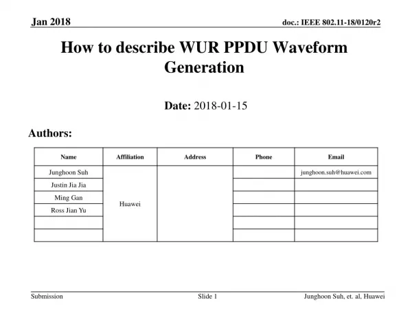
Download
1 / 15
150 likes | 252 Vues
How to Describe Data. Much of this info is based on a presentation by Marianne W. Zawitz, Bureau of Justice Statistics Link on the course website to: http://www.scs.gmu.edu/~wss/methods/index.html#Graphics Presentation by Dr. Steven Lich-Tyler (Econ professor). Describing Data.

E N D
Much of this info is based on • a presentation by Marianne W. Zawitz, Bureau of Justice Statistics • Link on the course website to: http://www.scs.gmu.edu/~wss/methods/index.html#Graphics • Presentation by Dr. Steven Lich-Tyler (Econ professor)
Describing Data • Your goal is to: • convey characteristics about a data sample in a concise and straightforward way • help the reader understand what is going on in your research paper, not confuse or mislead them
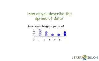
Table or Graph? • Use a Graph if: • You want to convey a lot of information in a small space • Illustrate the “big picture” • Use a Table if: • 10 or fewer data points • Exact Numerical Data
A good graph • Presents data clearly • Uses the space efficiently (very little “excess” ink) • Encourages comparisons
Worlds Worst Graph(per Dr. Steven Lich-Tyler) • Discontinuous Axis Misrepresents the scale • Decoration is pointless and confusing • Top portion mirrors the bottom portion – no new information • The percentages are given, making the graph redundant
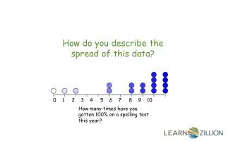
What Kind of Graph to Use?Continuous Variables • Relative Frequency Histogram • use when distribution of the variable doesn’t follow usual bell shape or other common distribution • Otherwise conventional statistics (mean, s.d., etc.) may be sufficient
What Kind of Graph to Use?Continuous Variables • Line Graph • show trends over time
What Kind of Graph to Use?Continuous Variables • Scatter Plot • show relationship between two variables
What Kind of Graph to Use?Categorical Variables • Bar Graph • Compare across different categories
What Kind of Graph to Use?Categorical Variables • Pie Charts • generally useless • Use a table instead
Graphs: Other Things to Avoid Misleading the Reader with Visual Tricks Poorly Scaled Axes Optical Illusions
Graphs: Other Things to Avoid • Too much non-data ink (gridlines, elaborate graphics, etc)
Tables • Limit Gridlines and Non-Data Ink good bad • Use appropriate number of decimal places good bad
More on Tables • Create a logical visual pattern • Order the content according to how the data will be used or discussed • Place data that are to be compared close to one another • Make patterns and exceptions obvious at a glance • Use notes to explain computed fields