Download
1 / 23
250 likes | 531 Vues
UNIVERSITÀ DEGLI STUDI DI PAVIA Facoltà di Lettere e Filosofia, Scienze Politiche, Giurisprudenza, Ingegneria, Economia Corso di laurea in Comunicazione Professionale e Multimedialità. Mobile web e responsive design: stato dell’arte e analisi del caso unipv.eu Relatore: Prof. Marco Porta

E N D
UNIVERSITÀ DEGLI STUDI DI PAVIAFacoltà di Lettere e Filosofia, Scienze Politiche, Giurisprudenza, Ingegneria, EconomiaCorso di laurea in Comunicazione Professionale e Multimedialità Mobile web e responsive design: stato dell’arte e analisi del caso unipv.eu Relatore: Prof. Marco Porta Correlatore: Prof. Mauro Mosconi Tesi di laurea di Giulia Biasini Anno Accademico 2011/2012
Mobile web: capabilities - Italy: the european Country with more smartphones - 15 millions internet accounts - The m-commerce is constantly growing - Good ROI of mobile advertisement
Mobile web: problems - 59% mobile users’ average success rate - Difficult input - Slow download - Mis-designed websites
Mobile Usability The effectiveness, efficiency and satisfaction with which specified users achieve specified goals in particular environments*. *Usability - ISO 9241 definition
Mobile content: the design - Information design: lesscontents, one-column layout - Interaction design:input minimization, feedback - Visual design:affordance, visualframework
Cases comparison
Cases comparison: Wikipedia • Information: verticalhierarchy,foldedforms • Interaction: buttonswith • differentfunctionstooclose • Visual: goodvisualframework
Cases comparison: Facebook • Information: long scrolling, • friends in alphabeticalorder • Interaction: closebottonswith • differentfunctions • Visual design: no affordance
Cases comparison: Libero - Information: progressive disclosure, verticalhierarchy, little STM loading - Interaction:very easy input - Visual: medium affordance, goodvisualframework
Implementation: four methods • Laissez-faire: no usability • No Styling: no usability • Media queries: no info and • navigation design • Mobile version: mobile • capabilities
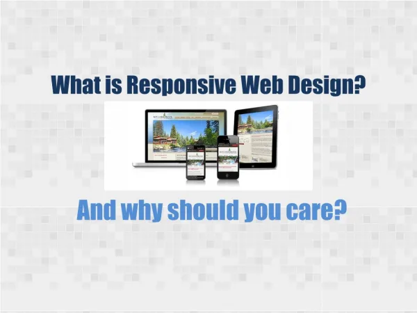
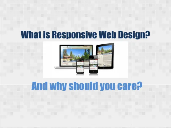
Responsive web design - Multiplatform site - Site abletoadaptitseftto the context in whichitisviewed - Flexibleimages, contents and grid-based layout
Responsive web design @media only screen and (max-width: 980px) and (min-width: 821px) @media only screen and (max-width: 820px) and (min-width: 621px) @media only screen and (max-width: 620px) and (min-width: 501px) @media only screen and (max-width: 500px) and (min-width: 341px) @media only screen and (max-width: 340px) and (min-width: 5px)
Conclusion - Mobile web: capabilities vs problems - Mobile content: the design - Cases comparison - Implementation: four methods - Responsive web design