Download
1 / 35
360 likes | 492 Vues
Chapter 3 Histograms. Histogram is a summary graph showing a count of the data falling in various ranges. Purpose: To graphically summarize and display the distribution of a process data set. 3. Histogram. It is particularly useful when there are a large number of observations.

E N D
Chapter 3 Histograms Histogram is a summary graph showing a count of the data falling in various ranges. Purpose: To graphically summarize and display the distribution of a process data set.
3. Histogram • It is particularly useful when there are a large number of observations. • The observations or data sets for which we draw a histogram are QUANTITATIVE variables.
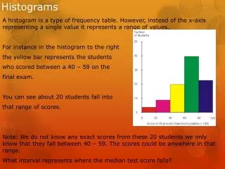
3. Histogram • Example: Test Scores
3. Histogram When Apple Computer introduced the iMac computer in August 1998, the company wanted to learn whether the iMac was expanding Apple’s market share. • Was the iMac just attracting previous Macintosh owners? • Or was it purchased by newcomers to the computer market, • by previous Windows users who were switching over?
3. Histogram • To find out, 500 iMac customers were interviewed. Each customer was categorized as • a previous Macintosh owner • a previous Windows owner • or a new computer purchaser.
3. Histogram Frequency Table
3. Histogram Example (http://cnx.org/content/m10160/latest/) • Scores of 642 students on a psychology test. The test consists of 197 items each graded as "correct" or "incorrect." The students' scores ranged from 46 to 167.
3. Histogram How To Construct A Histogram • A histogram can be constructed by segmenting the range of the data into equal sized bins (also called segments, groups or classes). For example, if your data ranges from 1.1 to 1.8, you could have equal bins of 0.1 consisting of 1 to 1.1, 1.2 to 1.3, 1.3 to 1.4, and so on. • The vertical axis of the histogram is labeled Frequency (the number of counts for each bin), and the horizontal axis of the histogram is labeled with the range of your response variable. • You then determine the number of data points that reside within each bin and construct the histogram. The bins size can be defined by the user, by some common rule, or by software methods (such as Minitab).
3. Histogram What Questions The Histogram Answers • What is the most common system response?------Mode • What distribution (center and variation) does the data have? • Does the data look symmetric or is it skewed to the left or right?---SHAPE • Does the data contain outliers?
3. Histogram Skewed distributions • it is quite common to have one tail of the distribution considerably longer or drawn out relative to the other tail. • A "skewed right" distribution is one in which the tail is on the right side. • A "skewed left" distribution is one in which the tail is on the left side.
3. Histogram • Salary distribution of Microsoft Employees • Grade distribution of an easy exam • Grade distribution of a difficult exam • SAT Scores
Chapter 4 Exploring Relationships between Variables • Smoking and lung cancer • Altitude and boiling point of water • Temperature and ozone concentration in air • Temperature and heating gas bill • Economic conditions and presidential elections
4. Bivariate Data Goal Let X and Y be two quantitative variables. Explore the relationship between X and Y
4. Bivariate Data Some Facts about Scatterplots: • X: Explanatory variable----explains or influences changes in the response variable • Y: Response variable----measures an outcome of a study
4. Bivariate Data Shapes of Scatterplot • Positive association: increasing trend • Negative association: decreasing trend
4. Bivariate Data • Example: Average-Degree days and Natural Gas Consumption X: Explanatory variable: avg. number of heating degree days each day during th e month. Heating degree-days are the usual measure of demand for heating. One degree-day is accumulated for each degree a day’s temperature falls below 65 degrees. An average temperature of 20 for example corresponds to 45 degree-days
4. Bivariate Data • Example:
4. Bivariate Data • Describe the relationship. Why is it not linear? • Is the relationship positively associated, negatively associated or neither? • Is the relationship strong or weak or neither?
4. Bivariate Data Summary • A Scatterplot shows the relationship between two quantitative variables measured on the same individual. • The variable that is designated the X variable is called the explanatory variable • The variable that is designated the Y variable is called the response variable
4. Bivariate data • Always plot the explanatory variable on the horizontal (x) axis • Always plot the explanatory variable on the vertical (y) axis • In examining scatterplots, look for an overall pattern showing the form, direction and strength of the relationship • Look also for outliers or other deviations from this pattern
4. Bivariate data • Linear Relationships: If the explanatory and response variables show a straight-line pattern, then we say they follow a linear relationship. • Curved relationships and clusters are other forms to watch for.
4. Bivariate data • Direction: If the relationship has a clear direction, we speak of either positive association or negative association. • Positive association: high values of the two variables tend to occur together • Negative association: high values of one variable tend to occur with low values of the other variable.
4. Bivariate variable • Strength: The strength of a linear relationship is determined by how close the points in the scatterplot lie to a straight line