Download
1 / 17
170 likes | 249 Vues
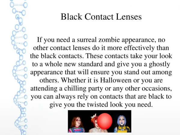
Having an Eye for Design. Click Here. Lesson 2 Color Theory . Bench Marks. Standards.doc. Click Here. Handout. Click Here. Color. Color is the response of the eye to differing wavelengths of radiation within the visible spectrum.

E N D
Having an Eye for Design Click Here Lesson 2 Color Theory
Bench Marks • Standards.doc Click Here
Handout Click Here
Color Color is the response of the eye to differing wavelengths of radiation within the visible spectrum. • Hue: Where the color is positioned on the color wheel. Terms such as red, blue-green, and mauve all define the hue of a given color. • Value: The general lightness or darkness of a color. In general, how close to black or white a given color is. • Saturation: The intensity, or level of chroma, of a color. The more gray a color has in it, the less chroma it has. Click Here
ColorHarmonies Color harmonies serve to describe the relationships certain colors have to one another, and how they can be combined to create a palette of color. • Complementary: A complementary relationship is a harmony of two colors on the opposite side of the color wheel. When complementary colors are placed side-by-side they tend to enhance the intensity (chroma) of each other, and when they are blended together they tend to decrease the intensity of each other. • Analogous: An analogous relationship is a harmony of colors whose hues are adjacent to one another on the color wheel. Analogous colors tend to be families of colors such as blues (blue, blue-violet, blue-green) and yellows (yellow, yellow-orange, yellow-green). • Triadic: A triadic relationship is a harmony of three colors equidistant from one another on the color wheel. Primary colors and secondary colors are examples of color triads. Click Here
Color spaces Color is typically organized in a hierarchal fashion, based on how colors are mixed. A color space helps to define how the colors are mixed, based on the medium in which the colors are used. There are two different kinds of color spaces: • Subtractive: A subtractive color space is the traditional color space that most people refer to when they talk about color. It is pigment-based color, as in the mixing of paint. In a subtractive color space, the pigments manipulate the wavelengths that our eyes see. The absence of any pigment produces white, and all pigments blended together produces black. • Primary colors: Red, yellow, blue • Secondary colors: Orange, green, violet • Additive: An additive color space is an electronic color space. It is light-based color, as in the mixing of color on the computer. In an additive color space, light is added to the screen in differing amounts to produce color. The absence of any light is black, the presence of all light, or light at full intensity, is white. • Primary colors: Red, green, blue • Secondary colors: Yellow, magenta, cyan Click Here
Handout Click Here
Pantone Matching System Before you start making your color wheel in Photoshop you need to pick out the colors to be used from the Pantone Matching System swatchbox. From the color samples provided in the swatches pick out the colors needed to make the color wheel. Please include: Primary, Secondary, and Tertiary colors. Click Here
Steps for Making Your Color Wheel • Step One: Launching Software/Opening file • Step Two: Changing the Size of Your Picture • Step Three: Making a Monotone Photo • Step Four: Saving and Repeat Steps • Step Five: Setting up the InDesign document • Step Six: Placing pictures/assembling the Color Wheel Click Here
Step One: Launching Software/Opening file • Step one: You will need to launch Photoshop and open the file labeled Mouse. It can be found in the shared all in the links folder. Click Here
Step Two: Changing the Size of Your Picture • You will then make the photo 1x1 inch photo by changing its size. • In your menu bar click on Image. In that pop down menu go to Image size and click on it. • You will then change the width and height to 1x1. If your constrained proportion is on and it. changes your measurement to a decimal that is fine. Just as long as it is under 1 inch. Click Here
Step Three: Making a Monotone Photo You will now need to make your photo into a montone. In your menu bar click on Image, then mode, and then on duotone. In the duotone options box you will select monotone and click on the color box for Ink 1. Here is where you go into your color picker. Click the button labeled color libraries. This is where you will look up your colors you choose early from the swatch box. Find your color and click ok. Click Here
Step Four: Saving and Repeat Steps • After you have changed your photo into a monotone you will need to save the file as a different name. • Open up the original file and start the process over again until you have all 12 colors. It you need to follow the steps again click here Click Here
Step Five: Setting up the InDesign Document • Open a new document in InDesign that is 8 x 10 It also should have .25 inch margins on all sides. Click Here
Step Six: Placing pictures/assembling the Color Wheel • One by one you will place each different color photo into the InDesign document arranging them into a circle. • Each color should be labeled with its pantone color • Print a copy off with crop marks • Mount on black paper • Glue into notebook with hand outs for grading Click Here
Example of Work Click Here
Work Cited www.vectezzy.com www.Colorguides.net www.Foxflages.com.au www.Trade.4over.com www.logodesignworks.com www.rankopedia.com/CandidatePix/21844.gif Clip Art from Art Explosion 1001 chip art software