Download
1 / 23
230 likes | 249 Vues
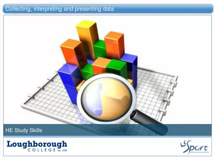
Collecting, interpreting and presenting data. HE Study Skills. Learning Objectives. What will you be able to do after this session?. Students will be able to: Define what data is and what is involved in interpreting and presenting it Describe the research process

E N D
Collecting, interpreting and presenting data HE Study Skills
Learning Objectives What will you be able to do after this session? Students will be able to: Define what data is and what is involved in interpreting and presenting it Describe the research process Understand how to collect data effectively Present data effectively in figure and table form.
Interpreting and presenting data What is data? How is it collected? Data is a bank of information that has been collected. The collection of data should have a pre-defined purpose e.g. to determine how far players travel over the duration of a football match. Science tends to focus on empirical data, gathered by experiment not theory. In order to collate data research must be carried out, through a systematic investigation. There are two main types of research qualitative and quantitative, with the potential to produce different kinds of data. Interpreting data Presenting data In order to determine the value of the data it needs to be interpreted. This will almost always involve basic statistical analysis, with the view of undertaking more detailed analysis using software such as SPSS. More detailed information on statistics will be covered in research project modules, however this session aims to remind you of the basic concepts. In order to portray the data to others effectively it needs to be presented correctly. There are many things to consider including the figure type, table layout, decimal places, titles, units and the list continues. Data should only be presented in a graphical form if it demonstrates a pattern that cannot be seen clearly in text e.g. a curved line on a scatter graph.
Research What is research? Research a process to collect data so we discover new information and it occurs in all fields from beauty, food production to sports science. The fundamental research process Identify an innovative research question e.g. something that will aid to the field of knowledge and set a hypothesis (the proposed outcome) Plan the research design, intervention timings, subjects, data to be collected etc… Conduct the investigation Interpret the data to find out if there was a significant affect of the intervention, provide feedback to subjects and write up the investigation in the desired format e.g. journal article, newspaper review etc… A well respected and valuable research study will be well planned, controlled, contain suitable subjects and be interpreted /presented thoroughly and correctly. Although it is hoped the hypothesis will be accepted, especially as many cases thousands of pounds have gone into designing and carrying out the research, successful research do not always have to show desired outcome. Whatever the outcome it is still extending our knowledge base in the dynamic field of science. NB – If the hypothesis is accepted it does NOT mean you have generically proved it across all subject groups etc…Research is extremely specific as should your interpretation and results stated be.
Qualitative vs. Quantitative research Types of research There are two main types qualitative and quantitative and the table show identifies some of the clear differences.
Ways to carry out research Research techniques There are common ways to collect each type of data but it must be remembered that a particular method can contain both types e.g. an interview may have open ended and closed numerical questions.
Considerations when collecting data Will the data add value to your investigation? For example when looking a self-confidence does diet need recording? Can the data be analysed easily? Can you use one method? Considerations when collecting data Will the subjects stay motivated throughout the data collection phase? Is it realistic? Do you have enough investigators and subjects to help you? You will only get data you set out to collect so plan carefully! You cannot go back and get the subjects feelings or outputs at the time!
Interpreting data – the basics Table 1. Beijing Olympics 2008 – Medal table adapted from BBC Sport - Olympics Quantitative Using the amended final medal table from the 2008 summer Olympics, calculate the mean, median, mode and range. Use the definitions below to help. Jot down your answers to input into the quiz at the end of this session. Basic analysis can help describe the data set and help to identify what further analysis should be completed. Mean The average of a set of values. Add all values and divide by the total number Median A numerical value separating the higher half of a sample by the lower half. Mode The value that appears most often in a data set. Range An indication of how disperse the data is, from the smallest to largest number.
Interpreting data – the basics Qualitative Answer the following questions: - 1. Did you play for a sports team when you were a child? Yes No 2. How did you travel to training? Car ____ Train ____ Bike ____ Bus ____ Walk ____ E.g. If the answer to Q1 Is Y it would be coded as 1 and N would be 0. For Q2 only the form of transport ticked would get a 1. The others would be a 0. Each question will need coding differently, so when planning the questionnaire be sure you know how to code it. Remember that open ended questions such as how did you get to training, complicates the question and may not get the answer in the format you require. How would you analysis this type of data? There are many types of questions that can be used from categorical, continuous, discrete or nominal data. In order to analyse it effectively you need to ‘code’ the data and input it into an excel document. Most data is categorical and from this you need to assign a numerical value.
Qualitative Data What next? Once the questionnaire has be coded you still need to present the data in some way. When coding may be able to work out percentages of respondents in a particular way that can be shown in a pie chart for example. You can also just report the findings in writing as part of the results and discussion section of reports. Plan the questionnaire – make sure it will tease out the answers you need to allow you to analysis it effectively. Test the questionnaire – this can be on a peer or someone else not participating in the real study. Code the questionnaire clearly, do not rush the process as errors can occur. Present the data and ask a subject specialist for advice if you are unsure. Key points
Presenting data Things to consider There are numerous ways to present data, from different figure types, tables, images, schematics etc… the skill is in choosing the right one. To do this you need to consider many things. • The expected trend of the data • The types/number of data points • The sensitivity of the data • The value of graphical outputs compared to text • The media format e.g. Journal, poster or presentation • The audience As well as choosing the correct type you need to ensure you are formatting the data correctly. This makes the figures clear and self-explanatory. A figure should contain all the supporting details without the reader referring to the text to include subject number, brief protocol description, statistical significance.
Formatting figures Figures In a range of subjects you are likely to need to present data in both figures and tables. This section will show you how to present the perfect figure and the things you need be aware of in order to do this. • Things to consider • Borders? • Titles ? • Decimal places? • Units? • Axis? • Gridlines? • Colours/Black & White? • Extrapolating data? • Best fit lines? • Joining points? • The solutions • Remove all borders • No titles – just a figure legend needed • Should meet those when the data was collected • Must be included on axis labels • Must be labelled and in intervals relating to data collection e.g. every 5 min • Remove all gridlines • Should be black and white, colour can be used in posters and PowerPoints. • Avoid this unless required specifically • Only include if you are sure of the expected relationship • Only do this if there is an expected relationship
How to present a figure Formatting figures Below is a correctly formatted figure and figure legend. In this case there was no statistical significance report but if this was available a P value would be expected at the end of the figure legend.
Referring to figures • Figures are different to figures and should be treated as so when referring to them in the text and contents page. Just follow the 5 key rules in green to the right. Further explanation is below. • Figures should be labelled in numerical order in the order they appear in the text. • The figure legend should be informative, but short. Do not waste words by saying this figure shows. • The legend should give the reader enough details to interpret the figure without having to read the text. Standard information includes the number of subjects (n=x) and any explanation of statistical analysis e.g. P>0.05 or P<0.05. • The figure legend should sit BELOW the figure, as you read figures from the below up (i.e. from the x axis). • In the text if the data in the figure is being quoted/explained you should always refer to the respective figure e.g. (Figure, 1). 1. Label your figures – Figure 1, Figure 2, Figure 3 etc… 2. The legend should NOT start this figure shows…we know it is a figure! 3. The legend should NOT repeat any data in the figure, it is just a brief description of what the table is showing. 4. The legend should be placed below the figure 5. In the text refer to the figure as the following (Figure, 1).
Formatting figures and tables Tables This section will show you how to present the perfect table (Table, 1) and the things you need be aware of in order to do this. Table 1. Subject (n=5) characteristics for sedentary participants prior to completing a 6 month upper body resistance training programme. There are three different types of skill: Intellectual / cognitive skills involve use of a performer's mental ability, e.g. a coach planning tactics before the game Perceptual skills involve the interpretation of information, e.g. looking at the positions of your team players in order to decide where to pass the ball Motor skills relate to the execution of physical movements and responses, e.g. performing a tennis serve
Creating tables Units are given for every measure No horizontal lines breaking up the data set Horizontal lines only What are the key features of the table on the previous slide? An informative legend at the TOP of the table No units on the values in the table Black and white Consistent approach in the number of decimal places used
Referring to tables • Tables are different to figures and should be treated as so when referring to them in the text and contents page. Just follow the 5 key rules in green to the right. Further explanation is below. • Table should be labelled in numerical order in the order they appear in the text. Also ONLY label tables tables! • The table legend should be informative, but short. Do not waste words by saying this table shows. If it is correctly labelled and formatted it will be clear you are describing a table. • The legend should be a brief description of what the table is showing but NOT repeat any of the contents. It should also include the number of subjects (n=x) and any explanation of statistical analysis e.g. P>0.05 or P<0.05. • The table legend should sit ABOVE the table, as you read tables from the top (i.e. the row headers). • In the text if the data in the table is being quoted/explained you should always refer to the respective table e.g. (Table, 1). 1. Label your tables – Table 1, Table 2, Table 3 etc… 2. The legend should NOT start this table shows…we know it is a table! 3. The legend should NOT repeat any data in the table, it is just a brief description of what the table is showing. 4. The legend should be placed above the table 5. In the text refer to the table as the following (Table, 1).
Task Creating the perfect table and figure. Summary sheet Now you are aware of the guidelines in place to create the perfect table and figure you need to know how to produce them in excel/word. Using the data in excel spreadsheet below create the perfect table and figure. Remember to use the help sheets if you get stuck and follow all of the guidance CAREFULLY Creating the perfect table and figure - Excel document Summary sheet – to help you with the task above and for future reference refer to the quick tips sheet below. ò ò ò Quick tips when presenting data Microsoft Office Excel Help
Reflect on the Learning Objectives Can you? Define what data is and what is involved in interpreting and presenting it Describe the research process Understand how to collect data effectively Present data effectively in figure and table form.
End of collecting interpreting and managing data topic ò Image owned by Loughborough College Further Readings Well Done, you have completed the end of collecting interpreting and managing data topic. For further readings and activities click on the link below