Download
1 / 38
380 likes | 526 Vues
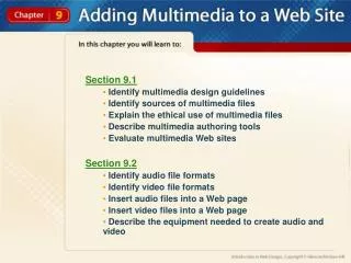
Design Guidelines for Multimedia. General Guidelines for Designing Presentations, Web Pages, and Other Types of Multimedia. Underlining. Never use underlining unless it signifies a hyperlink. Google. Alternate Forms of Emphasizing T ext. Color and/or Bold Highlighting Italicizing Size

E N D
Design Guidelines for Multimedia General Guidelines for Designing Presentations, Web Pages, and Other Types of Multimedia
Underlining Never use underlining unless it signifies a hyperlink. Google
Alternate Forms of Emphasizing Text Color and/or Bold Highlighting Italicizing Size Animation CAPS
Hyperlinks 2. If you decide to hyperlink a graphic, it should be obvious that the graphic is a link. If it is not, then you need to insert a text message indicating that the graphic links to another web page. Click here to go to Cakes.com!
Font 3. Keep thenumberof fontvariations ononeweb page totwo or possiblythree. This includesfont type, color, and size.
Text 4. Be aware of color conflicts so that text is readable. Can you see me????? Can you see me?????
Hyperlinks 5. Blueis a standard color for hyperlinks. Although you may change the color of hyperlinks, you should avoid blue text since it signifies hyperlinks. Click me. I’m fun too. Haha – nothing on this page is linked…fooled you!
Display 6. When your multimedia will be displayed on a computer, use a light background with dark text. When your multimedia will be presented on a projection system, use a darker background with lighter text. A good way to remember this is that many web sites have a white background with black text whereas a common combination of colors for a projected PowerPoint presentation is a darker blue background with white or yellow text. Bad Example Good Example
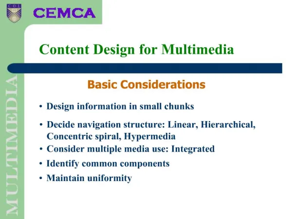
Graphics 7. Although graphics may be used for cosmetic purposes, consider using graphics that reinforce the content.
This is a bad example… In modern astronomy, a constellation is an internationally defined area of the celestial sphere. These areas are grouped around asterisms (which themselves are generally referred to in non-technical language as "constellations"), which are patterns formed by prominent stars within apparent proximity to one another on Earth's night sky.
This is a good example… At 11.40 pm (ship's time), lookout Frederick Fleet spotted an iceberg immediately ahead of Titanic and alerted the bridge. First Officer William Murdoch ordered the ship to be steered around the obstacle and the engines to be put in reverse, but it was too late; the starboard side of Titanic struck the iceberg, creating a series of holes below the waterline. Five of the ship's watertight compartments were breached. It soon became clear that the ship was doomed, as she could not survive more than four compartments being flooded. Titanic began sinking bow-first, with water spilling from compartment to compartment as her angle in the water became steeper.
Aesthetics 8. Avoid clutter on multimedia creations. Click me.
Aesthetics Continued 9. Limit the amount of text on presentations.
This slide has too much text • The Holocaust (from the Greek ὁλόκαυστος holókaustos: hólos, "whole" and kaustós, "burnt"),[2] also known as the Shoah (Hebrew: השואה, HaShoah, "catastrophe"; Yiddish: חורבן, Churben or Hurban,[3] from the Hebrew for "destruction"), was the genocide of approximately six million European Jews during World War II, a programme of systematic state-sponsored murder by Nazi Germany, led by Adolf Hitler, throughout Nazi-occupied territory.[4] Of the nine million Jews who had resided in Europe before the Holocaust, approximately two-thirds perished.[5] In particular, over one million Jewish children were killed in the Holocaust, as were approximately two million Jewish women and three million Jewish men.[6][7] • Some scholars maintain that the definition of the Holocaust should also include the Nazis' genocide of millions of people in other groups, including Romani, communists, Soviet prisoners of war, Polish and Soviet civilians, homosexuals, people with disabilities, Jehovah's Witnesses and other political and religious opponents, which occurred regardless of whether they were of German or non-German ethnic origin.[8] This was the most common definition from the end of WWII to the 1960s.[8] Using this definition, the total number of Holocaust victims is between 11 million and 17 million people.[9] • The persecution and genocide were carried out in stages. Various laws to remove the Jews from civil society, most prominently the Nuremberg Laws, were enacted in Nazi Germany years before the outbreak of World War II. Concentration camps were established in which inmates were subjected to slave labor until they died of exhaustion or disease. Where Germany conquered new territory in eastern Europe, specialized units called Einsatzgruppen murdered Jews and political opponents in mass shootings. The occupiers required Jews and Romani to be confined in overcrowded ghettos before being transported by freight train to extermination camps where, if they survived the journey, most were systematically killed in gas chambers.
Holocaust • 1936-1945 • Third Reich • Genocide of 6 million Jews • Nuremberg laws – multiple stages • Others were also persecuted: • Gypsies • Homosexuals • Communists • Disabled
Varied Platforms 10. Test web pages on both PC and Mac platforms and various browsers (Explorer, Firefox, Chrome, Safari, etc). Click here to test your website on multiple browsers at once.
Tutorials 11. On user controlled tutorials, provide directions for navigation at the beginning of the program. Click this button to take you to the next slide. Click this button to take you to the previous slide. Click this button to take you to the home slide.
Buttons 12. Not all users may understand the direction of graphic buttons. When using buttons for navigation, also add text to each button indicating the direction of navigation. This button takes you to the previous slide. Wait…what?
Sound Effects 13. Avoid extraneous and unnecessary sound effects and music unless they enhance the user's experience. This one was on the 2009 30 top website fails for design, but will hurt multiple senses– prepare yourselves…
Animations 14. Avoid the use of excessive animations unless they enhance the content. Click the picture for an example.
Transitions 15. Avoid the use of numerous types of transitions. Be consistent with a few types.
Transitions Continued 16. Transitions should compliment the direction of navigation.
Design 17. Be consistent in design throughout a presentation or web site. Titles, navigation indicators, text areas, etc., should be consistently located. This current presentation is an excellent example of good design This one, is not.
Design Continued 17. Be consistent in design throughout a presentation or web site. Titles, navigation indicators, text areas etc. should be consistently located. This is a good example. What’s going on here?
Design Continued 18. If using buttons, they should be the same size and in the same exact location for all slides or web pages.