Download
1 / 9
90 likes | 194 Vues
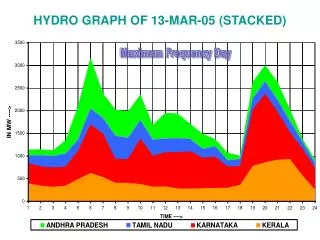
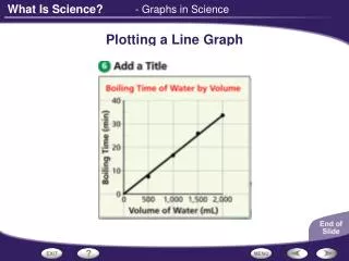
Creating a Stacked Line Graph. Pages 54 - 55. I can…. Understand the trends in immigration to Canada’s population growth and, how and why it is changing. Create, interpret and use combination bar/line graphs. Demographic Impact of Immigration (2010 – 2050).

E N D
Creating a Stacked Line Graph Pages 54 - 55
I can… • Understand the trends in immigration to Canada’s population growth and, how and why it is changing. • Create, interpret and use combination bar/line graphs.
Demographic Impact of Immigration (2010 – 2050) eg; The highest value on the table will be ; 124.9 + 192.8 = 317.7 317.7 • The range of values for the entire table is: • 317.7 • -103.5 • 421.2 • This value will help us set up the y-axis in the next step. Calculate Population Growth data column by adding Nat. Increase and Net Migration. eg; The lowest value on the table will be ; -103.5 (Source: Statistics Canada)
Standard Sheet of linear X linear graph paper 33 boxes 42 boxes
Draw a tick mark every 2nd square. • The range of values for the entire table is: • 317.7 • -103.5 • 421.2 • This value will help us set up the y-axis. Starting from the base, label the marks as -120 , -80, -40, 0 etc… to 320 Locate the base of the y-axis at 4 squares up and 1 square in and draw a line of 22 squares Etc… 0 -40 -80 Don’t forget to identify the units on the y- axis! -120
Starting at 0 draw an x-axis completely across the paper Place a tick mark on the x-axis every 2nd square. 0 -40 At the base of the graph label every 5th mark as ‘10, ’20, ’30 etc… to ‘50 -80 -120 ‘10 ‘20 ‘30 Don’t forget to identify the units on this axis!
Line with “orange” fill below Line with “yellow” fill below Place a tick mark every 5th horizontal square and label every 2nd mark as ‘10, ’20, ’30 etc… to ‘50 Bars 0 0 -40 -40 -80 -80 -120 -120 ‘10 ‘10 ‘20 ‘20 ‘30 ‘30
Add a title which reflects content of the graph Add a legend which explains the meaning of each of the colours used. Place a tick mark every 5th horizontal square and label every 2nd mark as ‘10, ’20, ’30 etc… to ‘50 0 0 -40 -40 -80 -80 -120 -120 ‘10 ‘10 ‘20 ‘20 ‘30 ‘30 Source Author