Download
1 / 22
220 likes | 333 Vues
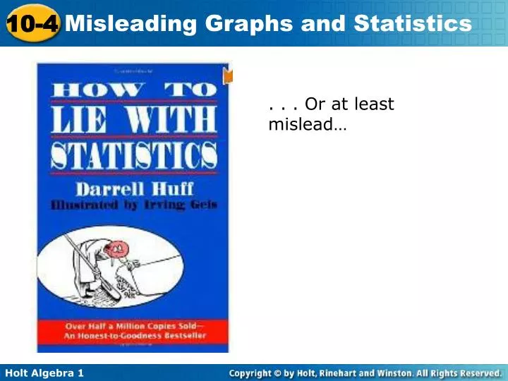
. . . Or at least mislead… . Can you spot the lie (deception)?. Keep track of the deceptions, ways in which the data is misleading, on your handout. Objectives. Recognize misleading graphs Identify and describe sources of bias and its effect Draw conclusions from data . Vocabulary.

E N D
Can you spot the lie (deception)? Keep track of the deceptions, ways in which the data is misleading, on your handout
Objectives Recognize misleading graphs Identify and describe sources of bias and its effect Draw conclusions from data
Vocabulary random sample Bias Deceiving/misleading
Graphs can be used to influence what people believe. The way data is displayed can influence how the data is interpreted.
% Example 1A: Misleading Bar Graphs The graph shows customer satisfaction with different brands. Explain why the graph is misleading. The scale on the vertical axis starts at 76. This exaggerates the difference’s between the sizes of the bars.
% Someone might believe that the satisfaction with brand B is significantly higher than the other brands. It is only 3 points higher than brand D. Example 1B: Misleading Bar Graphs The graph shows customer satisfaction with different brands. What might someone believe because of the graph?
Check It Out! Example 1 Who might want to use the graph at right? Explain. Company D; the fertilizer from company D appears to be more effective than the other fertilizers.
Example 2A: Misleading Line Graphs The graph shows the amount of rainfall by year in a particular metropolitan area. Explain why the graph is misleading. The intervals on the vertical axis are not equal.
Someone might believe the amount of rainfall decreased the most between 1997 and 1998. However, the change between 1997 and 1998 was only 8 inches while the change between 1998 and 1999 was 10 inches. Example 2B: Misleading Line Graphs The graph shows the amount of rainfall by year in a particular metropolitan area. What might people be influenced to believe by the graph?
Possible answer: taxi drivers; the drivers could justify charging higher rates by using this graph, which seems to show that gas prices have increased dramatically. Check It Out! Example 2 Who might want to use the graph at right? Explain.
The sections of the graph do not add to 100%, so the expenditures are not accurately represented. Example 3A: Misleading Circle Graphs The graph shows the allocation of the county budget for 2005. Explain why the graph is misleading.
Someone might believe that road maintenance takes more than 50% of the budget. Example 3B: Misleading Circle Graphs The graph shows the allocation of the county budget for 2005. What might people be influenced to believe by the graph?
Check It Out! Example 3 Who might want to use the graph at right? Explain. Smith: Smith might want to show that he or she got many more votes than Atkins or Napier.
Statistics can be misleading because of the way the data is collected or the way the results are reported. A random sample is a good way to collect unbiased data. In a random sample, all members of the group being surveyed have an equal chance of being selected. If a sample is not random, we say it may be biased.
Example 4: Misleading Statistics A study of 5 households found the following number of pets per household: 2, 1, 1, 9, and 2. Explain why the following statement is misleading: “The average household has 3 pets.” The sample size of 5 households is too small to achieve accurate results. This sample implies that each household has pets when many probably do not.
Check It Out! Example 4 A researcher asks 4 people if they have seasonal allergies. Three people respond yes. Explain why the following statement is misleading: “75% of people have seasonal allergies.” The sample size is much too small.
A reporter asks people he/she personally knows A TV show counts the votes of people who call/text in
Lesson Quiz: Part I 1. Explain why each graph is misleading. The scale exaggerates the differences between the sitting fees; someone might believe that studio Z charges much less than its competitors.
Lesson Quiz: Part II 2. Explain why the graph is misleading. The vertical scale extends well below the data set; the number of members did not vary much throughout the year.
Lesson Quiz: Part III 3. Explain why the graph is misleading. The sectors do not add to 100%; Someone might believe that Gutierrez would receive most votes.
Lesson Quiz: Part IV 4. A researcher asks 5 people if they like to snow ski. Four people respond yes. Explain why the following statement is misleading: “80% of people like to snow ski.” Only 5 people were asked whether they liked to snow ski. The sample is too small.