Download
1 / 45
450 likes | 457 Vues
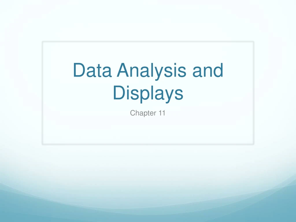
Data Analysis and Displays. Chapter 11. Measures of Center and Variation. I can compare the mean, median, and mode of a data set. Measures of Center and Variation. Vocabulary (page 330 in Student Journal) m easure of center : a measure that represents a typical value of a data set

E N D
Data Analysis and Displays Chapter 11
Measures of Center and Variation I can compare the mean, median, and mode of a data set.
Measures of Center and Variation Vocabulary (page 330 in Student Journal) measure of center: a measure that represents a typical value of a data set mean: the sum of the data divided by the number of data values median: the middle number when the values are written in numerical order mode: value that occurs most often outlier: a data value that is far removed from the other values
Measures of Center and Variation Example (page 332 in Student Journal) Consider the data set: 2, 5, 16, 2, 2, 7, 3, 4, 4. #1a) Find the mean, median, and mode of the data set. #1b) Determine which measure of center best represents the data. Explain.
Measures of Center and Variation Solutions #1a) mean: 5, median: 4, mod: 2 #1b) median due to the outlier
Measures of Center and Variation I can find the range and standard deviation of a data set.
Measures of Center and Variation Vocabulary (page 330 in Student Journal) measure of variation: a measure that describes the spread (distribution) of the data set range: the difference of the greatest value and the least value in the data set (max – min) standard deviation: a measure of how much a typical value in the data set differs from the mean
Measures of Center and Variation Examples(page 333 in Student Journal) #3) Find the range of the heights for each team. #4a) Find the standard deviation for Team A. #4b) Find the standard deviation for Team B. #4c) Compare the standard deviations. What can you conclude?
Measures of Center and Variation Solutions #3) Team A: 30, Team B: 21 #4a) 8.7 #4b) 6.4 #4c) Team A’s standard deviation is greater so the heights very more on that team than Team B.
Measures of Center and Variation I can identify the effects of transformations on data.
Measures of Center and Variation Vocabulary (page 330 in Student Journal) data transformation: a procedure that uses a mathematical operation to change a data set into a different data set
Measures of Center and Variation Core Concepts (page 332 in Student Journal) Data Transformation Using Addition When a number is added to each value in the data set the measures of center of the new data set increase by the amount added, but the measures of variation stay the same. Data Transformations Using Multiplication When a number is multiplied to each value in the data set the measures of center and the measures of variation of the new data set can be found by multiplying the original measures by the number each value was multiplied by.
Measures of Center and Variation Examples (page 333 in Student Journal) #5) Find values of the measures when each value in that data set increases by 8. Mean: 42 Median: 40 Mode: 38 Range 15: Standard Deviation: 4.9
Measures of Center and Variation Solutions #5) Mean: 50 Median: 48 Mode: 46 Range: 15 Standard Deviation: 4.9
Box-and-Whisker Plots I can use box-and-whisker plots to represent data sets.
Box-and-Whisker Plots Vocabulary (page 336 in Student Journal) box-and-whisker plot: shows the variability of a data set using the least value, greatest value, and quartiles quartile: divide the data set into 4 equal parts five-number summary: the 5 numbers that make up a box-and-whisker plot (min, Q1, median, Q3, max) interquartile range (IQR): a measure of variation for the data set, which can be found by the difference of the 3rd and 1st quartiles (Q3 – Q1)
Box-and-Whisker Plots Core Concepts (page 337 in Student Journal) Shapes of Box-and-Whisker Plots skewed left: left whisker is longer than right, majority of data is on the right side symmetric: the whiskers are about the same length, majority of data is in the middle skewed right: the right whisker is longer than the left, majority of data is on the left side
Box-and-Whisker Plots Example (page 337 in Student Journal) #1) Make a box-and-whisker plot of the data, which represents hours of sleep. 7, 9, 8, 8, 8, 6, 6, 5, 4
Box-and-Whisker Plots Solution #1)
Box-and-Whisker Plots Example(page 338 in Student Journal) #4 a) Identify the shape of each distribution. b) What state’s data is more spread out? c) Which state had the least number of tornado’s in a month?
Box-and-Whisker Plots Solution #4 a) State A is symmetric and State B is skewed right b) State B c) State A
Shapes of Distributions I can describe the shapes of data distributions.
Shapes of Distributions Vocabulary (page 341 in Student Journal) histogram: a bar graph that shows the frequency (amount) of data values in intervals of the same size frequency table: a table that shows the frequency (amount) of data values in intervals of the same size
Shapes of Distributions Core Concepts (pages 341 and 342 in Student Journal) Symmetric and Skewed Distributions skewed left: the tail of the graph extends to the left, majority of data is on the right side symmetric: the left and right tails are approximately mirror images of one another, majority of data is in the middle skewed right: the tail of the graph extends to the right, majority of data is on the left side
Shapes of Distributions Choosing Appropriate Measures symmetric distributions: use the mean as the measure of center and the standard deviation as the measure of variation skewed distributions: use the median as the measure of center and the 5-number summary to describe the variation
Shapes of Distributions Example (page 342 in Student Journal) #1 a) Display the data in a histogram using 6 intervals. b) Which measures best represent the data? c) A weather station lists the top 20 snowiest cities with the 20th city having a snowfall of 51 inches. How would you interpret this?
Shapes of Distributions Solution #1 a) b) median and 5-number summary c) most cities from our data were not on that list
Shapes of Distributions Example (page 343 in Student Journal) #2) Compare the distributions using their shapes and the appropriate measures of center.
Shapes of Distributions Solution #2) City B typically has greater monthly precipitation with City A’s precipitation varying more each month.
Choosing a Data Display I can choose an appropriate data display based on the data.
Choosing a Data Display Vocabulary (page 351 in Student Journal) qualitative (categorical) data: consists of labels and non-numerical entries that can be placed into groups or categories quantitative data: consists of numbers that represent counts or measurements
Choosing a Data Display Core Concepts (space on page 351 in Student Journal) Common Qualitative Displays bar graph pictograph circle graph (pie chart) Common Quantitative Displays scatter plot stem-and-leaf plot dot plot line graph box-and-whisker plot histogram
Choosing a Data Display Examples (page 352 in Student Journal) Tell whether the data are qualitative or quantitative. Explain! #1) bookmarks in your web browser #2) heights of players on the basketball team
Choosing a Data Display Solutions #1) qualitative, nonnumeric #2) quantitative, measured
Choosing a Data Display Example (page 353 in Student Journal) Describe how the graph is misleading. #7)
Choosing a Data Display Solution #7) the x-axis is not scaled at equal intervals
Two-Way Tables I can make two-way tables.
Two-Way Tables Vocabulary (page 346 in Student Journal) two-way table: a frequency table that displays data collected from 1 source that belongs to 2 different categories joint frequency: each entry in a two-way table marginal frequency: the sums of the rows and columns in a two-way table
Two-Way Tables joint relative frequency: the ratio of the joint frequency to the total number of observations marginal relative frequency: the ratio of the marginal frequency to the total number of observations conditional relative frequency: the ratio of a joint relative frequency to a marginal relative frequency
Two-Way Tables Examples (page 347 in Student Journal) #1) Find and interpret the marginal frequencies.
Two-Way Tables Solution #1)
Two-Way Tables Example #3)
Two-Way Tables Solution #3)
Two-Way Tables Example (page 348 in Student Journal) #4) Make a two-way table that shows the joint and marginal relative frequencies.
Two-Way Tables Solution #4)