Download
1 / 37

E N D
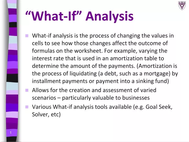
“What-If” Analysis • What-if analysis is the process of changing the values in cells to see how those changes affect the outcome of formulas on the worksheet. For example, varying the interest rate that is used in an amortization table to determine the amount of the payments. (Amortization is the process of liquidating (a debt, such as a mortgage) by installment payments or payment into a sinking fund) • Allows for the creation and assessment of varied scenarios – particularly valuable to businesses • Various What-if analysis tools available (e.g. Goal Seek, Solver, etc)
Goal Seeking (1) • Goal Seek is part of a suite of commands called What-If Analysis tools. • When you know the desired result of a single formula but not the input value the formula needs to determine the result, you can use the Goal Seek feature available by clicking What-If Analysis in the Data Tools section of the Data tab on the Ribbon • When goal seeking, Microsoft Excel varies the value in one specific cell until a formula that's dependent on that cell returns the result you want.
Goal Seeking (2) • For example, Goal Seek can be used to change the interest rate in cell B3 incrementally until the payment value in B4 equals $900.00.
Goal Seeking (3) • In the Set cell box, enter the reference for the cell that contains the formula • In the To value box, type the formula result that you want. In the example below this is 5000 • In the By changing cell box, enter the reference for the cell that contains the value that you want to adjust. In the example, this reference is cell B3.
Section 6 – Multiple worksheets • Worksheets are displayed as tabs at the bottom of the workbook, and named by default sheet 1, sheet 2, etc.
Naming tabs • Right-clicking on one of these tabs brings up a menu that allows you to: • Insert a new (extra) worksheet • Remove (Delete) a worksheet • Rename a worksheet • Move or Copy a worksheet • Select All worksheets (which would be useful if you wanted to make a universal change e.g. to set one font for all sheets). • Change the Colour of the worksheet tabs
3D References • 3D references are references to data on worksheets other than the active worksheet. In other words if you are working on Sheet 2, any references to cells on Sheet 1 or Sheet 3 etc will be 3D references • In a 3D reference, the first part of the reference is the worksheet name, followed by an exclamation mark • The remaining part is the cell reference within that worksheet • E.g. Sheet1!B12 refers to cell B12 on Sheet 1
Section 7 – Charts and Graphs • Tools for creating charts and graphs are available from the Charts section of the Insert tab of the Ribbon
Which Chart? (1) • Column Chart/Bar charts • show the relationship of data • useful for comparison of discrete measurements made at regular intervals. For example, if you were counting people entering a building, you might use a column chart to show count totals for a series of days or weeks. To display data from several buildings you could use a stacked column chart, where figures for each building are shown as a part of the total column count. • A column chart has time on the horizontal x-axis whereas bar chart has time on the vertical y-axis. http://www.windmill.co.uk/xlchart.html
Which Chart? (2) • Pie Charts – show the relationship of parts to a whole
Which Chart? (3) • Line charts show a trend over a period of time • Scatter charts do this too, but plot X against Y values, showing more precisely the relationship between two categories of data. • You would usually use Scatter chart in preference to a Line chart. An independent variable is plotted on the x-axis and variables dependent upon this plotted on the y-axis. Adding a trend line shows the relationship between the variables. • With Line charts the x values are more like labels than values. They are spaced equally, no matter what their value, meaning that the shape of the graph can be misleading http://www.windmill.co.uk/xlchart.html
Steps in creating a chart (1) • Highlight your data (from top left to bottom right) and select the type of chart you want from the Charts group of the Insert tab of the Ribbon
Steps in creating a chart (2) • Excel immediately inserts a chart
Steps in creating a chart (3) • Check your data range and the general shape of your chart. If it seems terribly wrong, check whether you chose an appropriate chart type. • When you click on the chart a Chart Tools section appears on the Ribbon • Charts can be moved and resized using sizing handles
Steps in creating a chart (4) • 3 tabs – Design, Layout and Format
Steps in creating a chart (5) • You can change the chart type from the Design tab of Chart Tools
Steps in creating a chart (6) • Position the legend: Chart Tools Layout tab Legend
Steps in creating a chart (7) • You can edit the chart’s title or add one in: Chart Tools Layout Chart Title
Steps in creating a chart (8) • Set up Data Labels (values, percentages, etc): Chart Tools Layout Data Labels
Steps in creating a chart (9) • Option to display data Table: Chart Tools Layout Data Table
Steps in creating a chart (10) • To place the chart in a completely separate sheet, select Move Chart from the Location group of Chart Tools
Editing/Customising Charts • Once you have created the chart, it is possible to make changes, resize it like a picture, etc • Clicking on an aspect once selects it; double-clicking it opens a dialog box for that specific aspect in which you can make formatting changes
Other charts • Various other chart options for specialised functions • Experiment with the different types by looking them up in the Help system and trying out the examples. Familiarise yourself with charts commonly used in your discipline
Commonly Used Functions -Financial Functions (1) Terminology • Present Value, (PV) –The amount you have to start with, an initial deposit or loan etc • Future Value (FV) – The end amount after a specified number of time periods • Payment (PMT) – a regular payment made at exact points in time e.g. monthly or annually • Interest Rate, as a % per period e.g. 10% per year (RATE) • Number of Time Periods, measured in years (NPER) • Type (Type) – use 0 if type is “in arrears” and 1 if type is “in advance” or “annuity due”
Commonly Used Functions -Financial Functions (2) • =FV(rate, nper, pmt, pv, type) • Displays the future value of a series of equal payments (3rd argument) at a fixed rate (1st argument), for a specified number of periods (2nd argument). (The 4th and 5th arguments are optional.) • E.g. How much does the total of 5 R100 payments accumulate to at the end of 5 years if you earn a rate of 8% interest per year? • =FV(0.08,5,100)
Commonly Used Functions -Financial Functions (3) • =PV(rate, nper, pmt, fv, type) • Displays the present value of a series of equal payments (3rd argument) at a fixed rate (1st argument), for a specified number of periods (2nd argument). (The 4th and 5th arguments are optional.) • E.g. If I have R10 573.45 in my account and I’ve earned 1% interest per month for 12 months, what was my original deposit? • =PV(1%,12,0,10573.45)
Commonly Used Functions -Financial Functions (4) • =PMT(rate, nper, pv, fv, type) • Displays the payment per period needed to repay a loan (3rd argument), at a specified interest rate (1st argument), for a specified number of periods (2nd argument). (The 4th and 5th arguments are optional.)
Commonly Used Functions -Financial Functions (5) • Make sure that you are consistent about the units you use for specifying rate and nper. • If you make monthly payments on a four-year loan at 12 percent annual interest, use 12%/12 for rate (to get the interest per month) and 4*12 for nper (48 months). • If you make annual payments on the same loan, use 12% for rate and 4 for nper.
Commonly Used Functions -Financial Functions (6) • Try one! If I borrow R1000 for 3 years at 7% interest, how much will I have to pay back? • = FV(rate, nper, pmt, pv, type) • Type is 0 because you are in arrears, i.e. needing to pay the money back • =FV(7%, 3, 0, 1000, 0)