Download
1 / 67
870 likes | 1.73k Vues
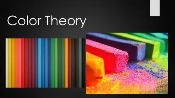
COLOR THEORY. What is color theory and why is it important?. COLOR THEORY. What is color theory and why is it important? Color has three aspects the artist needs to be fluent in (especially in today’s media based culture... Physical aspect Psychological aspect Chemical aspect.

E N D
COLOR THEORY What is color theory and why is it important?
COLOR THEORY What is color theory and why is it important? Color has three aspects the artist needs to be fluent in (especially in today’s media based culture... Physical aspect Psychological aspect Chemical aspect
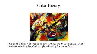
Color Study Color has been the object of study by scientists and thinkers for as long as man has been able to “think”. These are color diagrams purportedly created by Pythagoras based on mathematics and astrology.
Sir Isaac NewtonNewton is considered the father of scientific study of color. In 1676 he projected a beam of light through a prism, breaking it into a spectrum of different light wavelengths (or colors).It was Newton who gave the pure colors the name HUE.
Newton created this color chart (the first real “color wheel”) to organize his color spectrum.
James Clerk MaxwellIn the 1860’s, Maxwell created the idea of the electromagnetic spectrum (energy waves).The “visible light spectrum” is only a small portion of this wavelength.
Other wavelengths humans can see with help are the Infrared and Ultraviolet parts of the spectrum.
Additive Color (light) • The Primary Colors of light are red, blue and green and light is called the Additive System because when all the colors are added white is the result.
light vs. pigment • Since most artists find it impractical to paint with light… • It is important to understand the difference between the Additive and Subtractive types of color and how color works in relationship to pigments.
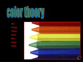
Subtractive Color gets its name from the way it interacts with light – it absorbs (or subtracts) light and color as you mix it. The three primaries used in mixing pigments are Red, Yellow and Blue. Primaries are the basic colors from which all others are created. If one of the primaries are missing then an entire range of colors cannot be created. Subtractive Color
Subtractive Color gets its name from the way it interacts with light – it absorbs (or subtracts) light and color as you mix it. Process, or printers colors use a different set of primaries. These are Cyan, Magenta and Yellow. When all three pigments are mixed black is the resulting color because it absorbs all of the spectrum. Subtractive Color
The interaction of pigment and light Light is both absorbed and reflected by the surface of objects. When an objects absorbs light, whatever light is reflected is what gives that objects its color. FOR EXAMPLE... An apple is red because it absorbs all the green and blue spectrum and reflects only the red light waves.
How does the eye see color? • The eye sees color by the use of Rod and Cones. • Rods see value (black and white). • Cones see color… • There are three types of cones, red, green and blue. • The specific wavelength of light will stimulate a specific set of cones, which will then stimulate the brain and produce a “color”. • This means light affects how we see color.
Local Color • Local Color is the color of a subject under normal daylight lighting conditions.
Subjective Color • Subjective Color is the color of a subject under unusual lighting conditions.
VALUE • Value is how light or dark an object is a color is, not its hue. • Value can be seen in terms of black and white.
Value in the real world… • Settings and scenarios in the real world have value… • Known as high key, middle key and low key
Find twelve black and white photographs that run the full gamut of the value scale (high key to low key).Create a twelve step value scale from these photographs.
Find examples of printed text that run the full gamut of the value scale (high key to low key) when seen as a body.Create a twelve step value scale from these pieces of text.
Creating depth with value • When creating the illusion of depth on objects within a given space or a landscape, objects are darker in value as they get further away. • This is because of cast shadows and reflected light.
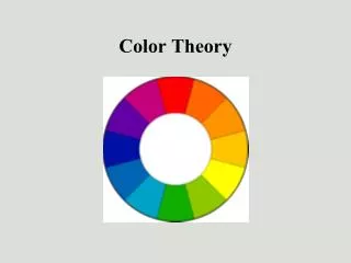
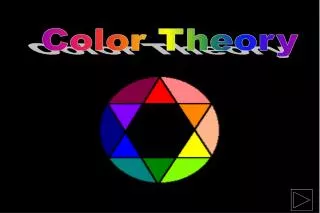
The Munsell Color Wheel • The traditional color wheel has only hue, no neutrals. • Black, Gray and White are called neutrals (or hue effectors) – they are not considered colors themselves. • To get the most out of your hue – you need both the color wheel and value.
The Basic Munsell system is what is taught at CF(and what is the most commonly used system).There can be many ways to set up the colors but all are basically the same.
Three primary colors from which all others are mixed.They are RED, BLUE and YELLOW.Three secondary colors, created from mixing two of the primaries.They are GREEN, ORANGE and PURPLE.Six tertiary (or intermediate) colors, made form mixing a primary and a secondary.They are RED-Purple, BLUE- Purple, BLUE-Green, YELLOW- Green, YELLOW-Orange and RED-Orange.How are they named?
The Munsell Color Tree (or solid)This tool breaks the colors into saturation (or chroma and value) scales.
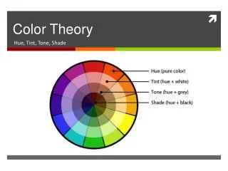
How the Color Solid works… • The color solid measures the properties of HUE. • HUE refers to the light wavelength and color to anything mixed from a HUE. • Lightness refers to the value of a color (also known as a tint or shade of a color). • Chroma refers to the saturation or amount of gray in a pure hue (also known as tone or intensity).
How the Color Solid works… • Notice that each value of a hue (tint or shade) has its own chroma (or tone) scale. • The further from the pure hue the value gets, the shorter the stretch from pure value to tint (a hue plus white) or shade (a hue plus black).
All other spectrums (that contain gray), no matter how fancy, break down into this basic system.
By learning to manipulate all these factors, the artist can create a great deal of mood, illusion and atmosphere with nothing else.
This weeks challenge… • Using your paints, create a traditional color wheel. • Mix your secondary colors, then tertiary colors.
LeonardoDaVinci was one of the first artists… (the first depending on what art historian you believe)… to make use of the idea of value to create depth in a landscape.Da Vinci called this “the perspective of disappearance” (and his explanation was complicated as all get out).
Atmospheric Perspective • As objects get further away, the atmosphere between us and “them” create the illusion that they are grayer and lighter in value than close objects.
The concept of “value depth” used in a piece of digital art…
You can also see the use of atmospheric perspective in DaVinci’s Last Supper.
VALUE DEPTHLets look at the way people read value as depth in the real world.Notice that the further away the objects, the lighter the value and lower the saturation.
Look at what happens to the lower saturations of green when the image is changed to grey scale.
If the values are reversed, the image doesn’t seem quite right.Here the lighter colors are in the area that should be closer and the layers don’t recede properly.
From photo’s to paintings…Notice the illusion of fog and the value change from the sand in the air.
The Hudson River School of painting.One of the most prolific and spectacular of all American realism movements.
Hudson River painters were masters of this illusion.They could manipulate value, intensity and color all at the same time.