1 / 6

Creating a Scatter Plot

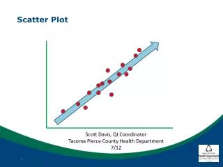
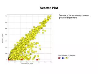
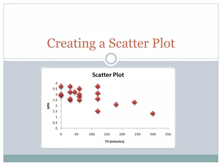
Creating a Scatter Plot. Create the chart. Highlight both variables, TV and GPA Insert  Scatter  2D Scatter. Add axes titles. Chart Tools  Layout  Axis Title Horizontal Axis  Below Axis  “TV (minutes)” Vertical Axis  Rotated Title  “GPA”. Delete Gridlines.

nicola
Télécharger la présentation

Creating a Scatter Plot

An Image/Link below is provided (as is) to download presentation Download Policy: Content on the Website is provided to you AS IS for your information and personal use and may not be sold / licensed / shared on other websites without getting consent from its author. Content is provided to you AS IS for your information and personal use only. Download presentation by click this link. While downloading, if for some reason you are not able to download a presentation, the publisher may have deleted the file from their server. During download, if you can't get a presentation, the file might be deleted by the publisher.

E N D

Presentation Transcript


  1. Creating a Scatter Plot

  2. Create the chart • Highlight both variables, TV and GPA • Insert  Scatter  2D Scatter

  3. Add axes titles • Chart Tools  Layout  Axis Title • Horizontal Axis  Below Axis  “TV (minutes)” • Vertical Axis  Rotated Title  “GPA”

  4. Delete Gridlines • Chart Tools  Layout  Gridlines  None

  5. Colors • Chart Tools  Design  Choose color

  6. Add Title • Chart Tools  Layout  Chart Title  Above Chart  Scatter Plot

More Related