Download
1 / 18
180 likes | 183 Vues
This exercise utilizes apparent solar transmission data from Mauna Loa Observatory in Hawaii for an interactive classroom exercise and follow-up assignment. Students work with the data to plot graphs and interpret trends, focusing on volcanic influences on climate.

E N D
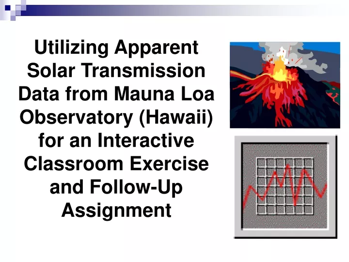
Utilizing Apparent Solar Transmission Data from Mauna Loa Observatory (Hawaii) for an Interactive Classroom Exercise and Follow-Up Assignment
Laura A. Guertin Earth Science Penn State University Delaware County Email: UXG3@PSU.EDU *The format for this exercise is a modification from Dr. Randall Richardson’s (Univ. of Arizona) homework problem using the global CO2 data set from Mauna Loa, Hawaii. Solar transmission values kindly provided by Dr. Ellsworth Dutton, NOAA/CMDL, Solar & Thermal Atmospheric Radiation.
Abstract • An interactive lecture and graphing exercise has been developed for an introductory-level physical geoscience course where students work with apparent solar transmission data. When lecturing on volcanism, I discuss volcanic influences on climate that can be seen in a Mauna Loa Observatory data set. Data has been compiled since 1958 of monthly averages of apparent solar transmission values which have been calculated from direct solar irradiance observations. • During a class period, students work in pairs plotting the apparent solar transmission value for a given month and year. Students graph the data on an overhead transparency sheet and answer a series of questions about trends and predictions for future data. All transparencies are overlain on an overhead projector. As a class we discuss features we see in the compiled graph, such as the notable decreases in the transmission values which they do not know at this point coincide to the timing of three major volcanic eruptions (Agung in 1963, El Chichon in 1982, Mount Pinatubo in 1991). • At the conclusion of the in-class exercise, students are required to type a summary explaining the graph. Students must clearly explain why there are the significant decreases in transmission. Students are asked if there are any other decreases in the transmission ratio they are surprised are not reflected in this global data, and they are required to use references to support their interpretations and discussion. The summary must also discuss Kilauea, and a statement as to why or why not the eruptions will be recorded in the solar transmission ratio data. • I use this exercise as the first where students work with graphing and interpreting a data set; consequently, student performance has been wide-ranging. Most groups accurately plot the data in class. Some students do not accurately correlate the dates of solar transmission decreases with volcanic eruptions. In addition, a number of students do not know how to apply what they have learned about Kilauea. Despite the range of student performance, this exercise serves as a valuable introduction to the global impact of physical processes and how to interpret that impact through working with data.
Mauna Loa Observatory “Mauna Loa Observatory is located on the Island of Hawaii at an elevation of 3397 m on the northern flank of Mauna Loa volcano. Established in 1957, Mauna Loa Observatory … is the site where the ever-increasing concentrations of global atmospheric carbon dioxide were determined. The observatory consists of 10 buildings from which up to 250 different atmospheric parameters are measured.” (images and text from http://www.cmdl.noaa.gov/obop/mlo/index.html)
Project Objective • Introduce students to the global impact of physical processes and how to interpret that impact through working with data
Why Do This? • Have students work with real-world data • Have students work on their graphing skills • Give students the opportunity to try to interpret variations in data, predict the causes and triggering mechanisms for these results
The Set Up • Have monthly average apparent solar transmission values on individual cards and separated into sets to distribute • Hand out formatted graph paper, transparency sheet, transparency marker
Hand Out • This exercise is about the “apparent” transmission, or transmission ratio, derived from direct • solar irradiance observations from the Mauna Loa Observatory in Mauna Loa, Hawaii. The • first part of the problem is meant to be done in class today. You may work on Part I in groups • today in class. After class today, please finish whatever parts are left on your own. • Number of points plotted: ___________ • BACKGROUND INFO • For approximately 45 years, measurements have been made at Mauna Loa, Hawaii, of the • atmospheric transmission of solar irradiation. Irradiance is the concentration of radiant power • striking a given plane (watts per m2). Solar irradiance provides the energy that powers the • Earth’s climate and biosphere. The variation of the total solar irradiance is an important study • area from the point of view of solar physics and because of the possible effect on the Earth’s • climate. Why do variations exist? Well, the data show that human activities do not affect these • values in the atmosphere on a global scale. Yet there are short-term fluctuations that do exist. • When do these occur and what are the causes? Time to investigate! • PART I • Plot the randomly selected data points at your table on the overhead sheet provided. • 2) Examine the graph you have just completed. Do you see any trends? Can you explain • anything about the graph? Any predictions for what the data values may be in the future? • Any data points that look like they might be in error? Describe as best you can.
Hand Out PART I (cont.) 3) When I give the signal, take the overhead sheet from your table and merge with the group sitting across the way. Overlay the two sheets. Identify the total # of points plotted with your graph and the new graph you just received: __________. Do you see any new trends? Can you add anything to your answer from before with just your data? Are there any predictions or descriptions you need to change? Any data points you think should be excluded? Describe this new graph as best you can. 4) Now, here comes the fun part… I will call for each overhead transparency sheet one at a time. Please bring the sheet to the front of the room when called. Let’s sit and stare at this compilation graph for a little bit…. OK, now let’s answer some questions as a group. 5) What are the dates of the first and last measurement? 6) What are the minimum and maximum transmission values, and at what dates do they occur? 7) When are there notable decreases in the transmission values? For how long do these departures from the “norm” occur?
Procedure • Give mini-lecture on solar transmission and Mauna Loa Observatory • Have students working in pairs to plot their piece of the data set • Then answer questions on the worksheet
Procedure • Have two individual groups merge into one • Overlay both transparency sheets • Answer additional questions on the larger data set
Procedure • Have students bring transparency sheets up to front of room, overlay one-by-one for the complete data set • Review graph as a class • Answer additional questions on worksheet
Atmospheric Transmission of Direct Solar Radiation (Mauna Loa, HI) Graph from http://www.cmdl.noaa.gov/star/mloapt.html
Assignment PART II (this time, you’re on your own!) TYPE a summary explaining the graph (approximately a full page, please) and be sure to answer the following: (1) Clearly explain why there are these significant decreases in transmission during certain dates/times. (2) Are there any other decreases in the transmission ratio you are surprised are not reflected in this data? Explain. (3) Also discuss Kilauea – do you think the most recent eruptions will be recorded in the solar transmission ratio data? Explain why/why not. Use any outside references necessary to support your interpretations and discussion. You may want to start by looking at the links I have placed on our course website.
Links Provided to Students • Mauna Loa Apparent Transmission http://www.cmdl.noaa.gov/star/mloapt.html • Volcanos and Climate http://www.cmdl.noaa.gov/star/volcano • Smithsonian Institution/Global Volcanism Program http://www.volcano.si.edu/gvp/ • VolcanoWorld http://www.volcanoworld.org/ • USGS Volcano Hazards Program http://volcanoes.usgs.gov/ • USGS – Intro to Kilauea Volcano, Hawaii http://hvo.wr.usgs.gov/kilauea/ • Mount Pinatubo: A Natural Climate Experiment (Geotimes, March 2002) http://www.agiweb.org/geotimes/mar02/geophen.html • Mt. St. Helens, 20 yrs. Later: What We’ve Learned (Geotimes, May 2000) http://www.geotimes.org/may00/featurestory.html • An Ozone-Depleting Volcano (Geotimes, August 2003) http://www.geotimes.org/aug03/geophen.html • Under the Volcano (Mt. Rainier) (Discover, November 1999) http://www.discover.com/issues/nov-99/features/underthevolcano1713/
Examples of Student Work • Students given 1-1/2 weeks to complete assignment outside of class • Samples of student submissions below
Grading Scheme for Volcano / Solar Transmission Exercise 95 - gives a thorough explanation for the causes of the variations, gives examples of what isn’t shown in the graph and why, clearly shows that student understands the significance and impact of this data, uses references beyond what is provided online, properly cites references, no spelling errors 85 - fully explains the causes for the variations in the graph, suggests what else student thought would be reflected in data, used references and properly cited, no spelling errors 75 - find the causes for the variation in the graph, used references and properly cited, no spelling errors 65 - incomplete answer as to what is causing variations in the graph, summary reflects lack of investigating outside information to explain answers, possible errors in citing references, possible spelling errors, hints of plagiarism 55 - extremely poor job, evident that this was a last-minute effort, information put down but not explained, references missing, possible spelling errors, hints of plagiarism
Student Comments • “I learned a lot about volcanoes doing this assignment… it was much better than a boring term paper.” • “I thought for sure that Mount Saint Helens affected the world...” • “It was fun doing an activity in class – we should do more!”