Download
1 / 18
180 likes | 682 Vues
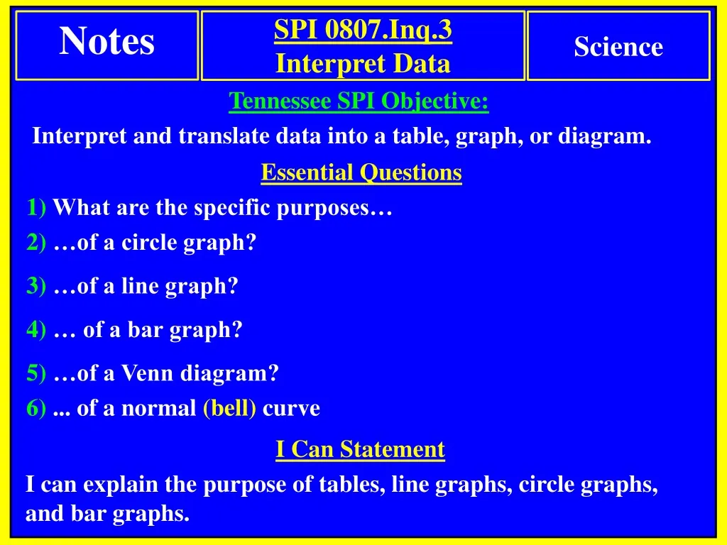
Notes. SPI 0807.Inq.3 Interpret Data. Science. Tennessee SPI Objective: Interpret and translate data into a table, graph, or diagram. Essential Questions 1) What are the specific purposes… 2) …of a circle graph? 3) …of a line graph? 4) … of a bar graph? 5) …of a Venn diagram?

E N D
Notes SPI 0807.Inq.3 Interpret Data Science Tennessee SPI Objective: Interpret and translate data into a table, graph, or diagram. Essential Questions 1) What are the specific purposes… 2) …of a circle graph? 3) …of a line graph? 4) … of a bar graph? 5) …of a Venn diagram? 6) ... of a normal (bell) curve I Can Statement I can explain the purpose of tables, line graphs, circle graphs, and bar graphs.
Different types of charts, tables, and graphs Data Tables • Tables are used to organize and display independent variable and dependent variable information/data. Dependent Variable Independent Variable
Different types of charts, tables, and graphs Pie Charts (circle graphs) • …are circular charts divided into sectors (slices). • Best used for comparing parts to a whole. • The total amount should equal 100%. • Works well for comparing 6 or fewer items, but more than six items becomes difficult to view and interpret.
Pie Chart/Circle Graph: Example Starts with data in a table like this Transfer the data into a circle graph like this Reminder: the sum of the sectors must equal 100% …is comparing parts to a whole, so a pie cart is best for this data. Parts: nitrogen, oxygen, other. Whole: Earth’s Atmosphere
Starts with data in a table like this Pie Chart/Circle Graph: Example Reminder: the sum of the sectors must equal 100% …is comparing parts to a whole, so a pie cart is best for this data. Transfer the data into a circle graph like this Parts: comedy, action, romance etc. Whole: types of movies
Different types of charts, tables, and graphs Line Graphs • …are used to display data that changes over time • Line graphs allow us to see overall trends such as an increase or decrease during a specific time period
SPI 0807.Inq.3: (Interpret Data) Line Graph: Example Notes Science Starts with data in a table like this …is not comparing parts to a whole, so a pie cart is NOT appropriate. Transfer the data into a line graph …is showing change over time, so a line graph works best for this data.
Different types of charts, tables, and graphs Bar Graphs • are used to compare categories of items (categorical data) …a visual display for comparing quantities in different categories • Bar graphs help us to see relationships quickly.
Bar Graph: Example Example: A survey of student's favorite after-school activities was conducted at school. This table shows the results …is not changing over time, so a line graph is NOT appropriate. …is not comparing parts to a whole, so a pie cart is NOT appropriate. …is comparing categories, so a bar graph works best for this data.
Different types of charts, tables, and graphs Venn Diagram • overlapping circles that show relationships between two or more topics/items. (most commonly used with 2 to 3 items.) Left Part of the Circle Right Part of the Circle Information here is only about whales. Information here is only about fish. Overlapping Area: Information here is about BOTH whales and fish. • helps you compare and contrast topics/items.
Different types of charts, tables, and graphs Normal Distribution Curve (A.K.A. Bell Curve) • is a symmetrical bell shaped curve that shows “normal” results from various sampling methods. Examples: (Test Scores) results from a test will often reveal that a few students scored very low, a few students scored very high, and all the other scores fall in the middle. Entire area under the curve encompasses 100% of the sample.
Review Question Bar graphs are used to compare categories Bar graphs help us to see relationships quickly.
Review Question Pie charts are circular charts divided into sectors. Best used for comparing parts to a whole. The total amount should equal 100%.
Review Question Line graphs are used to display data that changes over time
Review Question Line graphs are used to display data that changes over time Graph A shows the distance increasing over time, and it is traveling faster at the end than at the beginning. This does notmatch the data in the table. Notice the trend in this data. Every ten minutes the bus is moving further away from the school. Graph B shows the bus slowing down and barely increasing at the end. This does match the data in the table. So Graph B is correct However it slows down during the last 20 min. Correct Speeding Up Slowing Down
Mass does not change from planet to planet. SPI 0807.12.4 Mass and Weight Science So the answer cannot be section 4 about mass. Questions Weight does change from planet to planet. Each planet has a different amount of gravity. Therefore, objects have different weights from planet to planet. Sect 2: Weight Sect 4: Mass Weight
Review Question Normal distributions are symmetrical curves that represent 100% of sample.
Review Question Pie charts are circular charts divided into sectors. Best used for comparing parts to a whole.