Download
1 / 58
610 likes | 872 Vues
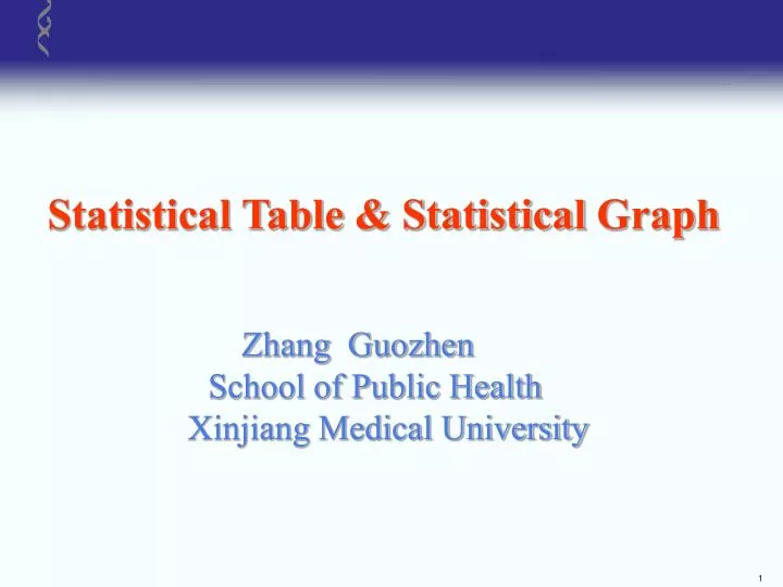
Statistical Table & Statistical Graph. Zhang Guozhen School of Public Health Xinjiang Medical University. Statistical Tables and Graphs. Statistical description is a kind of fundamental work for statistical inference, which describes the feature of the sample.

E N D
Statistical Table & StatisticalGraph Zhang Guozhen School of Public Health Xinjiang Medical University
Statistical Tables and Graphs • Statistical description is a kind of fundamental work for statistical inference, which describes the feature of the sample. • The main forms for description are tables, graphs and numerical indexes. • Statistical tables and graphs are two kinds of forms made of point, line, area and number. • They can show the information of data directly. So they are widely used in medical practice.
Statistical Tables Example1 125 children were tested in county B and 9 cases were found In this study, 221 children were tested in county A and 4 cases were found suffering from rachitis; the prevalence rate was 18.10 per thousand.; the prevalence rate was 72.00 per thousand. 248 children were tested in county C and 2 cases were found; the prevalence rate was 8.00 per thousand….. • Very tired and verbose. • Difficult to remain any impression
Put into a table Table 1 Rachiotis prevalence rates in 5 counties • Clearimpression ! • Easy to compare each other !
Principles of Making Tables • The main contents must be emphasized, simple and understood easily. • Primary and secondary contents as well as arrangement must be clear
Construction of Statistical Table • Title:generalize the contents, including time and site. The title is located on the top of the table and a sequence No. is on the left of the title. • Horizontal item:indicate the subjects investigated, usually located in the left of the table. • Vertical item:indicate statistical index including the units, usually located in the right and upper of the table.
Lines (horizontal only): • Top and bottom (dark): define the range of table • Others (light): separate items and figures. • Not suitable to having too many lines. The vertical lines and skew lines can’t be allowed. • Figures:require to use Arabian number in the statistical table and the decimal must be accordant. The empty cells can’t be allowed. • Notes:usually use star mark “ ” to express notes, and the mark “ ” usually put on the bottom of the table.
Basic Structure of Statistical Table Table 1 Table title Top line Item line Total line Bottom line
Types of Statistical tables • Simple table:One variable only • Combinative table: More than 2 variables
Simple Table • Row item: Subject • Column item: Predicate • The table read as: • The group of HBsAg carriers has 1457 persons tested, among which 46 positive with positive rate 3.16%. • 2. The group of HB patients has 1224 persons tested, among which 161 positive with positive rate 13.15%.
Table 4 the result of HBsAg of persons at different age group in city or country at certain area in certain year
Announcements of Making Statistical Table Example 2 The mental score and other factors related to coronary heart disease were researched in certain area. The results were shown in table 5
Table 5 compare of the risk factor of patients with coronary heart disease
Problems in above Table • Too much content was put in a table, especially, the measurement data and numeration data were put in a table. • Many blank space in table because of incompatible content in different column. • Inversion of row item and column item • Too much content, complex ranks, data inappropriately arranged in table
Table 6 compare of the risk factor of patients with coronary heart disease (X±S) Solution:dividing it into two tables, table 6,7
Table 7 compare of the risk factor of patients with coronary heart disease
Frequent Mistakes in Tables • Title: Not exactly fit the content • Content: Too much; Mix of important and many non-important ones • Items:Inappropriately arranged • Figures: Total and subtotals; Digits and decimals • Lines: Using vertical lines and oblique lines
Statistical Graphs • advantage: data visualization and remaining impression. • The purpose of using graphic displays is to give a quick overall impression of the data, which is sometimes difficult to obtain with numeric measures.
type:Different graphs according to different purposes and types of data bar graph, histogram, percent bar chart, pie chart, line graph, scatter plot ,statistical map, stem-leaf plot, box plot, residual plot
Basic requirements: • Axis: Y-axis (vertical) and X-axis (horizontal). • Legend:explain meaning of colors or patterns. • Title:under the graph; content, time, place.
Principle • Select the proper graph according to different aim of study and the character or feature of data. • Title: including time , place and main content . below the graph
Index and unit are shown in the Y-axis and X-axis. The point of intersection commonly is 0. The ratio of Y-axis to X-axis is 5:7 properly. • Different lines and colors indicate different statistical value of subjects. Marginal data is attached to the graph. • Legends are the notes of a statistical graph, usually located on the right top corner or located between the bottom of the graph and the title.
Basic Structure of a Statistical Graph legend Vertical item (unit) legend Graph body 0 Horizontal item (unit) Fig 1 The basic structure of a statistical graph
Content • bar chart • pie chart • percent bar chart • line graph • Histogram • Scatter Diagram
Bar Chart • Compare figures of different populations • Display the comparison among similar and relative independent data • Often used to compare the level of the variable at several locations • simple bar chart or complex bar chart
Example 3 Mortality rates of main cause of death are shown in figure 1. Bar chart is selected because the cause of death is interdependent indexes. Simple bar chart , only classified by the cause of death .
Fig.3 Average cost of outpatients for several treatments in a hospital in 1994 and 1997
Guidelines for Bar Charts • Label both axes clearly • Leave space between bars • Leave space between the left-most bar and the vertical axis • When possible, begin the vertical axis at 0 • All bars should be the same width
Pie Chart • Describe percentages of all the parts of population • Indicate the proportion • The 360o angle at the centre is apportioned to each item in the total in proportion of its magnitude .
Guidelines for Pie Charts: • Give clear, complete title • Label all sections clearly • use a legend or key • Order by frequency • Start at top (12:00) • Move clockwise from start
10% 40% 15% 17% 18% Fig.5 Percentages of the reasons for re-addiction (xx place,1996)
A pie chart is good for making relative comparisons among pieces of a whole.
Percent Bar Chart Compare frequencies of a category variable • Indicate the proportion
Fig. 6 Mother’s education manner in group of drug addicts and group of controls. (xx place, 1996)
Line Graph Describe the changing of Y with X (time) -- tendency Fig. 7 Incidence rates of stomach cancer in a city
General Line Graph • Used for expressing a phenomenon changes with the time and condition, or one phenomenon changes with another phenomenon. • Its horizontal axis and vertical axis are all arithmetic rules.
Semi-logarithmic Line Graph • Used for expressing the developing velocity (relative number) of a phenomenon changes with the time ,condition, or another phenomenon. • Unlike a general line graph, its horizontal axis is arithmetic rule and vertical axis is logarithmic rule.
Semi-logarithmic Line Graph Left: The absolute difference of mortality rates ~ Year Right: The absolute difference of log (mortality rate) Suitable line graphs in different situation