Download
1 / 22
220 likes | 440 Vues
Making Presentable PowerPoint Slides. Solomon Oyelekan. Ph.D. MSTAN, Microsoft Cert . Main Headings. The meaning of PowerPoint? Sub-headings/Outlines Slide Structure and layout Use of Fonts Use of Colour Slide Background Prsenting Graphs Checking Spellings and Avoiding Grammatical

E N D
Making Presentable PowerPoint Slides Solomon Oyelekan. Ph.D. MSTAN, Microsoft Cert.
Main Headings • The meaning of PowerPoint? • Sub-headings/Outlines • Slide Structure and layout • Use of Fonts • Use of Colour • Slide Background • Prsenting Graphs • Checking Spellings and Avoiding Grammatical • Conclusions • Questions
The meaning of PowerPoint? • PowerPoint is a complete presentation graphics package. • It is one of the major Office programmes which enables the user to do draw diagrams, present graphs and data and other things in a presentable manner.
What you can do in PowerPoint: • You can do the following in a PowerPoint: • When you create a presentation using PowerPoint, the presentation is made up of a series of slides (pages). The slides that you create using PowerPoint can also be presented as overhead transparencies. • The slides can be printed as audience handouts, outlines, and speaker's notes. • You can format all the slides in a presentation using the Slide Master . • You can keep your entire presentation in a single file- all your slides, speaker's notes, and audience handouts. • PowerPoint is compatible with other Office programmes like Word and Excel. You can import what you have created in other Microsoft productsinto any of your slides. • You can import videos and sounds to the presentation
Sub-headings/Outlines • It is good to allow your audience to have a clue as to what to expect in your presentation • This should be presented as sub-headings (What could be likened to table of contents) • The presentation should be made in the order in which they have been written in your outline.
Features of a Good Slide • The texts should be written in short phrases or sentences. • 4 or 5 points are okay for a slide • It must not contain too many words. • It must not be clumsy (e.g. this slide)
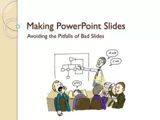
Features of a Bad Slide • It contains too many words, and sentences not written point by point. The font size could be too small or too big and bogus. The fonts may not be of the same type and the text may be masked by the background colour of the slide. These features will distract the audience and in fact they may get easily confused and this could reduce their attention. When there are too many words on a page, the audience may even be straining their eyes to read from the slide. (This particular slide is bad)
Slide Structure – Good • A good slide: • Shows one point at a time • Captures the attention of the audience • Will prevent audience from reading ahead • Will highlight the points of discussion concisely • Will help you keep your presentation focused (This is an example of a good slide).
Animations In a good slide, animations should: • Not be distracting • Be consistent (use the same transition all through) • Not be too complicated
Fonts • Use standard font types like Arial or Times New Roman • Fonts size must be big enough to be seen by your audience (e.g. use a minimum of 18 point size). • Some fanciful fonts may not be legible enough. Avoid them. • Different font sizes may be used for different emphasis (e.g. the font size of the title of this slide is bigger than that of the points.
Fonts (contd) • DO NOT USE CAPITAL LETTERS TOO OFTEN. THEY ARE NOT EASILY READ. • Do notmix fonttypes in a sentence just for the fun of it.
Fonts - Bad • If you use a small font, your audience won’t be able to read what you have written • CAPITALIZE ONLY WHEN NECESSARY. IT IS DIFFICULT TO READ • Don’t use a complicated font
Colours • Ensure that the colour of your text contrasts sharply with the background colour of the slide • Using any font colour that does not contrast with the background colour is hard to read • You do not have to use different colours for every point. It creates confusion. • Mixingcolours within a sentence does not make sense. It will only create further confusion.
Good Colour contrast • This colour is good because it contrasts sharply with the background colour. • The colour can easily be read. • The page is not decorated with too many colours.
Background Colour • Use backgrounds such as this one that are attractive but simple • Use backgrounds which are light • Be consistent in the use of background colour in your presentation
Bad background • Avoid backgrounds that are distracting or difficult to read from • Always be consistent with the background that you use
Data and Graphs • Graphs are beta used than tables because a graph can illustrate many points at a time than tables. • Data in graphs is easier to comprehend & retain than is raw data • Trends are easier to visualize in graph form • Do not use excessive grid lines • Use appropriate colours • Always title your graphs
Spellings and Grammar • Always proofread your slides for: • speling mistakes • the use of of repeated words • grammatical errors you might have make • It is good to have someone else check your presentation for spelling or grammatical mistakes
Conclusion • Do not end your presentation abruptly. • Use an effective and strong closing remarks as this may linger on in the mind of your audience.
Questions • Ask your audience if they have any questions.