Download
1 / 12
120 likes | 346 Vues
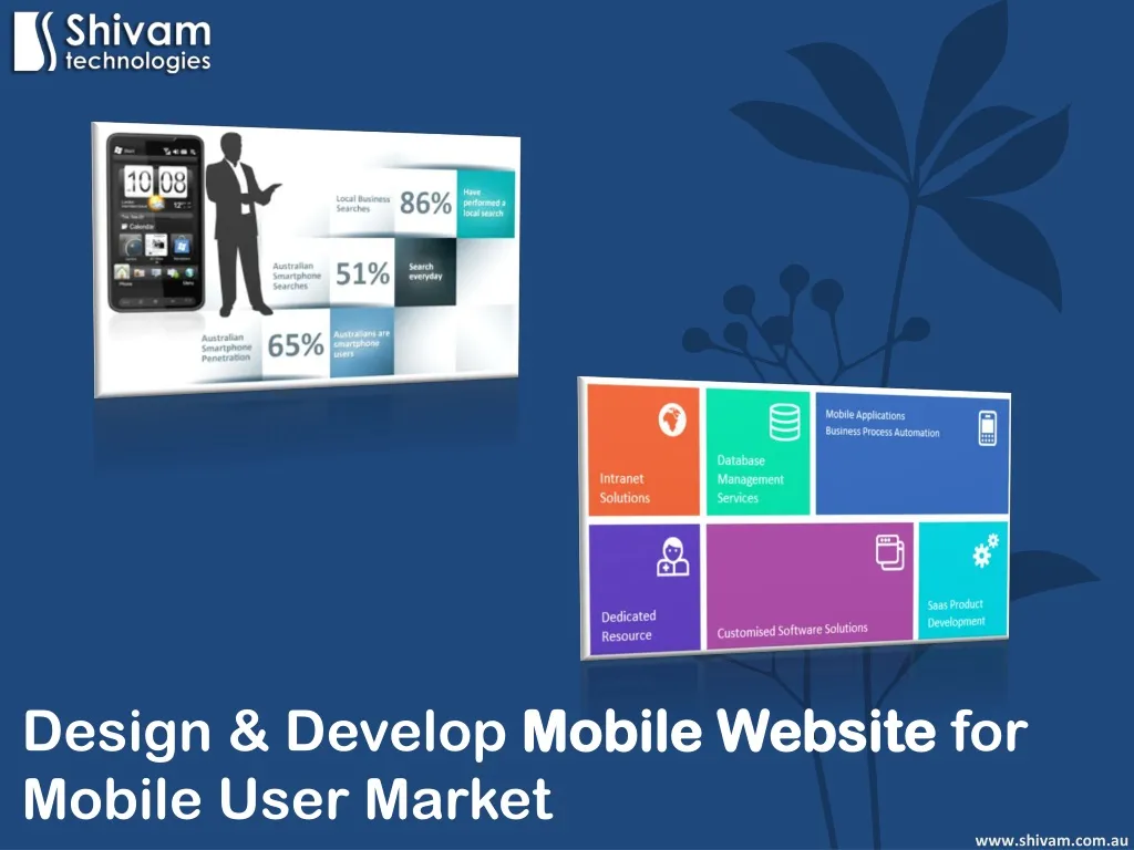
Does your business have a mobile website? Capture the mobile user market with your mobile website. Create a specific user-friendly mobile website design by considering important factors.

E N D
Design & Develop Mobile Website for Mobile User Market www.shivam.com.au
Before I begin to discuss the importance of creating a mobile website and how to market it, let me show you something. The above are numbers which will change by the time I complete this article. The point I am making is that it is time to act NOW and create a mobile website for your business. Creating a mobile website is slightly different from creating a traditional website. One thing that developers forget is who they are building the website for. It is important to understand the mobile user and how they will be viewing your website. www.shivam.com.au
For most mobile users, the key elements they are looking for include the following: - Directions to your office - Directions to your warehouse - Click to call button - Your phone number - Map of your store location www.shivam.com.au
If you know what the frequent searches are, then it makes It easier to create a mobile website which is what the user is really after and not load it with lengthy PDF’s or company philosophy or even press releases. There are some best practices to keep in mind as you develop your mobile website presence. This will ensure that you are creating a mobile website design which is adaptable to what the user actually is searching for. www.shivam.com.au
Content Reigns Supreme The very first step is to list down the most important content to include in the mobile website design. Do note that there is screen constraints. Find out what your customers or potential customers would look for. Do you have many stores? How about a store locater? How about a map? These are some likely questions you will ask yourself. Just think, if you were on a dental website, how fast can you go from Point A to Point B to book your appointment? www.shivam.com.au
Site Layout Do note that mobile web pages do take a longer time to load than traditional websites. Therefore, I would recommend to keep the number of pages to a minimum. For my clients, I normally recommend no more than 10 pages. I tell them that no one will browse more than 2 or 3 pages so it is best to keep the pages tight but make it content rich. This will allow for the site to be streamlined. The bottom line is: The mobile website MUST LOOK – Simple and Uncluttered. www.shivam.com.au
White Space is Good Like some traditional websites, please do not attempt to try to fill every white space! Remember that white space is good because it gives your mobile website a classier look plus makes it look cleaner. Let me add a secret. If you have more white space, it is easier for the user to click on important buttons like – Buy Now, Try Now, Book Appointment etc… www.shivam.com.au
Try to Avoid Java and Flash The main reason for this that some smartphones do not support Flash or Java. Considering that mobile usage is increasing, the last thing you want is to lose a large chunk of potential new clients. Type Less It is a fact that many of us have trouble typing on tiny keyboards. However, there are times that we have to enter important information to proceed towards the completion of booking an appointment or making a purchase. www.shivam.com.au
So, what is the solution? Well, where possible, use drop down menus. This will help minimise time-consuming typing and the possibility of someone leaving your site as it becomes too cumbersome to fill in so much information by typing. Pop-Up Windows – NO Pop-up windows can slow navigation considerably. If the user is supposed to open a new window, ensure there is an alert in place so that they navigate back to the original page. www.shivam.com.au
Please Visit the Whole Site Creating the mobile website is only part of your marketing strategy. As explained, you will only be creating some important pages for your mobile version. However, ensure that you include links back to your main website on multiple pages. Once you have your mobile website using the best practices above, there will be no looking back. Do remember that your brand image is important so whatever decisions you make in creation of the website must include this fact. www.shivam.com.au
Once your mobile web design is complete and your mobile website is ready to go, there is another important thing you must do. You need to get people to search for your products and services online. • So, what can you do? • Use mobile advertising to get people to search for your service/product via a mobile device. • Optimise your Google+ Place Listings • Be active in social medias • Constantly track your mobile site traffic on Google Analytics www.shivam.com.au
Shivam Technologies Pty. Ltd. Suite 1209, 530 Little Collins Street Melbourne Victoria 3000 Australia Phone: 1300 894 506 Fax: (03) 9614 5858 Email: info@shivam.com.au Website: www.shivam.com.au www.shivam.com.au


