Download
1 / 4
40 likes | 177 Vues
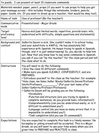
PRELIMINARY TASK EVALUATION. Emma Tennant Candidate Number: 5337 Centre Number: 31030. EVALUATION SURVEY. Target Audience

E N D
PRELIMINARY TASK EVALUATION Emma Tennant Candidate Number: 5337 Centre Number: 31030
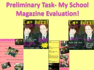
EVALUATION SURVEY Target Audience We chose to do a 6th Form Magazine for new 6th Form Students because we felt that we could relate to this type of magazine, as we both fit in the target market for this magazine. We thought about the content of the magazine by relating it to the target market, what we would like to see in the magazine if we were reading it, for example a music page, majority of people in the target audience have an interest in music. We also included in our contents a fashion page and sports page, this is because it will attract two types of our target audience, male and female. Image Manipulation Program We have used Adobe Photoshop elements 7 to create our 6th Form Magazine. The main features we used were the Magnetic Lasso Tool. This allowed us to cut around objects and people, it was mostly used on the front cover. To make the images perfect and neat, we used the eraser tool to rub out any unwanted image. After we used the blur tool this helped create an effect on the edges, so that the edges do not look sharp. We also changed the images by brightening them or adding colour to them with the detail smart brush. This created various effects, for example on the front cover the main image is brightens to make it stand out even more from the other images, so that the reader attracts to the image. We used the crop tool to edit some images on the contents page. This allowed us to cut out any unwanted sections of the images. Skills Required • ICT • Photography • Creativity • Teamwork • Research Conventions We have used a variety of conventions in our magazine. These include: Title, masthead photos, barcode, price and text. We made sure we kept to a colour scheme throughout the two pages, the colour scheme was black, red and white. We chose this as its simple, also kept our layout simple with only a small amount of information, this was because we thought our target market would prefer it simple not overcrowded as it would look unattractive.
SURVEY • Person 3 • What grabs your attention on our front cover? • The massive picture of a sixth form student on the front really attracts me as it is kind of cheesy but in a good way and makes me want to read more. The logo for the magazine at the top is very eye catching and bold. • What do you think of the colour scheme of our magazine? • I think it’s quite good as red is a key colour at Nicholas Chamberlaine but to relate more they could use the yellow. • Would you buy this magazine? • Yes. • Is the content suitable for the target audience? • Yes. • What do you dislike about the magazine? • Instead of the background being white it could be yellow and you could incorporate the Nicholas Chamberlaine yellow that way. • Person 4 • What grabs your attention on our front cover? • The pictures and also the bold titles. • What do you think of the colour scheme of our magazine? • Its effective because the colours contrast against each other. • Would you buy this magazine? • Yes. • Is the content suitable for the target audience? • Yes. • What do you dislike about the magazine? • Instead of white you could use a more vibrant colour so it stands out more and looks effective. Target Audience Feedback Person 1 What grabs your attention on our front cover? The main image and the 6 in the title. What do you think of the colour scheme of our magazine? It works well. Would you buy this magazine? I probably wouldn’t buy it. Is the content suitable for the target audience? Yes. What do you dislike about the magazine? The background is too white. Person 2 What grabs your attention on our front cover? The main image. What do you think of the colour scheme of our magazine? It’s nice. It's not too bright and not to dull, it’s just right. The colours go very well together. Would you buy this magazine? Yes. Is the content suitable for the target audience? Yes it is set out nicely and the pictures are very good. What do you dislike about the magazine? It is very white which makes it look like there is a lot of blank space.
EVALUATION OF FEEDBACK Overall the feedback from our target audience was very positive. We asked four people what they thought of our magazine and they all said they really liked the colour scheme and the main image we used. We think the image we used on the front cover was really effective as most of them found it attractive and someone said it makes them want to read on. They also all said that it appealed to them. 3 out of 4 of the people we surveyed said they would buy the magazine, this is really good as the main reason for a magazine is for the target audience to purchase it. All the people we surveyed thought our colour scheme worked well “it’s not too bright, not too dull, it’s just right, the colours work well together”. One person stated this, our goal was for the colour scheme to be simple and not over the top or uninteresting and we achieved that. We did chose contrasting colours so that it looks effective throughout the two pages. However they all agreed that the background should be a different colour when asked about their dislike of the magazine. Two people thought it was too white, and the other two suggested other colours. Therefore if we had a chance to improve our magazine we would change the colour to a more vibrant colour so it stands our more to our target audience. We could improve by replacing the white with yellow so it fits with the school, however we have to take in account that this is just one of our target audience’s opinion, and may not apply to others. If we placed yellow in the colour scheme it may be too bright, and not simple for our target audience.