Download
1 / 24
240 likes | 388 Vues
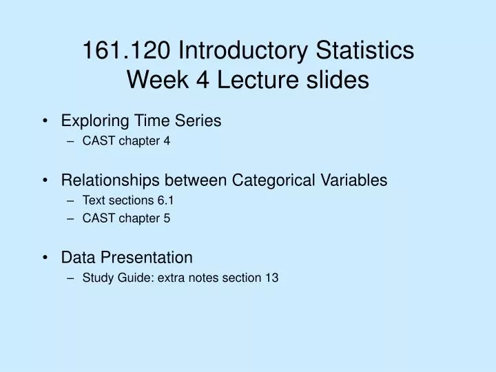
161.120 Introductory Statistics Week 4 Lecture slides. Exploring Time Series CAST chapter 4 Relationships between Categorical Variables Text sections 6.1 CAST chapter 5 Data Presentation Study Guide: extra notes section 13. Time Series – What you need to be able to do.

E N D
161.120 Introductory Statistics Week 4 Lecture slides • Exploring Time Series • CAST chapter 4 • Relationships between Categorical Variables • Text sections 6.1 • CAST chapter 5 • Data Presentation • Study Guide: extra notes section 13
Time Series – What you need to be able to do • Plot time series and use least squares to make forecasts • Identify and describe in words (in terms that the data collector might understand) the trend and seasonal components in a time series plot
What is a Time Series? A series of data values recorded (generally at equal time intervals) sequentially in time. • Average age at death of people each month in a large city over a period of 5 years • Area of rice grown in East Asia each year for the past 15 years • Weight of every 100th kiwifruit packed during an 8-hour shift • Number of hospital admissions each day over a period of 5 months
What is a Time Series? • There is often a time-related pattern to the variability. - A trend towards higher or lower values over time - A pattern that repeats regularly • Ignoring the time ordering and examining the data with dot plots or similar univariate techniques may result in useful information being missed • Particularly important in business and commerce
The importance of plotting • Can be difficult to get useful information from time series if they are presented in tabular form. • Information in a time series is most easily understood from a graphical display. • A time series plot is a type of dot plot in which the values are displayed as crosses against a vertical axis. • The horizontal axis spreads out the crosses in time order. • (It can also be thought of as a scatterplot in which the 'explanatory' variable is time.) • The successive crosses are often joined by lines.
Trend • Time series data often change systematically over time – this change is called the trend. • The long-term upward or downward movements in the values. For example time series plots of commodity prices often have an upward trend over a period of years. • The trend can be masked by random fluctuations • Trend is very important for forecasting future values
Smoothing Methods • Reduce the fluctuations and show the trend more clearly. • These methods replace each value in the series with a function of it and the adjacent values. • Moving averages (also called running means) • Each value is replaced by the mean of it and the two adjacent values (3-point moving average)
Greater smoothing is obtained by using means of more adjacent values. • Effective at highlighting the trend in the centre of a time series, but cannot be used at the ends since the moving average requires values both before and after each value being smoothed.
Forecasting – Least squares • Linear model • Residuals • Recode year
Quadratic model • Patterns in residuals • Forecasting • Once the equation of a trend line (using least squares) is obtained, insert future time values into equation for forecast. • Beware forecasting many time periods into the future • The shape of the actual trend line might be different from your model
Cycles • Not all increases and decreases can be explained by a smooth trend line. • Many time series change in cycles • Cyclical Patterns • Cycles do not repeat regularly • Example: Sun spot activity cycle of approx 11 years, but not all cycles are of the same length. • Seasonal Patterns • Not usually referred to as ‘cyclical’ • Distinguished by a period that repeats exactly • Regular cycles that are strongly repeated to the calendar • Monthly or quarterly data often has a pattern of peaks and troughs that repeat in a similar way each year • Important that the most recent values is not interpreted in relation to the immediately preceding value
Relationships between Categorical Variables • What we might ask • Explain why relative frequencies allow better comparison between groups. • Use stacked and grouped bars in a bar chart to better compare groups. • Identify whether a table of data is a contingency table. • Find marginal and conditional proportions from a contingency table to answer questions stated in words.
Contingency Tables • Single rectangular array combining frequency table for each variable Example: A study exploring the relationship between hypertension (high blood pressure) and amount of smoking of a sample of 200 people.
Fully describes categorical data (2 or more groups) • Poor way to compare distributions if there are different total numbers in the groups • Can be more informative to use proportions within the groups (each frequency in table is divided by the total for that group)
Example 6.1 Smoking and Divorce Risk Data on smoking habits and divorce history for the 1669 respondents who had ever been married. Among smokers, 49% have been divorced, 51% have not.Among nonsmokers, only 32% have been divorced, 68% have not.The difference between row percents indicates a relationship.
When the groups correspond to different rows, the most important comparisons are down columns.
The corresponding bars for the smoking groups are widely spread, making comparison harder. Can cluster bars by smoking group.
Among men with no ear pierces, 43/424 = 10% have a tattoo.Among men with one ear pierce, 16/70 = 23% have a tattoo.Among men with two or more ear pierces, 26/71 = 37% have a tattoo.% with a tattoo as number of ear pierces => relationshipCould examine column percents (see graph above) or overall percents too. Example 6.2 Tattoos and Ear Pierces Responses from n = 565 men to two questions:1. Do you have a tattoo? 2. How many total ear pierces do you have?
Stacked Bar charts are often the best way to graphically compare groups
Types of bivariate relationship • Experimental data • Categorical data sometimes collected separately from different groups • Categorical measurement treated as response • Grouping treated as explanatory variable • Stimulus-response data • Stimulus may affect the response • Also can have two categorical measurements made from one individual One can affect the other but not the reverse • Association • Not all relationships are causal, so sometimes the variables cannot be classified into explanatory and response variables
Joint proportions • What proportion of the skiers where given the placebo and didn’t catch a cold? • Marginal proportions • What proportion of skiers didn’t catch a cold? • Conditional proportions • What proportion of skiers caught a cold given that they had the Placebo?