Download
1 / 59
610 likes | 744 Vues
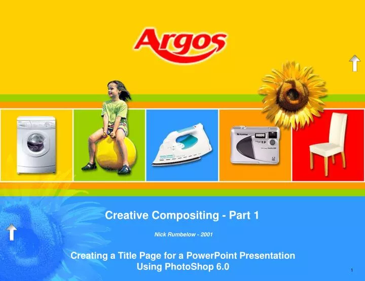
Creative Compositing - Part 1. Nick Rumbelow - 2001. Creating a Title Page for a PowerPoint Presentation Using PhotoShop 6.0. About This Screen Show. Introduction. Navigation. Next Slide. Return to the Last Slide Viewed. Click Anywhere to Progress. View Front Page. Previous Slide.

E N D
Creative Compositing - Part 1 Nick Rumbelow - 2001 Creating a Title Page for a PowerPoint Presentation Using PhotoShop 6.0
About This Screen Show Introduction Navigation Next Slide Return to the Last Slide Viewed Click Anywhere to Progress View Front Page Previous Slide
Introduction Introduction Objectives This work-through aims to demonstrate how PhotoShop 6.0 can be used creatively and effectively in our work in Presentations. By creating the background for the title page of this PowerPoint presentation, issues are presented in context to common requests made by Analysts, helping skills to be absorbed by example. • Topics covered: • Measuring in Pixels • Image Size • Target Size • Resolution • Sampling Colours • Background / Foreground Colours • Fill / Bucket Tool • Layers / Layer Options • Canvas • Filters • Cropping • Working With Small Logos • Transform / Scale • Magic Eraser • History • Gaussian Blur • Selection / Transform Selection • Copy Layer • Move Layer • Re-order Layer • Linking Layers • Merge Linked Layers • Flip • Scanning • Pen Tools • Grid • Preferences • Stroke Selection • Colour Profile • Levels • Quick Mask • Brushes • Matting • Layer Blend • Dragging Between Images • Layer Styles • Save for Web • Formatting PowerPoint Backgrounds
Page Dimensions Setting-Up Prepare for the End at the Beginning • For this tutorial you will create the composition on the front cover. Before you begin, you need to know how big the background picture should be to fit the PowerPoint page exactly, and as we shall see, just looking at PowerPoint’s Page Setup will not help. • You may be working on a client-style document that has already been started with custom dimensions, or beginning a new one, so sizes may vary; • Open a blank presentation in PowerPoint • Select File > Page Setup • By default, the template sets the page to 26.4 x 20.4cm • If your units are in inches, select Start > Settings > Control Panel > Regional Settings > Number and set the Measurement System to Metric • Select Cancel • It would be tempting to use these dimensions for creating the background PhotoShop document, however this would be misleading as the actual PowerPoint page is larger. To prove this; • Draw a rectangle to fill the PowerPoint page • Format it by double-clicking on it, and select the Size tab • Contrary to the Page Setup information, the working size is actually 21.6 x 27.95cm. This is the target size and should be recorded • Cancel the formatting dialog box for the rectangle, and delete it
Page Dimensions (cont’d) Setting-Up Converting Centimetres Into Pixels • Open a new document in PhotoShop • Set the Width and Height according to the dimensions measured from the PowerPoint rectangle - in this case 27.95 x 21.6cm • Set the Resolution to 96 pixels-per-inch (also referred to as dots-per-inch) as this is the standard for PC monitors and therefore gives a true representation of the rectangle. This translates as 37.795 pixels per cm, but the industry standard for resolution is still to use inches • Ensure the mode is set to RGB Colour. You are designing a screen presentation, so the final image will be created from combining just three colours of light - Red, Green and Blue, as opposed to four colours of ink for print (CMYK - Cyan, Magenta, Yellow and BlacK). Working with just three colours will help to keep the file size down • Set the Contents to white. This will set the background colour • Click OK • When working in PhotoShop, always work with a higher resolution than you need, as this will give you finer image detail to edit. You should work in high resolution, then compress a low resolution copy. In this tutorial you will be working with 300dpi, which will be too big for PowerPoint to process effectively, and looking ahead, the PhotoShop function you will need to use when you eventually compress the final image allows you to set the dimensions in pixels only. Therefore, before you increase the dpi to 300, you need to find out how big your page is in terms of pixels so that you can reset it at the end; • Select Image > Image Size(Fig. 1) Click to view Fig. 1 – Jump back here by clicking the UP arrow when it appears on the right • The pixel dimensions are given at the top of the Image Size dialog box. You need to record these dimensions for use at the end of the tutorial (in this case 1056 x 816). • With the Image Size dialog box open, make sure Constrain Proportions is ticked and Resample Image is set to Bicubic (Resampling is discussed later) • Now change the Resolution to 300 pixels/inch • Notice the pixel dimensions now change to 3,301 x 2,551 • Click OK
Page Dimensions (cont’d) Setting-Up Converting Centimetres Into Pixels Fig. 1 Target Dimensions / Resolution Change Target Dimensions Metric Dimensions Change Resolution Step 2: Change the resolution Step 1: Record the target pixel dimensions By setting the metric dimensions for the new document, the target pixel dimensionscan be recorded from the Image Size dialog box.
Capture the Argos Website Setting-Up Preparing to Sample • The presentation will be influenced by the style of the client’s website. You could develop a feeling for their design and philosophy as you navigate the site, taking note of the common elements, such as shapes, colours, fonts etc. This will help you to interpret their online presence, and plan the layout of the slide placeholders and the visual flow. Try to feel what the client would do themselves - in the spring of 2002, after this tutorial had been created, Argos happened to produce a new catalogue with a sunflower off-set in a bottom corner, with a similar layout as this cover. • Use Internet Explorer to visit www.argos.co.uk • The Argos site relies on the use of just a few colours, in fact limiting the number of colours together with clean, cut-out graphics, gives the site a very distinctive look, and promotes Argos’ familiar identity. As you navigate through the site, the colours switch place, giving a sense of moving location, but by allowing the style to develop within principal guidelines, consistency is easily achieved. • The Argos site may have changed since this tutorial was written, but in the Autumn of 2001 the dominant features were; • a basic five-colour cycle • elements in boxes with white frames • some elements breaking through their boundaries • a clean sans-serif font • two opposing sides of the background framed by stripes • From these observations a theme can develop, but to achieve convincing results you need to sample the exact colours Argos have used. To do this you need to capture the web page as a picture so that you can measure the colours using PhotoShop; • At the Argos home page, press the Print Screen key (Fig. 2). This copies an image of everything currently visible on your screen into the clipboard memory. If the website has changed considerably, please copy Fig.2 • Create a second new document in PhotoShop. By accepting the default dimensions offered by PhotoShop, the new document is set at the size of the last item copied into the memory • Press Ctrl+V to paste the screenshot into the new document • In PhotoShop, switch back to the developing Argos composition
Capture the Argos Website (cont’d) Setting-Up www.argos.co.uk (July 2001) Fig. 2 The Argos Website
Dividing the Page The Blue & Yellow Halves Using the Grid • The page is going to be divided into five columns for our five objects in their squares. We will use the grid to divide the page, but the current page dimensions are not readily divisible by five; • Select Image > Image Size, ensure Constrain Proportions is ticked, and set the Print Size Width to 25cm • Click OK • Zoom out using the Navigator so that you can see the whole page, and maximize the workspace • Display the grid by selecting View > Show > Grid, followed by View > Snap to > Grid • For the grid to be meaningful to this job, the gridline spacing needs to be set as a preference; • Select Edit > Preferences > Guides and Grid(Fig. 3) • Set a Gridline every 2.5cm, with just 1 Subdivision • Click OK • The page is also going to be divided into two horizontal halves, the yellow top and the blue bottom; • Using the Rectangular Marquee tool (Fig. 4) make a selection across the top half of the page Fig. 3 The Guides and Grid Preferences
Rectangular MarqueeSelect Move Paintbrush Bucket / Fill Magic Eraser Direct Select Pen Tool Eyedropper Magnifying Glass Swap Foreground /Background Colours Foreground Colour Background Colour Pure Black and White Standard Mode Quick Mask Mode Getting the Colours The Blue & Yellow Halves Sampling From the Site • Tip: A small black triangle in the bottom-right corner of a Toolbar tool indicates that tool is part of a group of related tools. If the desired tool is not being displayed, left-click and hold the incorrect tool to display and select the appropriate tool from its group • To make sure you are using exactly the same colours as Argos, switch to the captured web page in PhotoShop; • Use the Eyedropper tool to sample the mustard-yellow from the background (Fig. 4) • To set the background colour, press Alt and use the Eyedropper tool to sample the blue from the right-hand stripe • Switch back to the Argos composition • Fill the selected top half with the yellow foreground colour, using either Edit > Fill, or Shift+f5, or the Bucket tool • Select the bottom half of the page by selecting Select > Inverse • Press the Delete key to fill the selection with the background colour • If you were working in a different layer, the deleted area would be replaced with transparent area, but deleting in the background layer reveals the Canvas, on which all the elements for the composition are layered. The Canvas takes the current background colour. • Deselect (Ctrl+D) Fig. 4 The Toolbar
Getting the Colours (cont’d) The Blue & Yellow Halves Filling the Halves Fig. 5 Top and Bottom Halves Filled, Displaying the Grid
New Selection Style Dimensions Fixed Size Selection Creating the Shapes Marquee Options • To create the stripes you will use the grid again, this time to make the two stripes lay flush together by creating one above a gridline, and one below the same gridline. Once created you can move them into position. • Create a new layer (Fig. 7) • The stripes need to be 25cm wide and 0.5cm high, so you can set the Rectangular Marquee Select tool to be a fixed size; • Double-click the Rectangular Marquee tool to display the Options bar (Fig. 6). All tool Options are displayed along the top of the screen by default. • Select Fixed Size as the Style • Set the Width to 25cm and the Height to 0.5cm, and choose New Selection from the operations on the left side of the bar • Click above the 3rd gridline from the top, and position the selection to snap above it • Sample the green and orange from the captured screenshot, then fill the selection with green • Make a selection below the 3rd gridline and position the selection to snap underneath it, and fill it with orange • Deselect Fig. 6 Marquee Options
Blending Mode Palette Options LayerOpacity Layer On / Off Link Layer New / Copy Layer Trash Bin Layers Creating the Shapes Duplicating • Layers can be thought of as stacked sheets of transparent acetate; layer contents cannot be moved within the layer, rather the whole layer is moved unless a selection is made. • Both stripes are contained in the same layer, and so are no longer separate. • Using the Move tool (Fig. 4), drag the stripes into position so that the bottom stripe snaps to rest above the 3rd gridline. (Holding the Shift Key while moving will constrain the movement into straight lines.) Both lines move together because they are part of the same layer • To create the second set of stripes, you will simply copy the layer, position it, and then flip it vertically. First, re-name the layer; • Right-click “Layer 1” in the Layers Palette, select Layer Properties,and name the layer “Stripes” • To make a copy of the “Stripes” layer, left-click the layer and drag it to the New / Copy Layer icon at the bottom of the palette (Fig. 7) • Use the Move tool to place the new stripes in position so that the top stripe snaps beneath the 5th gridline. • Select Edit > Transform > Flip Vertical Fig. 7 Layers Palette
Layers (cont’d) Creating the Shapes Merging • It would be acceptable to leave the two sets of stripes in their individual layers, but there may be occasions when you will need to combine several layers into one. • Link the “Stripes copy” layer to the “Stripes” layer by clicking the Link Layer box (Fig. 7). A chain link icon appears in the box to indicate that although the two layers are still separate, they will now behave as one. There is no limit to the number of linked layers • From the Layers Palette Options, select Merge Linked(Fig.7) • Both sets of stripes are now part of the same layer (Fig. 8) and any layers not linked have been preserved. • Reducing the number of layers can be useful to keep the desktop uncluttered, but once committed it may be difficult to separate them should you need to later. • By default, transparent areas are represented by a grey and white chequered pattern. If you were working on a predominantly grey image, this chequered pattern would not be helpful. • Tip: If you need to change the way transparent areas are represented, select Edit > Preferences > Transparency & Gamut, and change the colours, size and frequency of the chequered pattern Fig. 8 Layers Merged, Background Preserved
Layers (cont’d) Creating the Shapes Merging Fig. 9 The Stripes Snapped Into Position and Merged
The Squares Creating the Shapes Select and Fill • Create a new layer and make sure it is above the “Stripes” layer in the layers palette • Name the new layer “Squares” • Use the Eyedropper tool to select the yellow from the top half of your image • To fit the five squares into your 25cm wide image, each square needs to be 5cm x 5cm, which is the width of two gridlines (Fig. 10). • You could make the selection using a Normal Rectangular Marquee Select, but it would be quicker to continue to use a Fixed Size Marquee; • In the Rectangular Marquee Select tool’s Options, set both the Width and Height to 5cm. • Click inside the composition and position the selection so that it covers the first 2 x 2 squares formed by the grid (Fig. 10) • Fill the selection with yellow using either Edit > Fill, or Shift+f5, or the Bucket tool Fig. 10 The First Square Selected and Filled
The Squares (cont’d) Creating the Shapes Stroke • In PhotoShop, the weight of a line is referred to as its Stroke. You need to create a white line around the selected square, in other words you will stroke the selection; • Choose Edit > Stroke • In the Stroke dialog box, set the Width to 10 pixels (Fig. 11) • Set the Colour to white by clicking in the Colour swatch • The Location indicates where the line will be drawn in relation to the selection marquee. If you were to choose either Inside or Outside, the line would become double thick along the sides where the squares are joined. • Select Centre so that one half of the line falls inside and the other half falls outside • Make sure the Blending Mode is set to Normal (more on this later), the Opacity is set to 100%, and Preserve Transparency is unchecked • Click OK • A white line now appears around the square • Repeat this process, (fill and stroke) for the other four squares, sampling the other colours from the background, the stripes, and the captured version of the web page Fig. 11 Stroke Options
The Squares (cont’d) Creating the Shapes Fill and Stroke Fig. 12 The Squares Filled and Stroked
Getting the Logo The Logo Print Screen vs. Copy • Tip: When a request is made for a logo to be taken from a website, avoid right-clicking and copying it. Instead, capture the whole page by pressing Print Scrn and then crop and edit it in PhotoShop. • To demonstrate the difference, try the wrong way first; • Switch to the website in Internet Explorer • Right-click on the logo and select Copy • Create a new PowerPoint document and paste the logo • The original logo was created with a transparent background, and the colour around the edges – the matting – has been set by the designer to blend with the site background colour (Fig. 13) • Unless the matting happens to be exactly the same colour as your PowerPoint background, this method is inappropriate. A particular logo may also be too small for the presentation, and appears ‘blocky’ when it is stretched on the page • For an alternative method; • Close the PowerPoint document without saving • In PhotoShop, switch to the captured website image, and draw a rectangular marquee around the logo. (Make sure the Style is set to Normal in the Options.) • Press Ctrl+C to copy it Fig. 13 Copied Logo Fig. 14 Copied at 72dpi, Pasted Into 300dpi
Getting the Logo (cont’d) The Logo Changing the Resolution • Tip: If you were using PhotoShop for only a logo, you would crop the website image so that only the logo was left, then select Image > Image Size to change the resolution to 300dpi. PhotoShop will fill-in the missing detail as the image expands, a process known as resampling, which avoids the “blocky” pixelated effect. You would then be able to edit the logo appropriately in finer detail • In this tutorial, your composition is already 300dpi; • Switch back to your PhotoShop composition • Press Ctrl+V to paste the selection into a new layer • Because the original was only 72dpi, it appears tiny within your composition (Fig. 14). • Select Edit > Transform > Scale to resize the logo. Holding Shift while dragging the corner handles will constrain the proportions • As you drag the handles, it appears even more pixelated (Fig. 15) • Press Enter to apply the transformation, then move the logo into the yellow area • PhotoShop resamples the missing data, fills-in the gaps and smoothes the edges (Fig. 16) Fig. 15 Before Transformation is Applied Fig. 16 Resampled Interpolation After Transformation
Scanning The Sunflowers Scan Settings & Colour Profile • Always scan at a higher resolution than you need; the editing will be finer, then later you can save a lower resolution version for your output. • Tip: When scanning, draw the bounding box around the preview, then click Auto before confirming the scan. This will help achieve the best contrast and colour balance from the scan • The sunflower used in this tutorial was scanned at 400dpi and the un-edited version has been saved for your use; • In PhotoShop, select File > Open and locate the file S:/Training Department/Staff Personal Training/PS Tutorials/Argos/Sunflower Scan.psd • It is possible that the Profile Mismatch dialog box appears (Fig.17). This indicates that the image you’re opening was created on a PC which had been set up to manage colours in a different way to the one you are working on now. • This becomes particularly important when designing for print as it can help to display a truer representation of the printed colours on the screen. • For this work it is safe to Convert the sunflower’s profile to the same as your current profile Fig. 17 Profile Mismatch
Scanning (cont’d) The Sunflowers Fig. 18 The Scanned Sunflower
Deleting Unwanted Areas The Sunflowers The Magic Eraser • There are many ways of selecting areas to be erased, and the choice of method is often driven by the content. The Magic Eraser tool (Fig. 4) will delete blocks of colour with similar values. • Double-click the Magic Eraser tool to display its Options (Fig. 19) • When you left-click in an area with the Magic Eraser, all areas with the same colour value will be deleted. The Options allow you to control; • Tolerance: how similar the surrounding pixels have to be to the area clicked before they are deleted. A low tolerance means only pixels that are very similar are deleted, a high tolerance broadens the criteria • Anti-aliased: smoothes the edges of the erased area, helping to prevent stepped, jagged edges • Contiguous: only deletes pixels adjacent to the area clicked. If this option is not ticked, any pixel which falls into the criteria set by the other options will be deleted, regardless of where it appears in the image • Use All Layers: allows you to sample and target pixels through all visible layers • Opacity: the transparency of the target pixels. 100% will delete the pixels completely, 50% will make them semi-transparent • Experiment with different settings to better understand how it works • The problem with the sunflower is that the scanning process can leave a grainy pattern when scanning from newspapers and magazines, called a “Moiré” pattern. The variety of differences in the pattern will prevent a smooth erasure and traces will be left over (Fig. 20). To combat this, blur the image slightly; • Select Filter > Blur > Gaussian Blur (Fig. 21) • Experiment with the Radius slider to see the effect as a preview • Set the Radius to 1.5 pixels, and click OK. This will blur the image enough to be effective, but subtle enough for it not to be noticeable • Now use the Magic Eraser tool to delete the sky
Deleting Unwanted Areas (cont’d) The Sunflowers The Moiré Pattern Fig. 19 Magic Eraser Options Fig. 20 The Moiré Pattern Fig. 21 Gaussian Blur
Quick Mask The Sunflowers Painting to Select • The Magic Eraser has deleted much of the sky, but it would be difficult to use it to accurately delete the sunflowers behind the petals (Fig. 22) as there is not enough contrast between them. A much better method for making complex selections is to convert a paintbrush into a selection tool for defining the area to be selected. The advantage is that the shape of the selection can be edited in minute detail. To convert the paintbrush tool into a selection tool, you will enter Quick Mask Mode. • Left-click the Quick Mask Mode button at the bottom of the Toolbar (Fig. 4) • In Quick Mask Mode, the selection is displayed as blocks of colour. Notice the foreground / background colours have changed to black and white. • Painting with black will add to the selection, painting with white will delete from it. • To demonstrate how it works; • Display the Options (Fig.23) by double-clicking the Quick Mask Mode button • Choose a colour that contrasts with the picture by clicking the Colour swatch. In the following examples, red has been selected • Set the Opacity to 50%, so that you can see the image beneath the mask • Make sure Colour Indicates Selected Areas, as you want your brushstrokes to become the selection, rather than be the protected areas • Click OK Fig. 22 Problem Area Fig. 23 Quick Mask Options
Quick Mask (cont’d) The Sunflowers Painting to Select • Choose black as the foreground colour, and select the Paintbrush tool (Fig. 4) • When you select the Paintbrush tool, the Options for the brush size and type are automatically displayed at the top of the screen • Select a medium-sized brush (maybe about 45 pixels) and paint an arbitrary area • Return to Standard Mode(Fig. 4) • The block of colour has become the selection. • Deselect (Ctrl+D) • Enter Quick Mask again, and using a variety of brush sizes, start to paint around the outside of the sunflower, covering the remaining sky and background flowers • Tip: When painting into narrow angles, such as between petals, using a tiny brush to get into the corner can be quite messy. Instead, use a larger brush to cover the area, overlapping the petals, then swap to white and shave away the excess mask (Fig. 24 – 26) • Once the mask is complete, in the Options, set the Quick Mask Opacity to 100% to check for holes(Fig. 27) • Return to Standard Mode (Fig. 28) • Press Delete (Fig. 29) Fig. 24 Paint to Overlap the Angle Fig. 25 Switch to White and Shave One Side Away
Quick Mask (cont’d) The Sunflowers Fig. 26 Shave the Other Side Away Fig. 28 Return to Standard Mode Fig. 27 Completed Mask at 100% Opacity Fig. 29 Press Delete
Working Between Images The Sunflowers Copying the Sunflower Layer Into the Composition • For your convenience, the sunflower has been isolated already and can be found in S:/Training Department/Staff Personal Training/PS Tutorials/Argos/Sunflower Isolated.psd. • The grid is no longer needed, so deselect View > Show > Grid • View both the Argos composition and the sunflower image at the same time by selecting Window > Tile • Make sure the sunflower image is the active window, then simply click and drag the sunflower Layer from the Layers Palette, and drop it into the Argos composition • Close Sunflower Isolated.psd • The sunflower is automatically placed into a new layer. • Use the Auto Levels function by pressing Ctrl+Shift+L • Simplified, this makes the darkest shadows black, the brightest highlights white, and stretches the midtones evenly between them. The sunflower appears twice within composition; • Copy the sunflower layer, and rename the pair “Small” and “Large” (Right-click the layer and select Layer Properties) • Use the Move tool (Fig. 4) to move the “Large” sunflower into position in the bottom-left corner (Fig. 30) • Working in the “Small” layer, resize the sunflower by selecting Edit > Transform > Scale. Hold the Shift key while dragging a corner handle to constrain the shape • Scale it so that it fits neatly inside one of the squares • Press Enter to apply the transformation, then position the “Small” sunflower (Fig. 30)
Positioning the Sunflowers The Sunflowers Fig. 30 The Sunflowers in Place
Blending Mode Layer Opacity LockTransparency New Layer / Layer Copy Blending Layers Layer Blends / Layer Styles Combining Colour Values Through Layers • The contents of layers can be combined to react with each other according to their colour and brightness values to produce creative results. By assigning a blend to a layer, the contents will be combined with the layers behind it, though they will remain separate. • Select the “Large” layer • From the Blending Mode drop-down list on the Layers palette, select different modes to see their effect (Fig. 31) • When using a blend, try all the modes as the results will differ according to the contents of your composition. • For this tutorial, Overlay was the mode used, and the Opacity was set to 50%(Fig. 32) Fig. 31 Layer Settings
Blending Layers (cont’d) Layer Blends / Layer Styles Combining Colour Values Through Layers Fig. 32 The Large Sunflower Blended
Lock Transparency TransparencyLocked View / HideLayer New Layer / Layer Copy Lock Transparency Layer Blends / Layer Styles Drop Shadows • There are two ways of creating a drop shadow; by assigning a Layer Style, which will create only a flat, off-set drop shadow, or you can create an independent drop shadow in a separate editable layer. • The advantage of creating an independent drop shadow is that it can be scaled, skewed, distorted, perspective can be added, or it can have filters applied to it such as Ripple, etc. • To create an independent drop shadow; • Select the “Small” layer and make a copy of it by dragging it onto the New Layer icon (Fig. 33) • Re-order the layers so that the “Small copy” layer is below the “Small” layer • To see what happens to the new layer, hide the “Small” layer by clicking its Eye icon along the left side of the palette. • Working in the “Small copy” layer, select Lock Transparency to protect the transparent areas from change. A small padlock appears in the Layers Palette to indicate the layer has one of its features locked • Select black as the foreground colour, then press Shift+f5 to fill the shape of the sunflower with black (Fig. 34) • Switch Lock Transparency off • Reveal the “Small” layer again Fig. 33 Creating the Shadow Layer
Lock Transparency (cont’d) Layer Blends / Layer Styles Fig. 35 Independent Drop Shadow Fig. 34 Transparency Locked
Layer Styles Layer Blends / Layer Styles Automatic Drop Shadow • Select the Move tool, and use the cursor keys to move the shadow down and to the right so that it is off-set slightly • Still working in the “Small copy” layer, use the Gaussian Blur filter to blur the shadow by about 10 pixels • Set the layer blending mode to Multiply, and the Opacity to 75% (Fig. 35) • This method allows total control over how the shadow appears. However, applying a drop shadow as a Layer Style is a faster process, though more limited; • Delete the “Small copy” layer by dragging it to the Trash Bin(Fig. 7) • Select the “Small” layer • From the main menu bar select Layer > Layer Styles > Drop Shadow • In the Layer Style dialog box, all the settings used for creating the independent shadow are available at once, together with options for applying other styles. Experiment with these settings, then set them as shown in Fig. 36 • Multiple Styles could be set to work together by selecting another style from the drop-down list and adjusting the settings • The Style you’ve created can be stored for instant access by clicking New Style. The style will then be stored in the Styles Palette and can be applied to a selected layer by simply clicking on it • Click OK to apply the effect Fig. 36 Layer Styles Dialog
Layer StylesIndicator Styles Applied Layer Styles (cont’d) Layer Blends / Layer Styles Layer Styles Indicator • Tip: Be subtle with the effects. Use them to enhance your work without dominating it. Less is definitely more • Notice that in the Layers palette, a small “f ” and a triangle have appeared in the layer containing the effect. The “f ” indicates the layer contains a Style (in PhotoShop 5.5, Styles were referred to as Effects), and clicking the triangle next to it will reveal a list of the Styles applied to that layer. Double-click the layer name or an applied Style to make any adjustments. Right-clicking the layer name will still offer the same options as before, such as re-naming the layer • As an alternative way of creating an independent effect, the automatic shadow could be detached from the sunflower. If you needed to do this, just select Layer > Layer Styles > Create Layer. This puts all the effects into separate layers, which is useful, but can create many layers. Sometimes a combination of automatic and manually created effects are the best option. Fig. 37 Layer Styles
Smooth Curves and Straight Lines Working With Paths Prepare the Washing Machine Image • To save time, the images in the five squares in the final composition have already been selected from the website and saved without any editing. • Open S:/Training Department/Staff Personal Training/PS Tutorials/Argos/Washing.jpg to open the picture of the washing machine • This picture is exactly as it would be if you had copied it from the site and pasted it into a new PhotoShop document. • Copy the washing machine into the working composition by viewing both at the same time (Window > Tile), then dragging the washing machine layer directly into the composition from the Layers Palette • The washing machine image can now be closed • Use the Move tool to position the washing machine inside the first square • Select Edit > Transform > Scale to resize it. Holding Shift while dragging will constrain the shape • Press Enter to apply the transformation • You need to delete the white background, but the Magic Eraser will be unreliable due to the similarity of the colours, and the Quick Mask would require a steady hand. • To create a selection with straight lines and smooth curves, you will use the Pen and its associated tools. Fig. 38 The Pen Tools
The Pen Tool Working With Paths Dot-To-Dot Paths • With the Pen tool (Fig. 38), curves and lines can be created between anchor points. Each anchor point has two leader handles to control the direction of the curve as it enters and leaves the point. Tension is created in a curve when one point sends it in one direction and the next point pulls it from another direction. • Left-clicking places the first anchor point, and holding then dragging in the direction of the curve displays the leader handles (Fig. 39). Clicking and dragging again places the second anchor point and sets the direction for the next segment. The length and direction of the leader handles between any two points changes the shape and tension of the curve segment between them. • Tip: To create the smoothest curves, place anchor points only where the curve changes direction, and use as few anchor points as possible. • To draw straight lines between anchor points, just click to place the point without dragging. This will create corner points instead of smooth points. The shape created with the Pen tool is called a Path. • For the beginner, it is sometimes easier to create a path by placing the key anchor points as corners with straight lines, then pulling out the leader handles and creating the curves. • This is the method you will use to draw a path around the washing machine. Fig. 39 Creating a Curve Anchor Point 1 Drag Curve Segment Anchor Point 2 Drag Leader Handles
Creating / Editing a Path Working With Paths Tracing the Washing Machine • Zoom-in on the washing machine by drawing a box around it with the Magnifying Glass tool (Fig. 4) • Select the Pen tool (Fig. 38) and double-click it to display its Options at the top of the screen • Choose the following option: • Select the Create New Work Path icon • Deselect Auto Add/Delete points, as this makes it simpler for the beginner • Make sure Rubber Band is ticked. This will display the next segment line as you move the mouse before you click, helping to position the next point • Place anchor points around the edge of the washing machine (Fig. 40) Fig. 40 Washing Machine Path Use the Direct Selection tool (Fig. 38) - not the Move tool - to reposition any anchor points which need moving. If necessary, use the Convert Point tool (Fig. 38) to change a corner into a curve by clicking on the point and dragging the leader handles out, or to convert a curve back into a corner. Extra anchor points can be added by clicking on the path with the Add Anchor Point tool selected, or deleted by using the Delete Anchor Point tool (Fig. 38). Notice as you return to the first point, the cursor changes shape to indicate the path will close.
Path Options Delete Path Create New Path Load Selection as a Path Load Path as a Selection Stroke Path Fill Path Load the Path As a Selection Working With Paths The Paths Palette • The Paths Palette contains a thumbnail representation of the path you just created, named “Work Path” by default. If you needed to save the path so that you can retrieve it again later, you could click on the Path Options arrow (Fig. 41) and select Save Path. • You created the path so that everything surrounding the washing machine can be deleted, but in order to do this, you need to convert the path to a selection; • If the Paths Palette is not visible, select Window > Show Paths • Drag the “Work Path” onto the Load Path as a Selection icon (Fig. 41) • The path is replaced with “Marching Ants” to indicate it is now a selection (Fig. 42). • The washing machine is selected, but you need to select everything outside the washing machine in that layer. You need to inverse the selection; • From the menu bar choose Select > Inverse • Make sure you are working in the correct layer, press Delete, and then deselect by pressing Ctrl+D Fig. 41 The Paths Palette Drag
Inversing the Selection Working With Paths Deleting the White Background • The other objects and the little girl can all be found in the same directory. • For each one; • Open it and drag the layer containing the object into the composition • Position and scale the object accordingly • Use the Pen and its associated tools to create a path around the object • Turn the path into a selection • Inverse the selection • Press Delete • Apply a drop shadow • The picture of the little girl has already been isolated from the background, and needs only to be scaled and positioned. Fig. 42 Path Converted to Selection
A Variety of Selection Methods Working With Paths Fig. 43 The Final Composition
Compression Save for Web File Types • Now that the composition is complete, you can prepare it for the presentation. PowerPoint does not support PhotoShop.psd files, so the composition needs to be compressed and saved in a format which PowerPoint can process and print quickly. A picture’s format indicates the method of compression used, and an application needs to be able to decompress the image data so that it can be displayed. The compressions used most in Presentations are .jpg and .gif and there are major differences between the two. • A .gif will generally produce good results if the original has blocks of solid colour and not much shading. This is because .gifs are limited to a maximum range of just 256 colours, so all shading and subtleties will be reduced and forced to become one of the 256. The range of colours available is called the Gamut. • Colour-reduction makes the file size smaller, but it can significantly reduce the quality. If the original was a colour photo with lots of colours, tones and shades, as a .gif, noise (random areas of distortion) will appear where Out-of-Gamut colours (colours not included in the range of 256), are converted to fit. A colour photo generally needs a gamut of millions of colours to faithfully reproduce the spectrum of shades created by lighting, shadows and ambience, and so a .jpg would be more appropriate. • However, if the original has simple plain colours, such as a logo, the 256-colour Gamut is usually enough for there to be little or no perceptual distortion, and unlike .jpgs, .gifs will allow transparency as one of the colours. From an original with plain colours, a .jpg would create a larger file because it will still carry a gamut of millions of colours, even though only a few are used, whereas a .gif can have the number of colours reduced to 2 if necessary. • PhotoShop can help you to decide which method produces the best result by letting you compare different formats and compromise between quality and file size. • Always save your original work before entering Save for Web • Select File > Save for Web(Fig. 44) • The Save for Web dialog allows you to preview and compare up to four compressed versions of the image. So you could test the file size and quality of your image as a .gif at various settings, and compare it with the results of the image as a .jpg, also at various settings, and choose the one which produces the best quality yet creates a small file size.