Download
1 / 28
290 likes | 461 Vues
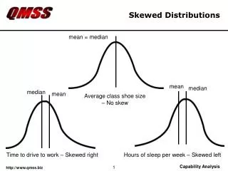
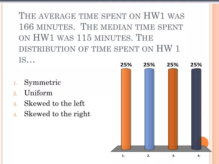
The average time spent on HW1 was 166 minutes. The median time spent on HW1 was 115 minutes. The distribution of time spent on HW 1 is…. Symmetric Uniform Skewed to the left Skewed to the right. Upcoming In Class. Homework #2 due Sunday (9/1) at 10:00pm Quiz #1 in class 8/28 (open book)

E N D
The average time spent on HW1 was 166 minutes. The median time spent on HW1 was 115 minutes. The distribution of time spent on HW 1 is… • Symmetric • Uniform • Skewed to the left • Skewed to the right
Upcoming In Class • Homework #2 due Sunday (9/1) at 10:00pm • Quiz #1 in class 8/28 (open book) • Part 1 of the Data Project due (9/4)
The standard deviation, s,is just the square root of the variance and is measured in the same units as the original data. What About Spread? The Standard Deviation (cont.)
Chapter 4 Understanding and Comparing Distributions
Why we need to understand and compare distributions? • Understanding the distributions provides us the preliminary descriptive data information and help you get a sense of models for further explanations.
The Big Picture • We can answer much more interesting questions about variables when we compare distributions for different groups. • Below is a histogram of the Average Wind Speed for every day in 1989.
Comparing Groups • It is always more interesting to compare groups. • With histograms, note the shapes, centers, and spreads of the two distributions. • What does this graphical display tell you?
Daily Wind Speed: Making Boxplots • A boxplot is a graphical display of the five-number summary. • Boxplots are particularly useful when comparing groups.
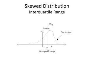
The Five-Number Summary • The five-number summary of a distribution reports its median, quartiles, and extremes (maximum and minimum). • Example: The five-number summary for the daily wind speed is:
Men vs Women Starting Salaries • Men • Women
Constructing Boxplots • Draw a single vertical axis spanning the range of the data. Draw short horizontal lines at the lower and upper quartiles and at the median. Then connect them with vertical lines to form a box.
Constructing Boxplots (cont.) • Erect “fences” around the main part of the data. • The upper fence is 1.5 IQRs above the upper quartile. • Q3 + 1.5*IQR • The lower fence is 1.5 IQRs below the lower quartile. • Q1 - 1.5*IQR • Note: the fences only help with constructing the boxplot and should not appear in the final display.
Constructing Boxplots (cont.) • Use the fences to grow “whiskers.” • Draw lines from the ends of the box up and down to the most extreme data values found within the fences. • If a data value falls outside one of the fences, we do not connect it with a whisker.
Constructing Boxplots (cont.) • Add the outliers by displaying any data values beyond the fences with special symbols. • We often use a different symbol for “far outliers” that are farther than 3 IQRs from the quartiles.
Wind Speed: Making Boxplots (cont.) • Compare the histogram and boxplot for daily wind speeds: • How does each display represent the distribution?
Comparing Groups (cont) • Boxplots offer an ideal balance of information and simplicity, hiding the details while displaying the overall summary information. • We often plot them side by side for groups or categories we wish to compare. • What do these boxplots tell you?
A class of fourth graders takes a diagnostic reading test, and the scores are reported by reading grade level. The 5-number summary for the boys and girls are shown below. • Girls • Min: 2.5 • Q1: 3.7 • Q2: 4.3 • Q3: 4.7 • Max: 5.8 • Boys • Min: 2.7 • Q1: 4.1 • Q2: 4.5 • Q3: 4.9 • Max: 5.9
Which group had the highest score • Girls • Boys
Which group had the greatest range • Girls • Boys • They are the same
Which group had the greatest IQR • Girls • Boys • They are the same
Which group’s scores appear more skewed? • The boy’s scores are more skewed. The quartiles are the same distance from the mean. • The girl’s scores are more skewed. The quartiles are not the same distance from the median. • The boy’s scores are more skewed. The quartiles are not the same distance from the median. • The girl’s scores are more skewed. The quartiles are the same distance from the median.
Which group generally did better on the test? • Girls did better b/c the mean for girls was higher. • Girls did better b/c the median for girls was higher. • Boys did better b/c the mean for boys was higher. • Boys did better b/c the median for boys was higher.
What Can Go Wrong? (cont.) • Avoid inconsistent scales, either within the display or when comparing two displays. • Label clearly so a reader knows what the plot displays. • Good intentions, bad plot:
What About Outliers? • If there are any clear outliers and you are reporting the mean and standard deviation, report them with the outliers present and with the outliers removed. The differences may be quite revealing. • Note: The median and IQR are not likely to be affected by the outliers.
Transforming Data • y=Log(x) • To get original data back x=10^y =10y • y=Sqrt(x) • To get original data back x=y^2 = y*y
*Re-expressing Skewed Data to Improve Symmetry (cont.) • One way to make a skewed distribution more symmetric is to re-express or transform the data by applying a simple function (e.g., logarithmic function). • Note the change in skewness from the raw data (previous slide) to the transformed data (right):
Next Time • Chapter 5 • How we use the Standard Deviation to make comparisons….